The main purpose of this ongoing blog will be to track global extreme or record temperatures related to climate change. Any reports I see of ETs will be listed below the main topic of the day. I’ll refer to extreme or record temperatures as ETs (not extraterrestrials).😉
Main Topic: New Record Ratio Charts for the United States and Canada
Dear Diary. As most of my readers know, back during the decade of the 2000s I came up with a new method for measuring the extent of climate change, which involves record temperature counts. You can read more about that scientific study in detail here:
I recently did an interview on record temperatures for Minnesota Public Radio. Here is that link:
Record temperatures and climate change: What’s the connection? | MPR News
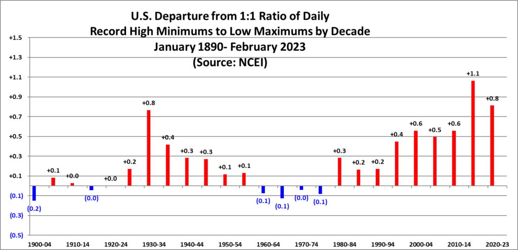
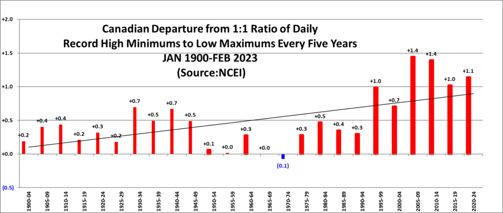
Essentially, if the climate were not warming or cooling, we would see a one-to-one ratio of record heat verses record chill. Over the last thirty years this ratio has begun to exceed this one-to-one ratio, now getting near or slightly over two to one for both the United States and Canada (Mathematically, +1.0 represents a 2-1 ratio.):
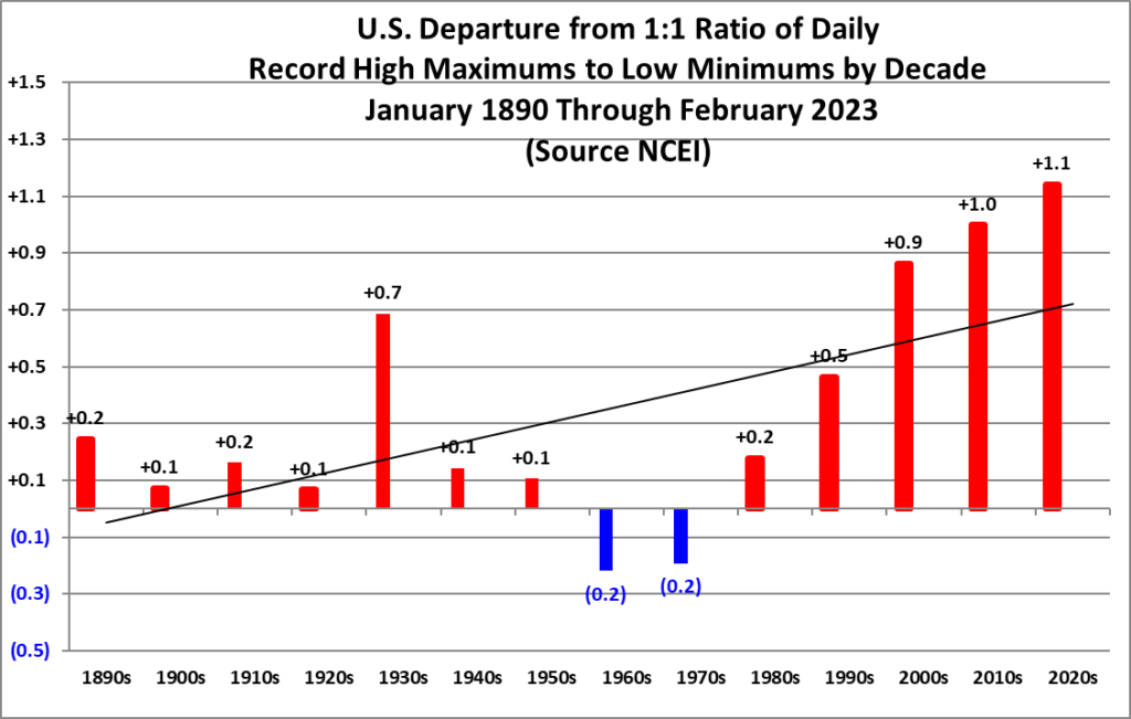
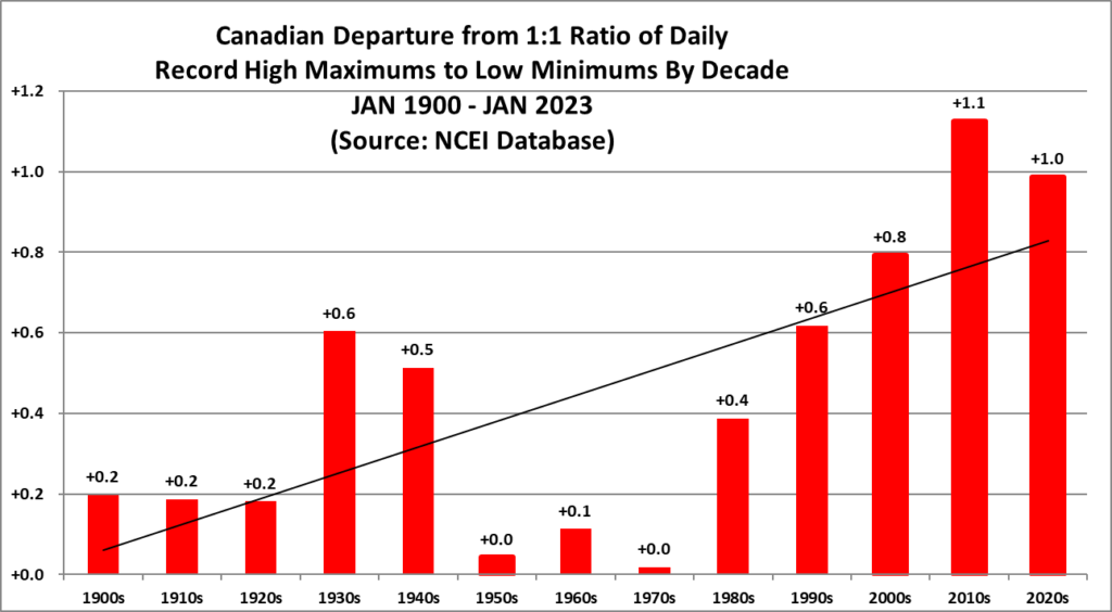
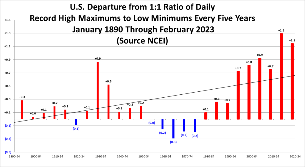
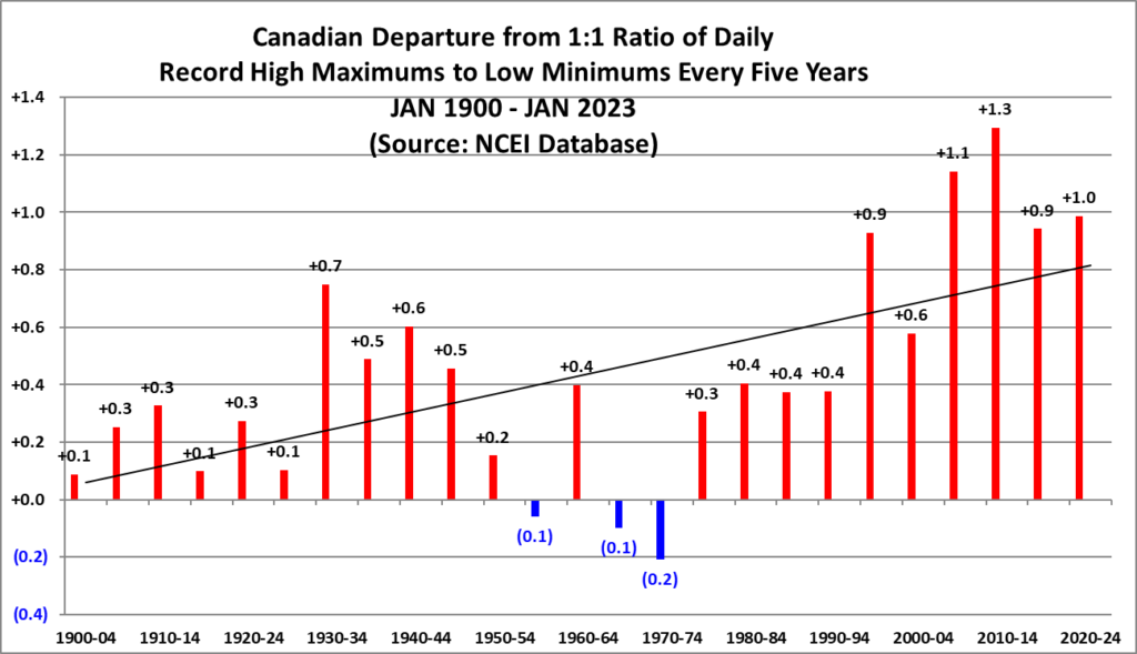
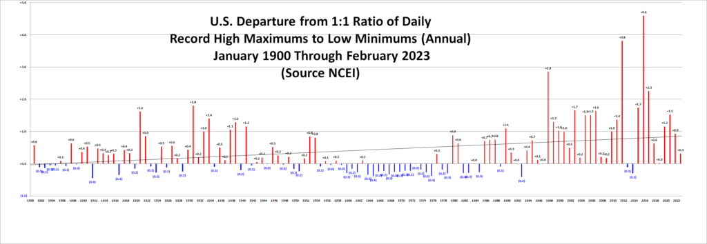
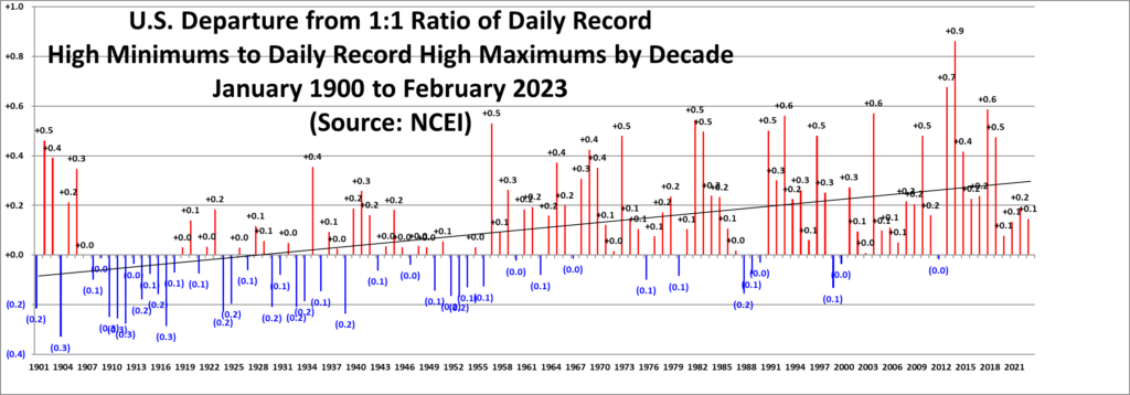
I’ve been using these two decadal charts for many years, but they lack detail, so I thought why not show bar graphs representing every five years and every single year? Here are the ones I’ve recently constructed (all from this data source):
On the above two charts we can better see warming from the 1930s Dust Bowl Era and mid-twentieth century cooling, mainly due to increased soot pollution from coal use and dirty car exhaust. Warming after the 1970s is quite stark.
On the two annual charts one can see spikes centered around the strong El Niño years of 1998 and 2016:

I’m also tracking record high minimum reports vs. low maximum reports:
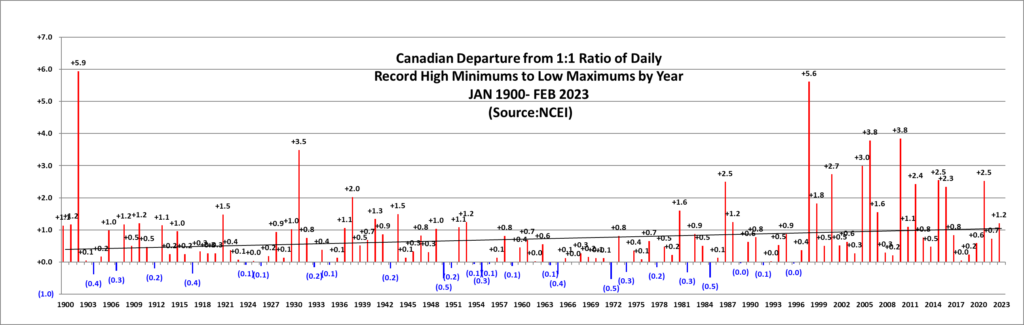
I cringe to think about what these charts will look like in a few years once the next moderate to strong El Niño interacts with heat already baked into the climate changing cake. There are strong indications that we will have at least a moderate El Niño starting later this year.
Anyway, for weather and climate nerds out there, I hope you will glean any science possible from these new charts.
Here are some “ET’s” recorded from around the planet the last couple of days, their consequences, and some extreme temperature outlooks, as well as any extreme precipitation reports:
Here is more February 2023 climatology:
Here is more climate and weather news from Wednesday:
(As usual, this will be a fluid post in which more information gets added during the day as it crosses my radar, crediting all who have put it on-line. Items will be archived on this site for posterity. In most instances click on the pictures of each tweet to see each article. The most noteworthy items will be listed first.)
If you like these posts and my work please contribute via the PayPal widget, which has recently been added to this site. Thanks in advance for any support.)
Guy Walton… “The Climate Guy”