The main purpose of this ongoing blog will be to track global extreme or record temperatures related to climate change. Any reports I see of ETs will be listed below the main topic of the day. I’ll refer to extreme or record temperatures as ETs (not extraterrestrials).😉
Main Topic: An Improved Hurricane Cone
Dear Diary. I’m all for improvements in association with conveying how weather and climate threats are related to the public. That is why I have pressed the meteorological world to start naming heat and cold waves plus identifiable non-tropical heavy precipitation events. The system pounding California this weekend should have a reference name to better focus people on its threats, for example. When people hear a name, such as Katrina, they also remember events better for future reference.
Mentioning hurricane names lets me segue into today’s main subject. The National Hurricane Center will soon roll out a new cone graphic that will better help people visualize threats. These days most people have short attention spans, so anything that conveys the most information in the shortest amount of time without confusion will be an improvement. No graphic to meet this goal will be perfect, but as a species we keep trying,,, as we should.
Here are more details from the Washington Post:
A big change is coming to the indispensable hurricane cone – The Washington Post
A big change is coming to the indispensable hurricane cone. It may help you better prepare.
The latest — and perhaps most significant — tweak to the indispensable forecast cone emphasizes the breadth of storm hazards, not just the point of landfall

By Scott Dance
February 2, 2024 at 7:00 a.m. EST

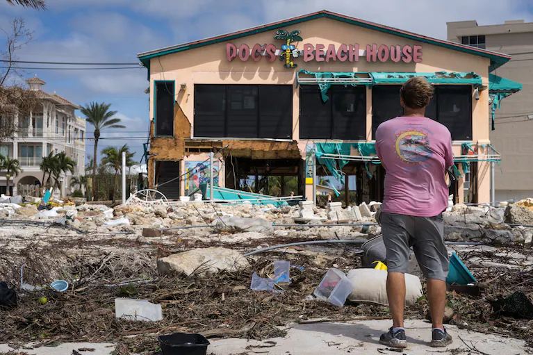
Doc’s Beach House in Bonita Springs, Fla., was destroyed after Hurricane Ian ravaged the region. (Thomas Simonetti for The Washington Post)
The forecast cone is central to how we prepare for hurricanes: It communicates who is in a storm’s path and how quickly communities must act. But critics have argued that it fails to properly warn the public, including ahead of recent storms.
Now, the National Hurricane Center is exploring, what is perhaps, its biggest-ever revamp of the indispensable graphic.
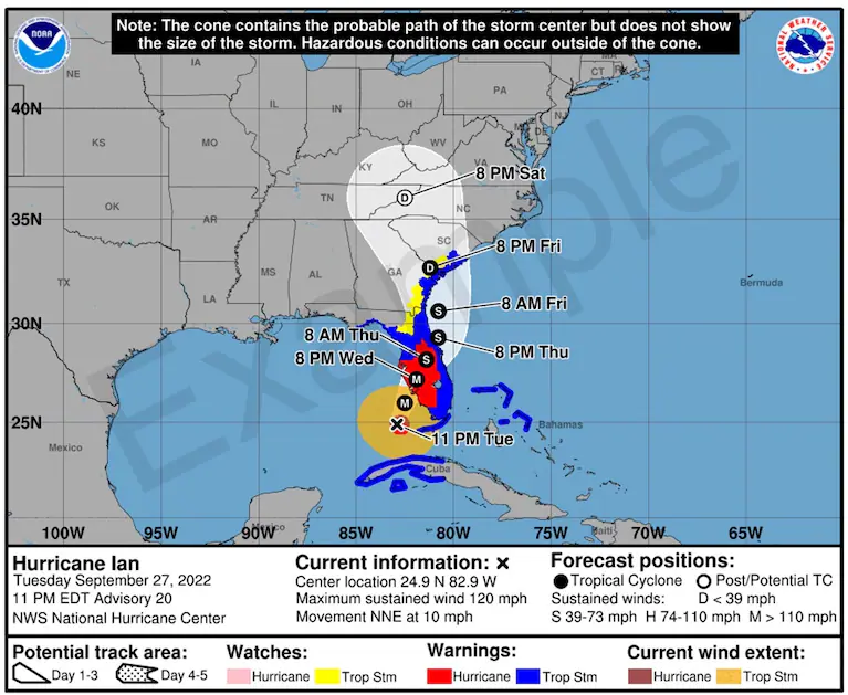
The hurricane center will issue an experimental version this year that will depict watches and warnings for inland tropical storms and hurricanes, superimposed on top of the forecast cone, aiming to communicate not just the storm path but the extent of its potential impacts. It could prevent a repeat of Hurricane Ian, when many Floridians said the cone was a reason they underestimated the 2022 storm’s widespread and severe effects.
If adopted, the new forecast cone would mark the first tweak in seven years to a graphic that millions of people use to decide when to evacuate, where to go and how to protect their homes. There could be even more changes to come, as scientists consider how to clearly pack more information about storm dangers into a single image.
The latest version of the forecast cone, which the hurricane center plans to begin publishing by mid-August, won’t yet replace the traditional graphic, but will appear alongside it as meteorologists gauge whether the revisions help people better understand the range and intensity of hazards they could face. Hurricane season begins June 1 and runs through November.
“It’s designed to help people more accurately assess their risk,” Michael Brennan, the hurricane center’s director, told The Washington Post. “We want to depict that risk as accurately as we can.”
The forecast cone has been a work in progress
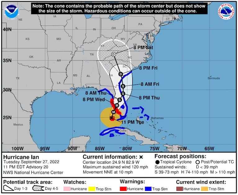
The forecast cone dates to 2002 and has since become ubiquitous during hurricane season, alerting the public to a tropical cyclone’s expected path, intensity and timing.
The bounds of the cone are designed to include the area within which the storm’s center is most likely to go. The cone widens because the farther out forecasters are predicting, the greater uncertainty there is over the potential storm path.

But the cone’s message hasn’t always been clear.
Forecasters’ most recent revision, adopted in 2017, added a depiction of a storm’s size, represented by orange and red-shaded circles that mark the reach of tropical storm and hurricane-force winds. The change was deemed necessary because many had interpreted the width of the cone to represent a storm’s expected size.
Other past changes have included adding letters to indicate a storm’s expected intensity at a given time — S for tropical storm, H for hurricane and M for major hurricane. The width of the cone even changes from year to year, revised based on the accuracy of the hurricane center’s forecasts over the previous five years.
“Every tweak they’ve made to the cone over its 21 years has been an improvement,” said Brian McNoldy, a senior research associate at the University of Miami and Capital Weather Gang contributor.
A revised graphic aims to telegraph inland threats
The latest version seeks to address lingering concerns over how well people interpret possible threats to inland areas — not just the coastal ones that tend to see the most devastation.
For example, when Hurricane Ian approached Florida’s western coast in September 2022, much attention went to early versions of the forecast cone that suggested landfall was likely in the Tampa Bay area. Many residents said they were caught by surprise when the storm made landfall well south of there — and when there were serious impacts far from the point of landfall.
Reducing emphasis on landfall and more broadly depicting storm impacts, a prototype of the updated forecast cone graphic shows the forecast cone as a shaded area — and as almost secondary to the hurricane and tropical storm warning areas that extend hundreds of miles along a storm’s expected path.

Hurricane warnings are issued when an area is forecast to experience sustained winds of at least 74 mph within the next 36 hours. Tropical storm warnings indicate that sustained winds of 39 to 73 mph are similarly imminent.
The experimental forecast graphic will also highlight tropical storm and hurricane watches, which are issued when such conditions are expected to be possible in an area within the next 48 hours.
Research into public understanding of the forecast graphics has shown a need to go beyond coastal hazards and “communicate more of the hazards inland,” said Barbara Millet, an assistant professor of interactive media at the University of Miami. In that sense, the new graphic “is definitely a step in the right direction,” she said.
Conveying all a storm’s threats remains ‘impossible’
Still, the latest version of the forecast cone doesn’t solve all of meteorologists’ concerns, as intensifying storms only heighten the imperative of properly communicating storm dangers to the public.
Chief among the limitations of even the latest forecast cone iteration: “It doesn’t deal with water risk, which is where most of the damage and mortality comes from,” said James Kossin, distinguished adviser at the First Street Foundation, a Brooklyn-based nonprofit focused on climate risk. The top water-related hazard during a tropical cyclone is storm surge — a rise in ocean water that storms push toward shore.
While the hurricane center has added new graphics and data to its website focused on storm surge, that information isn’t included in the most prominent and widely shared forecast cone graphics.
Millet and McNoldy are among a group of researchers exploring how to better combine various types of storm threats into a single map, and how to design it in a way that is most useful for the public. That includes not just hazards such as winds and storm surge, but the expected timing and even some direction on what people should do to respond and prepare.
“There are so many different types of information that need to be communicated,” Millet said. “We’re not necessarily capturing everything a true warning message needs to convey.”
As the hurricane center tests the latest version of the forecast cone during the upcoming Atlantic hurricane season, Brennan said its meteorologists remain open to further changes.
He said the center chose to emphasize tropical cyclone watches and warnings in the latest version because they are issued for days at a time, as opposed to warnings around storm surge or tornadoes, which typically only last a matter of hours.
To add those other hazards into a single graphic would be all but “impossible,” he said.

By Scott Dance Scott Dance is a reporter for The Washington Post covering extreme weather news and the intersections between weather, climate, society and the environment. He joined The Post in 2022 after more than a decade at the Baltimore Sun, where he most recently focused on climate change and the environment. Twitter
Here are more “ET’s” recorded from around the planet the last couple of days, their consequences, and some extreme temperature outlooks, as well as any extreme precipitation reports:
HISTORIC IN SOUTH AMERICA
— Extreme Temperatures Around The World (@extremetemps) February 4, 2024
45.8 Pozo Hondo, ARGENTINA hottest February day in South America since 1937 ! and 2nd overall after the 46.0C at Campo Gallo.
RECORDS BROKEN https://t.co/MM4OwGfpOt pic.twitter.com/newazxbIt1
Here is more brand-new January 2024 climatology:
Here is More Climate News from Sunday:
(As usual, this will be a fluid post in which more information gets added during the day as it crosses my radar, crediting all who have put it on-line. Items will be archived on this site for posterity. In most instances click on the pictures of each tweet to see each article. The most noteworthy items will be listed first.)