As suspected in my post, February at Halftime, the “warm team” fueled by carbon pollution ripped up the ill prepared and under equipped “cold team” during the second half of “the game”, but just by how much? What was the final score for February 2017? The answer as of the time of this post is 6,302 daily record highs to only 129 daily record lows for a ratio of 49 to 1 as of this posting. So, what is the true meaning of this statistic?
On this post, I will not be digging into the fascinating statistical weeds of how February’s records game turned out during each “play by play”. Others, such as Bob Henson of Weather Underground, Brian Kahn of Climate Central, and Andrew Freedman of Mashable did great pieces singling out specific records which were “key plays to the game”. If interested please peruse their posts linked below. Rather, I will be concentrating on a climate study that is starting to verify.
https://www.wunderground.com/blog/JeffMasters/comment.html?entrynum=3565
http://www.climatecentral.org/news/record-high-temperature-february-21186
http://mashable.com/2017/02/28/chicago-breaks-146-year-weather-record/#MpHB4Cl4VkqE
As we go through time, I will keep referring to the Record Temperature Meehl Study that I helped to start in the decade of the 2000’s. An updated version, indicating that a ratio of 15 to 1 daily record highs to lows from year to year is forecast to be common by around the year 2100, can be found here:
https://www.sciencedaily.com/releases/2016/11/161121174251.htm
In the world of climate science, I thought that I would need to wait until after the year 2030 before seeing a substantial change to United States record temperature ratios since climate change, even at an accelerated pace, is relatively slow over one lifetime. Boy was I wrong. That change is becoming very apparent now. On the one hand I am gratified that what I started in the year 2000 is scientifically verifying, but on the other hand it’s been like wishing that I would experience a horrible nightmare every evening.
So, what are the rules of the record ratios game? I am getting my data from the following National Center for Environmental Information link below. One tally is counted when a record is either tied or broken at any meteorological station across the 50 U.S. states or territories during a calendar day. A station is eligible to have record highs or lows cataloged in the site after it has been in existence for thirty years. Record data will trickle into the NCEI site a couple of months after an individual month’s end date. In other words, the tally won’t stabilize for February 2017 until May 1st, 2017. Once stations become eligible next year more tallies will get added for individual days, months and years, but relatively few; so, overall ratios will not change much with time. Prior to 1922 viable record data is sparse, so I have opted not to catalogue statistics before 1920.
https://www.ncdc.noaa.gov/cdo-web/datatools/records
How does the tally of ratios of daily record highs to lows across the United States stack up for February 2017 compared with all other months since 1920? I have prepared a chart of the top fifteen highest ratios from my data, what I have described as “The Records Genome” shown at the end of this post. There is an old adage that once someone finds a rotten apple in a barrel one is likely to find others. In my first post on guyonclimate.com I noted that the first big rotten apple was the record ratio for November 2016. Walla, only three months later in February 2017 we see another, and now it is the granddaddy of them all. God forbid that such a ratio occurs during June, July or August; but that possibility is becoming more likely. The United States, at this point, will be lucky if it does not suffer through a wickedly hot summer this year.
![]()
Look at the chart and think about this. Of all the 1,166 months of record keeping since January 1920 the two with the highest ratios of daily record highs to lows have occurred in just the last four months. Coincidence? Certainly not. Average global temperatures due to carbon pollution have climbed to all-time highs the last three years producing jet stream patterns and surrounding warm sea surface temperature regimes that have led to above nomal temperatures in the U.S. Also, note that 12 out of the top 15 months have occurred during the last 27 years. The temperature anomaly is that for the continental United States during each month that is depicted in the chart. Something is up….. yep, the numbers and statistics from a warming trend. The bottom line with me is that a climatic warming trend is occurring, and after scientifically ruling out natural causes, all fingers can be pointed to human induced carbon pollution. Period.
As an aside, it is interesting that 5 out of the top 15 highest ratio months occurred during February. I don’t know if this is a coincidence or not.
Recently in my records genome I have begun to use bold type for months where ratios have exceeded ten to one, or when cold, lower than one to ten. Taken from these statistics, the following chart by decade shows how skewed the instances of ratios greater than ten to one have been in recent decades:
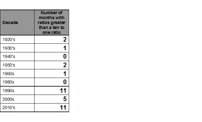
Also, 8 instances of greater than ten to one ratios for individual months have come in 2015, 2016 and now in 2017. Hmm….a lot of “rotten apples” are showing up. Don’t forget that the decade of the 2010’s has an additional 34 months left, hopefully with not too many more awfully hot months.
Why is this important? Because we know from trends that more warm months than not will be occurring across the U.S. While most of us relish mild days during the heart of winter, pests, such as pine beetles, will take a toll on species that can’t adapt as spring encroaches on increasingly mild winters. Life threatening heat waves will become dominant during the summer. As I have written in the past, no one minds a record high in New York City near 70 during January, but a record high of 102 during July, not so much. February 2017 has been described as “strangely” warm. Game over. Welcome to a new world of “strange”.
We will look at monthly records on my next post.
The Climate Guy
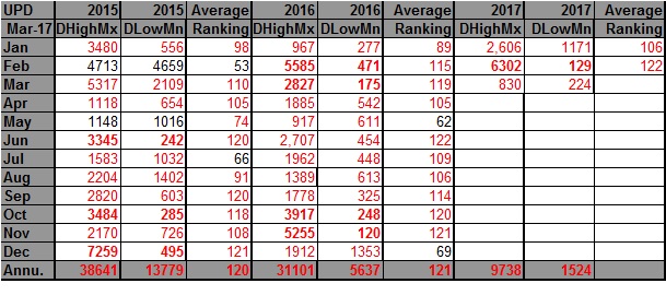
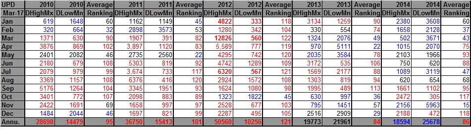
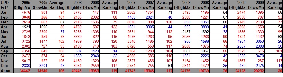
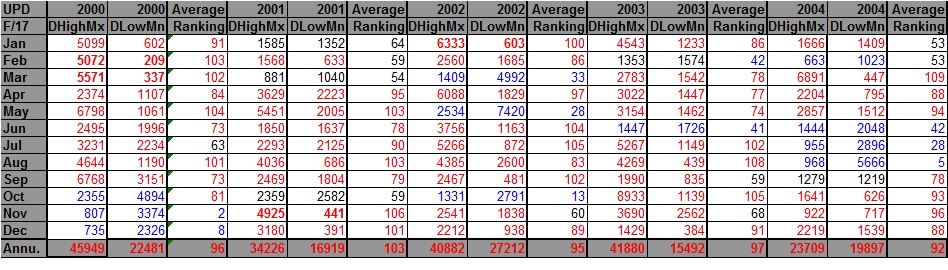
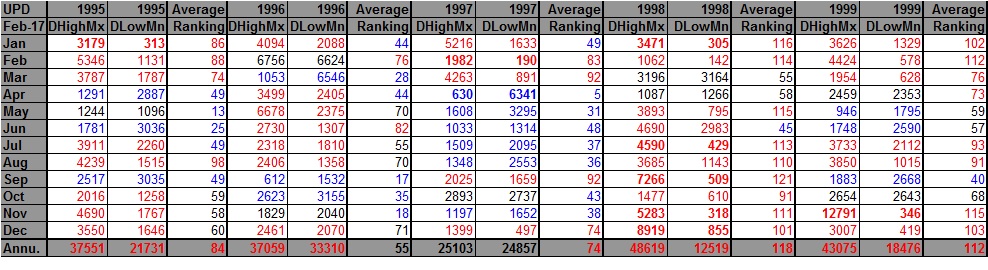
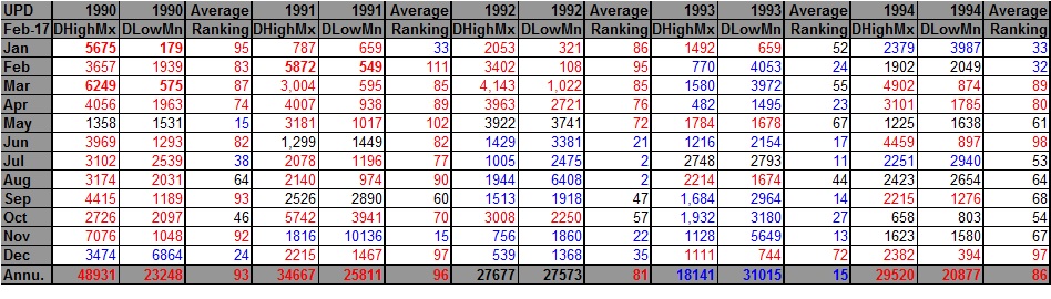
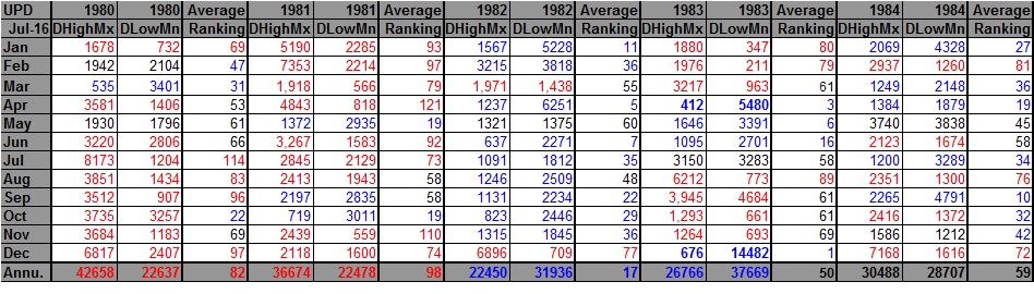
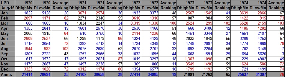
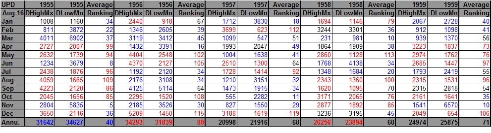
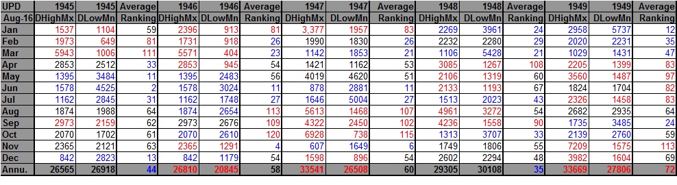
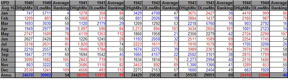
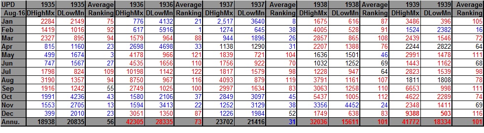
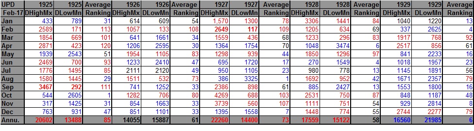
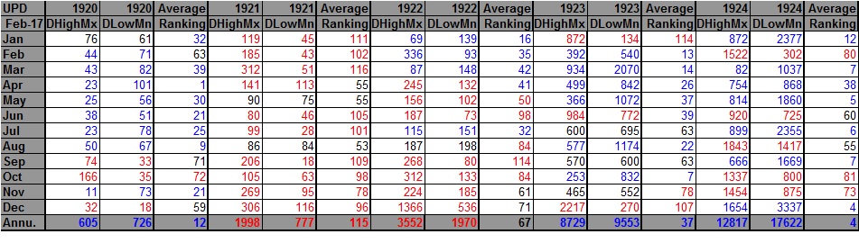
Rankings are for the lower 48 states with the warmest ranking since 1895 being 122 and 1 being the coldest. Blue colors represent cold months and red warm. Months that had near 1 to 1 ratios are colored black representing neutral months. Months that had greater than a 10 to 1 ratio or less than a 1 to 10 ratio are in bold type. Time stamps for when I updated each dataset are located in the upper left hand corner of each chart. Notice that beginning in late 2015 the numbers of daily record lows have been decreasing substantially….. something that was predicted by the Meehl study in 2009….an alarming trend.