In the past week I sent out a tweet that garnered more attention than any of my prior social media transmissions, which I was rather surprised at:
https://twitter.com/climateguyw/status/912706196460773376
I was pleased to see a Washington Post article stemming from what I noticed: https://www.washingtonpost.com/news/capital-weather-gang/wp/2017/09/28/summers-revenge-part-2-mega-heat-dome-to-build-over-central-and-eastern-u-s-next-week/?sdfsdfdsfds&utm_term=.68f1a40a973a
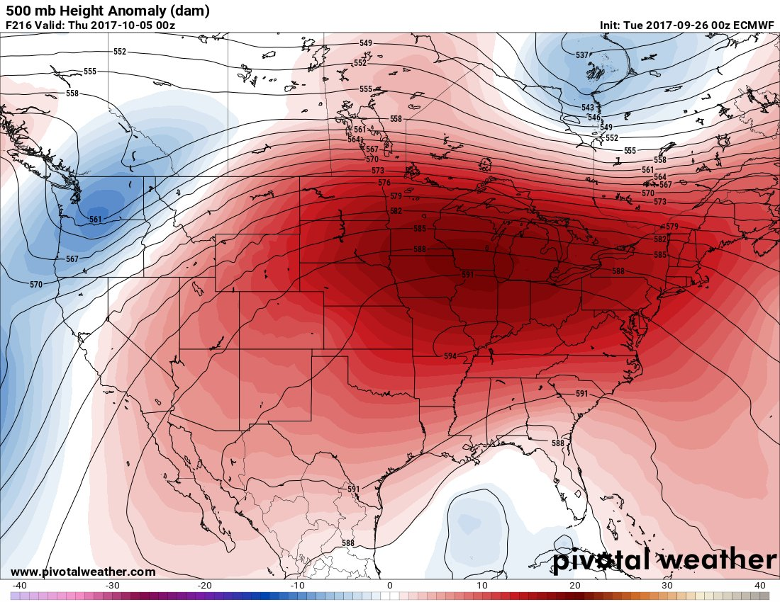
In the tweet I stated and informed Dr. Michael Mann, “If verified at 594+ decameters this ridge would be the strongest heat dome in early October that I have seen in my 35 year career.” Not wanting to be overly alarmist, let’s deconstruct this statement.
Here is the 216 hour European Model panel I used in the tweet:

I wasn’t surprised to see responses like “What on Earth is a decameter?” or “What does this chart refer to in relation to global warming?” I got one comment about how frighteningly red the thing looked, so this post will be a tutorial on 500 millibar charts as well as an update on how the forecast is going for October 4th.
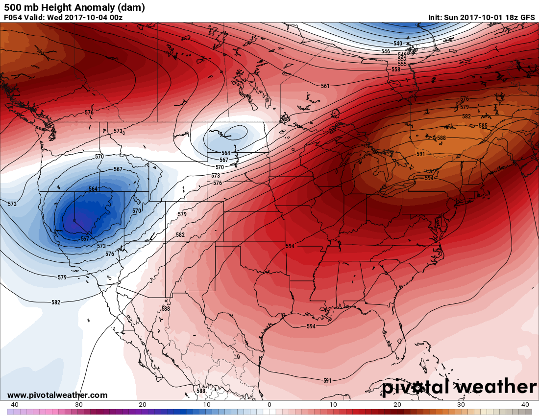
First here is the latest model data valid for 8PM 10/4:

The weak storm system forecast 216 hours out is a little stronger and farther east at 54 hours out in time and divided into two pieces as noted by one blue circle over Nevada and a weaker, lighter blue circle over North Dakota. On Pivotal Weather 500 charts millibar (abbreviated mb) the deeper the blues or purples the colder the synoptic or weather system. Other sites have differently formatted and colorized charts. Aloft (and at 500 Mb) the colder a non-tropical weather system relative to its surroundings, the stronger. Meteorologists have used the 500 mb level, which is about half way up through the atmosphere, to judge the strength of storms and heat domes since the early 20th century.
In this case the heat dome over the East 54 hours before verification is even stronger than what was forecast at 216 hours. Again if verified, this would be the strongest and most widespread heat dome in early October that I have seen in my 35 year career over the Continental United States or CONUS. As global warming theory goes the atmosphere from the surface up to the stratosphere has been and will be warming with time due to carbon pollution. This holds true at the middle level of the atmosphere, which is near 500 mb. Atmospheric pressure is often given in millibars where standard sea level pressure is defined as 1013.25 mb.
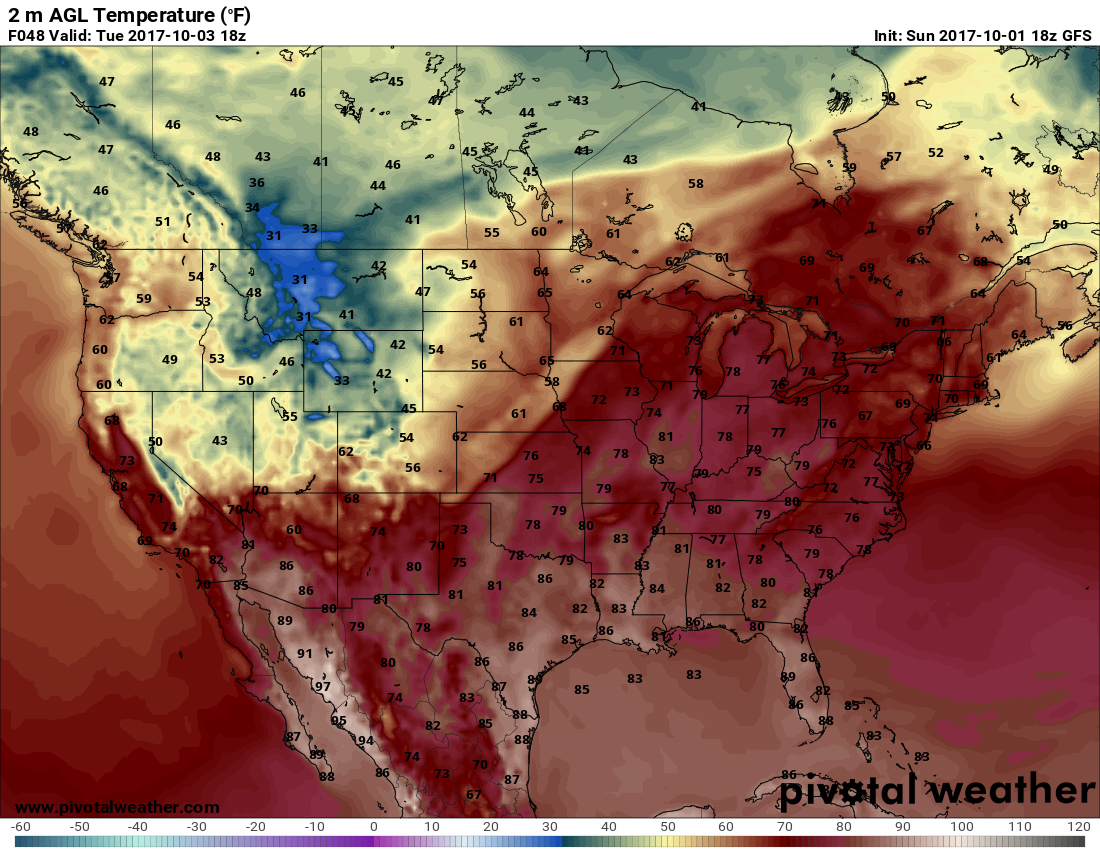
When one looks at the air mass under the ridge, though, scorching readings well above 90F aren’t forecast. Indeed, this might be a heat dome for the record books for October, but it won’t be alarmingly hot at the surface:

Let’s dissect that forecast 500 mb chart more:

Look closely at the legend going from about -40 to +40. Each shade of color along the bottom of the chart represents climatologically how “anomalous” the “heights” are per decameter. One decameter is ten meters. A location with an average forecast height is Phoenix, AZ where the chart says it will be 5820 meters at 500 mb. You will need to scale a ladder 5820 meters to get to the 500 Mb level in Phoenix. At Buffalo, NY the 500 mb height is forecast to be a meteorologically whopping 5940 meters, or looking at the pretty orange colors, about 250 meters above average. Anomalous forecast heating will cause you to scale that ladder 250 meters higher than what it would be climatologically at 5690 meters or 569 decameters. Conversely the 500 mb height at Reno, NV is forecast to be about 5600 meters or about 150 meters below average. The warmer the column of air the higher the height.
There are a lot of reds on the chart. As the years have gone by I’ve been noticing more and more reds on these 500 mb charts (although back in the stone age before the Internet in the 1980s there were no colors☺). We can be thankful in the eastern U.S. that there was not a similar anomalous heat dome this summer.
That’s about it for this little tutorial.
The Climate Guy
Please explain the values around the blue low pressure area. What is the average DM, from which highs and lows deviate? (I’m trying to understand the whole 500 mB, DM way of describing weather systems.) Thanks.
Thanks for the questions, Don.
Very roughly, average height deviations are mainly + or – 10 decameters in the summer over the CONUS rising to + or – 30 decameters over the winter when the polar vortex strengthens and starts to pultrude into the U.S
The central value of the blue cold pocket or low-pressure area over Nevada on the above chart is about 561 decameters.
Yes, I know that it can be difficult learning these metric units in these met charts but keep practicing.