Wednesday September 23rd… Dear Diary. The main purpose of this ongoing blog will be to track United States extreme or record temperatures related to climate change. Any reports I see of ETs will be listed below the main topic of the day. I’ll refer to extreme or record temperatures as ETs (not extraterrestrials).😉
Main Topic: New British NCEI Record Counts Showing A Warming Trend
Dear Diary. As most of you know, my main contribution to climate science has been the introduction of surface record ratio counts showing a warming trend in association with climate change. Daily records for the United States were meticulously compiled during the 2000s leading to the Meehl Record Study, a scientific paper published in Geophysical Science, in 2009:
https://agupubs.onlinelibrary.wiley.com/doi/full/10.1029/2009GL040736
Since 2009 I have used the National Center for Environmental Information record count tool to look up and compare record trends for various countries then compare that data with U.S. ratios per decade. It is no surprise that wherever I look across the globe we are seeing a warming trend.
My latest research comes from the British Isles where we have one of the longest periods of surface temperature record keeping on the planet. Obviously, since the United Kingdom is a relatively small country compared with the United States there are fewer sites, but there is enough data to see some stark results. Some were surprising as we shall see in this brief post.
As a reminder:
Here are my British numbers compared with those from my latest update for the United States:
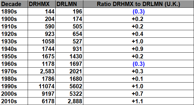
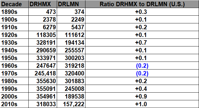
As shown in the above four charts U.S. data is somewhere between 30 to 40 times greater than that for the U.K. Still, we have thousands of counts (including ties) for each decade since the 1920s across the United Kingdom.
Here are decadal bar graphs of daily record high maximums vs. daily record low minimums:
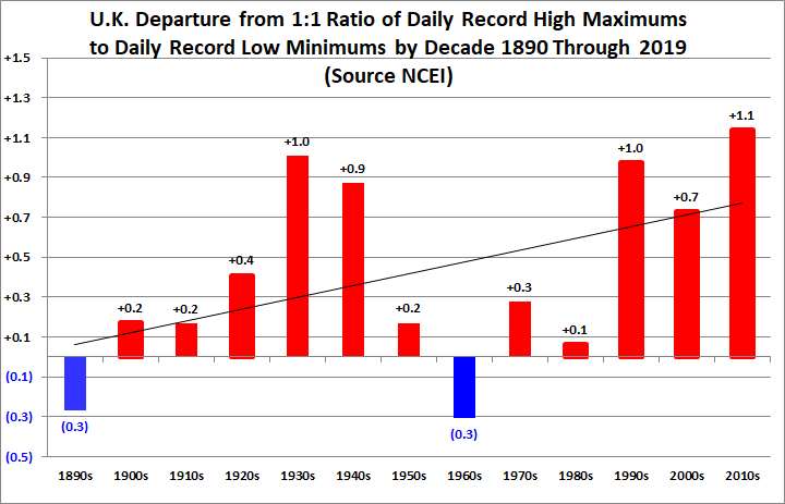

The above two charts are interesting because one can see a clear warming trend, mid 20th century cooling, and the fact that the last decade had the highest ratio for both datasets. What’s a little surprising is the 1930s spike in both the United Kingdom and the United States. This can be accounted for in the U.S. due to the Dust Bowl but not in the U.K.
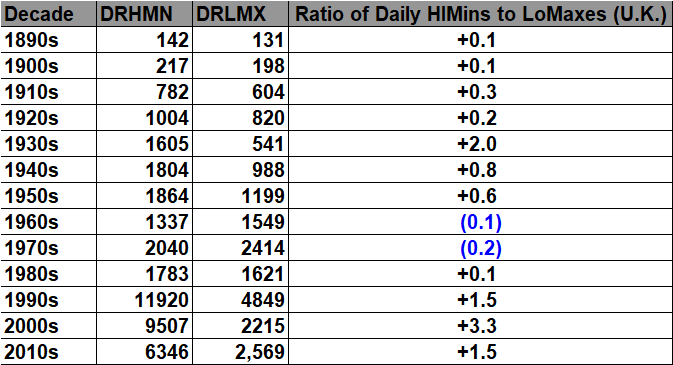
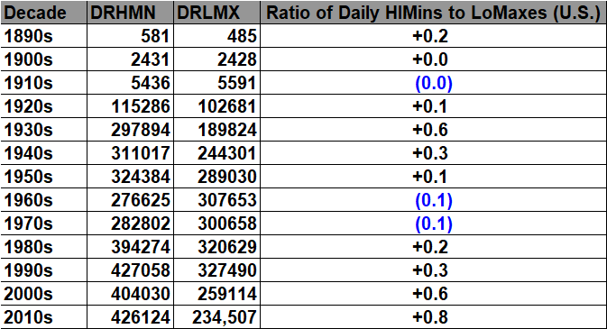
As far as daily record high minimums and low maxes go, here are charts from both countries of those datasets:

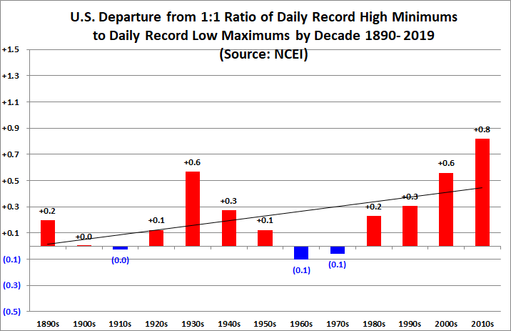
Here we note that the decade of the 2000s had the highest ratio for the United Kingdom, but there is an overall warming trend.
What about any signs of nights warming faster than days for the United Kingdom, which is one thing to look for in the realm of climate science?
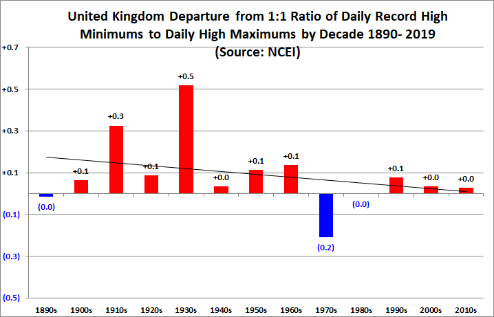
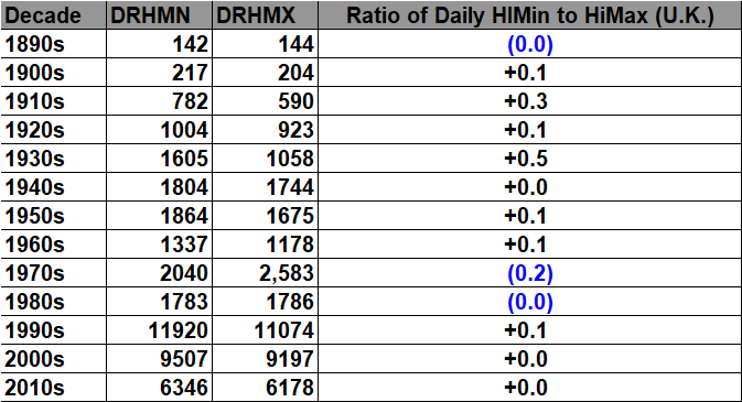
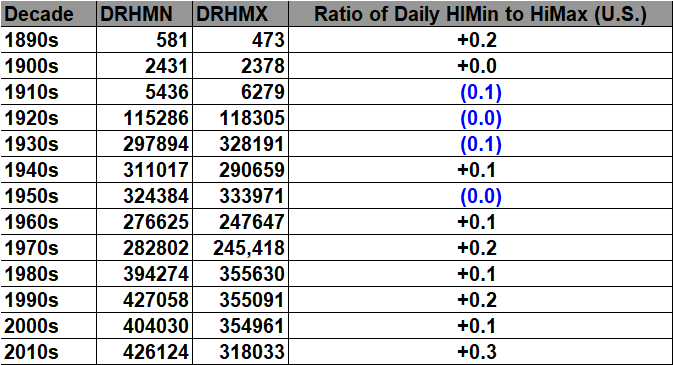
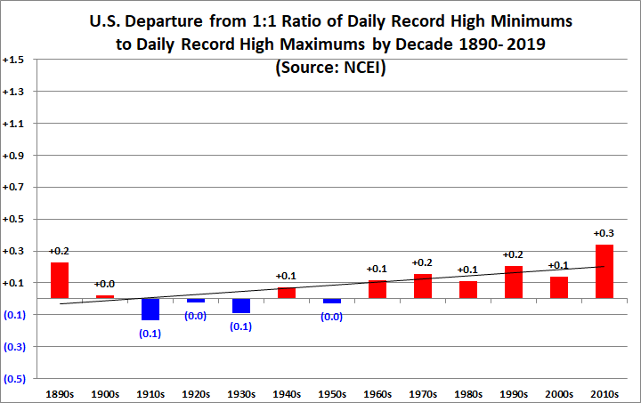
Noting that there is a distinct drop off in record counts prior to 1920, we do see some subtle signs of nights warming more than days since we do have more record high minimum reports than high maximum after the mid 20th century cool period. This pattern is more distinct with U.S. data:
I will be presenting my findings for Germany and China at a later date.
For many more charts and graphs from my NCEI British research, including monthly data, see:
Speaking of records or “ET’s here is another from Puerto Rico from last week:
Here is more climate and weather news from Wednesday:
(As usual, this will be a fluid post in which more information gets added during the day as it crosses my radar, crediting all who have put it on-line. Items will be archived on this site for posterity. In most instances click on the pictures of each tweet to see each article. The most noteworthy items will be listed first.)
Now here are some of today’s articles and notes on the horrid COVID-19 pandemic:
(If you like these posts and my work please contribute via the PayPal widget, which has recently been added to this site. Thanks in advance for any support.)
Guy Walton “The Climate Guy”