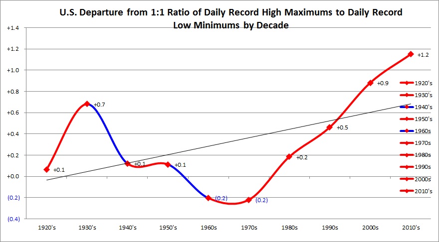
Shortly after the Meehl Records Study that I was a part of got published in 2009, I began noticing a rather strange phenomenon in association with record temperatures. Data from the National Climatic Data Center’s record site had come on line in 2008, which confirmed my findings that in the decade of the 2000’s there was about a 2-1 ratio of daily record highs to daily record lows and then a warming trend in association with records since the 1970’s. Because the records site also catalogued record high minimums (or warm overnight lows) and record low maximums (or record cool highs) I began to chart those in Excel files even though these two datasets were not a part of the Meehl study. For reference, here is a link to the first Meehl study:
http://onlinelibrary.wiley.com/doi/10.1029/2009GL040736/abstract
By 2010 I noticed that there was a strange, recurrent pattern from month to month in most instances. The number of record high minimums exceeded the number of high maximums followed by low maximums with low minimums being the least. My colleagues at the time could not explain the phenomenon, but I knew that if one sees a pattern in mathematics or nature there must be a scientific answer. So, for this decade I kept charting surface record data and sending messages out concerning how the four dataset numbers were stacking up. By 2016 Dr. Meehl and his statistic partner, Claudia Tebaldi, had come up with an answer (just for the shear number of forecast daily record high maxes to daily record low minimums emphasized here) I might point out, which were also my primary suspects for how all four datasets were behaving: evapotranspiration and precipitation. These factors were accounting for disparity between observed record numbers and those forecast by climate models.
Their latest study is noted here: https://www.sciencedaily.com/releases/2016/11/161121174251.htm
Quoting from the 2016 study: “Their analysis uncovered two reasons for the disparity between the computer models and observations.
First, the models tended to underestimate precipitation. Because the air is cooled by precipitation and resulting evapotranspiration — the release of moisture from the land and plants back to the atmosphere — the tendency of the computer models to create an overly dry environment led to more record high temperatures.
Second, the original study in 2009 only went back to the 1950s. For the new study, the research team also analyzed temperatures in the 1930s and 1940s, which is as far back as accurate recordkeeping will allow. Because the Dust Bowl days of the 1930s were unusually warm, with many record-setting high temperatures, scientists found that it was more difficult in subsequent years to break those records even as temperatures warmed. However, even taking the warm 1930s into account, the model-simulated and observed ratio of record highs to record lows has been increasing.”
As an aside, at least this is good news. The ratio of daily record highs to daily record lows on an annual basis is now forecast to be 15-1 by 2100 instead of a horrendously toasty 50-1 as forecast in 2009.
My own Excel charts had been showing expected results. The first resulted in the 2009 study:
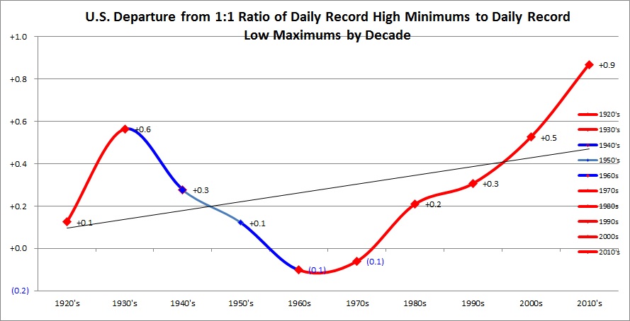
The second, though not part of the 2009 study, also shows a warming trend and expected results:
Well, I thought just last week, why not compare record high minimum data with record high maximum data in my Excel programs? Walla, out popped the following nifty chart. I’m kicking myself for not thinking of doing this years ago😊. This is the end result:
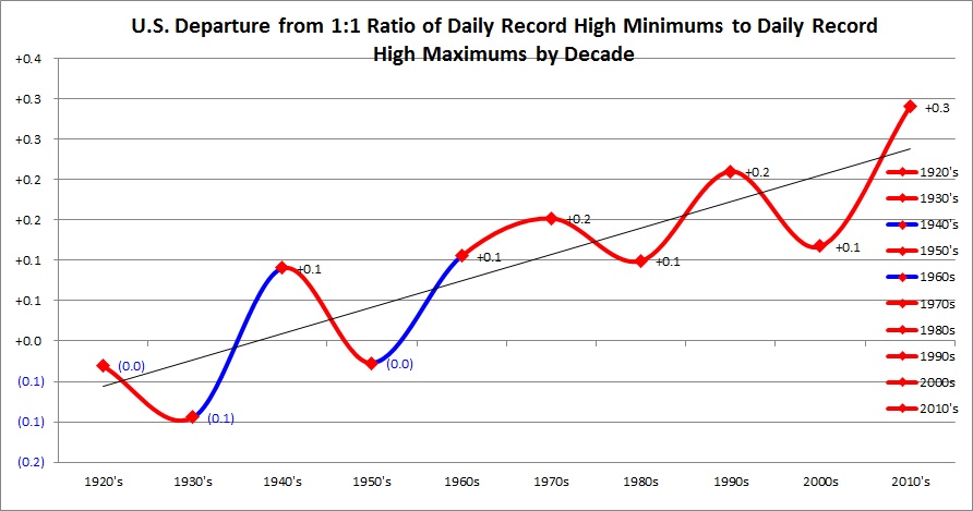
This thing looks counterintuitive. Given that the planet is warming I, as well as many of my colleagues, thought that nights and days were warming uniformly due to the radiation imbalance brought about by carbon pollution. Expected results should yield a flat line here. Instead, we see a sinusoidal looking chart in which there is a trend of more daily record high minimums than high maximums. As an aside, it is interesting that the mid-20th century downturn or cooling trend, is not reflected in this chart. I can’t explain that yet, so drop me a line if you think you have a hypothesis. There is only one conclusion: nights are warming faster than days!
But why? Another clue can be found when I compared the other two datasets, low maximums and low minimums, which in a warming world are decreasing in frequency:
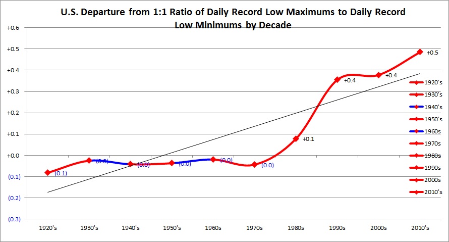
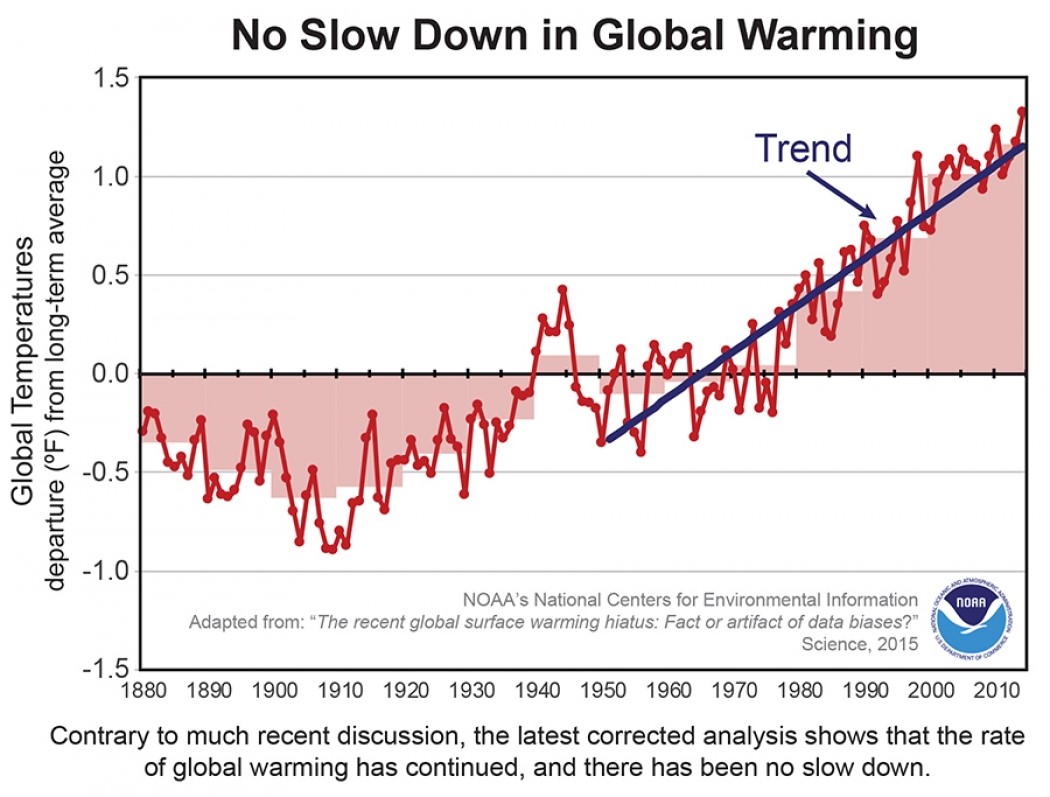
This time, as expected, we see a flat line between 1920 and 1980, but low maximums begin to outnumber low minimums substantially thereafter. The shear number of low maximums outnumbering low minimums would also point to nights warming faster than days. This trend coincides with the fact that discernible, substantial heating from carbon pollution also occurs after 1980 (National trends do, of course, reflect global trends.):
It is time for a simple meteorological thought experiment (remember those from school?😊). We already know that a warmer atmosphere holds more moisture. Climate change is leading to heavier precipitation events in most areas across our country once that added moisture is released. Accumulated moisture in the form of rain, dew and even snow on land takes some of the incoming radiation from the sun to be evaporated during the day, so there is less leftover available energy to produce a relatively higher maximum temperature, especially when the ground is wet. This would account for the disparity between the number of daily record high maximums and high minimums from month to month. As moisture condenses to form more clouds during the day in cold synoptic regimes there is less incoming radiation penetrating to the ground for heating. So, we are seeing in the statistics more record low maximums than low minimums over the long run…. another sign of nights warming faster than days.
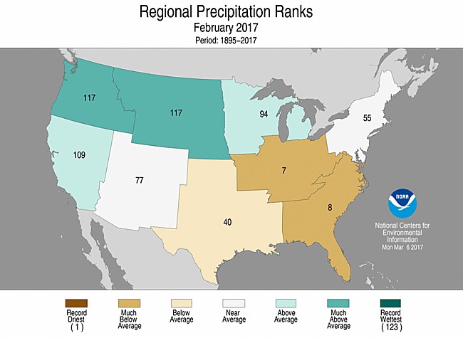
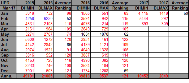
It is interesting that when I see more record daily high maximums than daily high minimums on a monthly basis most of those months are relatively dry across the U.S. when there is less condensation and evaporation. Such was the case in February 2017. The record statistics as of this writing for FEB 2017 go as follows: 6,304 DHMX 5,444 DHMN 292 DLMX 128 DLMN
February 2017’s average minimums ranked as the warmest on record while the average maximums ranked second warmest…. just another subtle sign of nights warming faster than days.
The areas where most of reporting stations are located were dry in FEB 2017…just another sign of how moisture is interacting with the four record temperature datasets:
I presented my “Records Genome” numbers of record counts where I am getting the data for my Excel charts for DHMX’s and DLMN’s on guyonclimate.com here: https://guyonclimate.com/2017/03/03/february-game-over/
At the end of this post I have the colorized Records Genome for counts of DHMN’s and DHMX’s for all to peruse.
Why is this important? Because the more we know about the nature of warming due to carbon pollution, the better mankind will be prepared to adapt. Extremely warm, sultry nights have been found to be deadly during the middle of heat waves. This Time Magazine article from last year and imbedded Climate Central link highlight the danger: http://time.com/4429378/heat-wave-hot-night-health-risks/
I will go into why all record counts are not equal…. presenting the Extreme Temperature Index on my next post.
The Climate Guy
The rankings are for the lower 48 states with the warmest ranking since 1895 of average temperatures being 122 and 1 being the coldest. Blue colors represent cold months and red warm. Time stamps for when I last updated each dataset are located in the upper left hand corner of each chart.


Great analysis! I think the first graph you made yourself, comparing DRMin and DRMax has something wrong with the values on the y-axis – they each seem to repeat twice! I think correcting this might remove that unusual wave pattern, although the trend will definitely still be going up and up (unfortunately).