Monday May 14th… Dear Diary. The main purpose of this ongoing post will be to track United States extreme or record temperatures related to climate change. Any reports I see of ETs will be listed below the main topic of the day. I’ll refer to extreme or record temperatures as ETs (not extraterrestrials)😊. Here is today’s main climate change related topic:
Disturbing Images
As the old proverbial saying goes a picture is worth a thousand words. One of my first posts last year presented some relatively new pictograms showing the planet’s and U.S. warming trend. Over the weekend one of my followers showed me this series of images from Zack Labe:
 Zack LabeVerified account @ZLabe
+ Graphic: http://www.columbia.edu/~mhs119/Temperature/T_moreFigs/ …
+ Data: GISTEMP (@NASAGISS) https://data.giss.nasa.gov/gistemp/
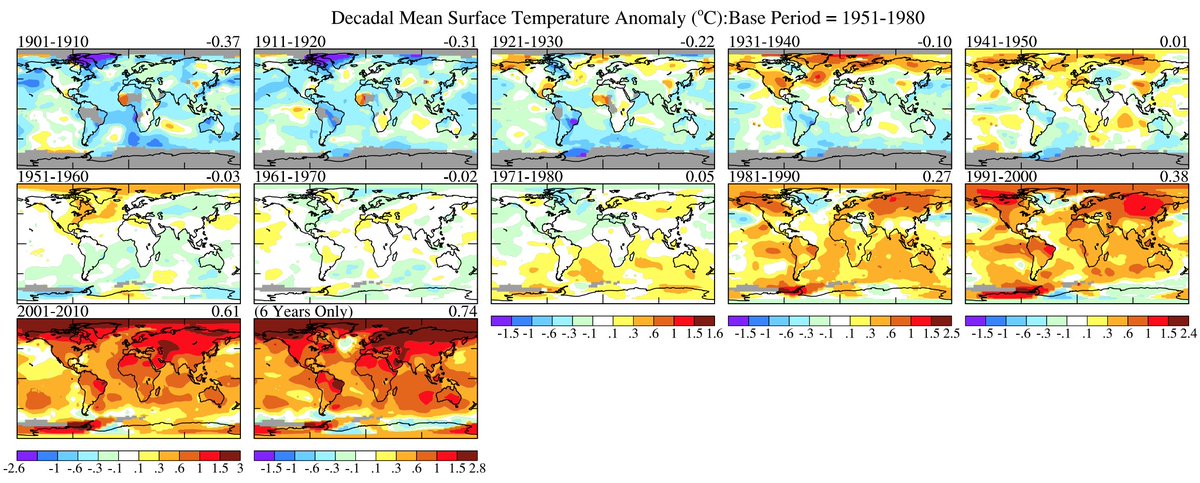

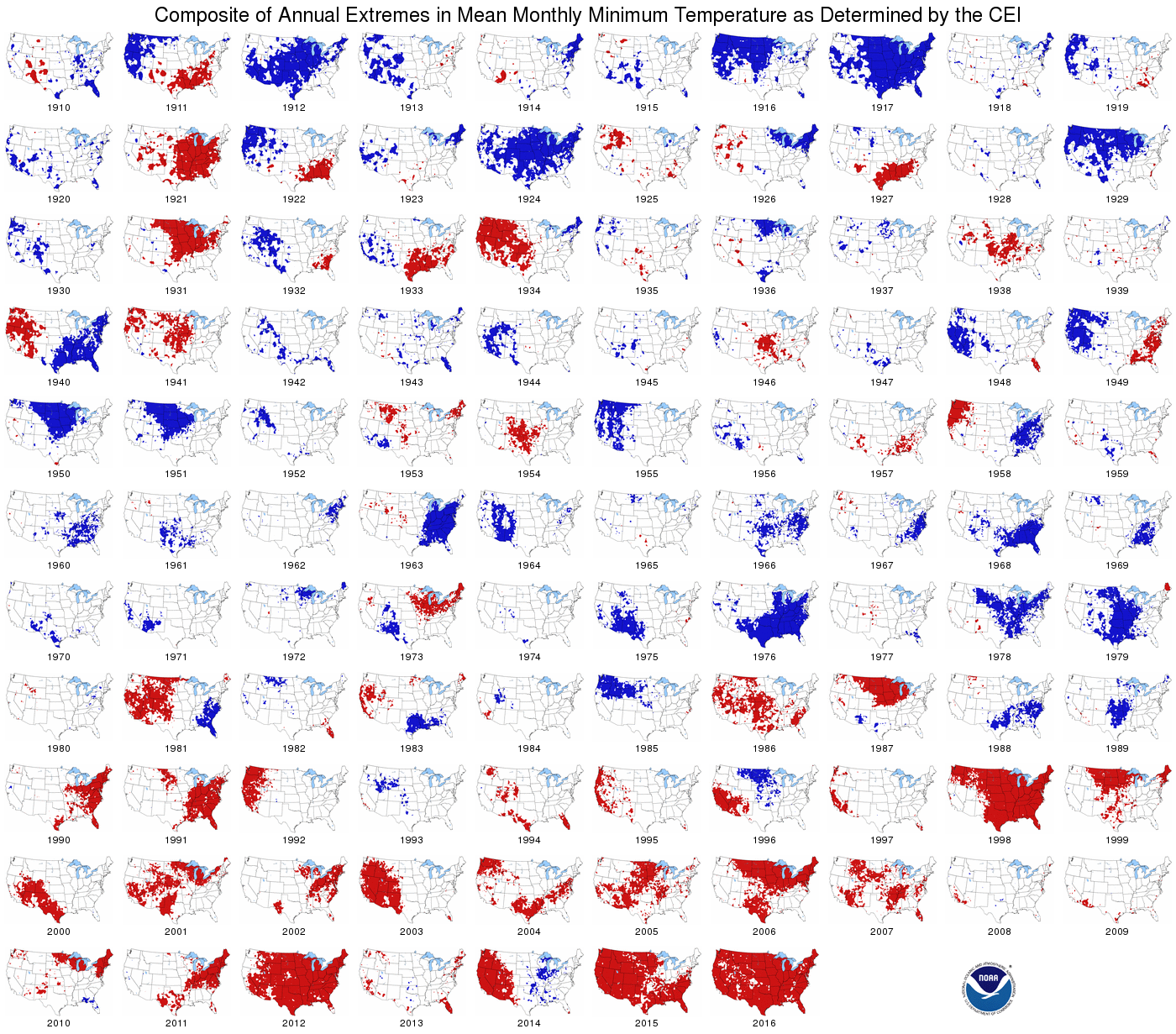
One can definitely see a marked increase in temperature since 1980 from these images. I wonder what could be the cause?😉
Here is one last disturbing image from Alaska:

Large area of open water in the Chukchi Sea near Alaska from the @NWSAlaska Sea Ice Program analysis. @NSIDC shows total Chukchi ice extent for May 13th is lowest in satellite era record: 755,000 km² would be the median extent June 15th. #akwx #Arctic @CinderBDT907 @lisashefguy

……………………………………………………………………………………………………………………………………………
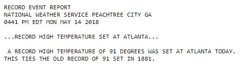
 NWS AtlantaVerified account @NWSAtlanta
I’ll add reports of any more ETs for today in the space below.
(If you like these posts and my work please contribute via the PayPal widget, which has recently been added to this site. Thanks in advance for any support.)
The Climate Guy