Saturday May 19th… Dear Diary. The main purpose of this ongoing post will be to track United States extreme or record temperatures related to climate change. Any reports I see of ETs will be listed below the main topic of the day. I’ll refer to extreme or record temperatures as ETs (not extraterrestrials)😊. Here is today’s main climate change related topic:
Cherry Picking
On this site I have often expressed my fondness for graphs and charts being fascinated with why subtle dips and surges occur. These rises and falls can tell us that something physical is going on that changes trajectories on charts. If the phenomena is weak the change will be temporary, if strong we get a complete reversal of trends. During the last decade, and particularly from 2005-2010, I saw this play out such that climate change contrarians got plenty of egg on their faces.
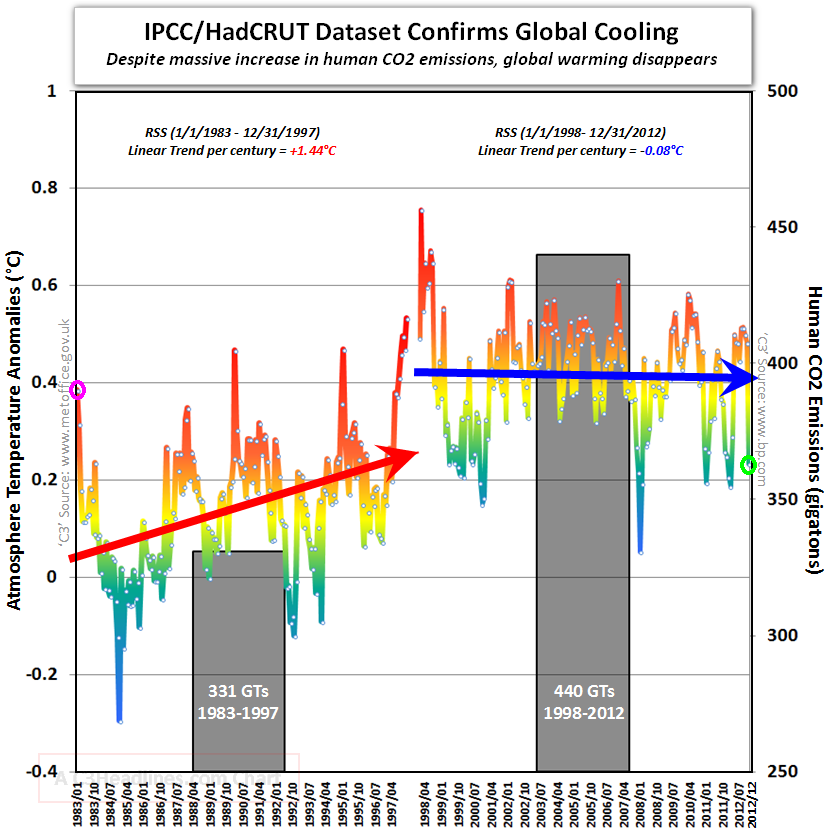
When one does not look at dips and rises long enough on graphs to ascertain a true trend what is called cherry picking occurs. Cherry pickers are those who want data to fit a desired outcome, but more often than not they try to make the proverbial round peg fit a square hole and vice a versa. In the world of climate the following chart is typical of ones I saw around the year 2012:

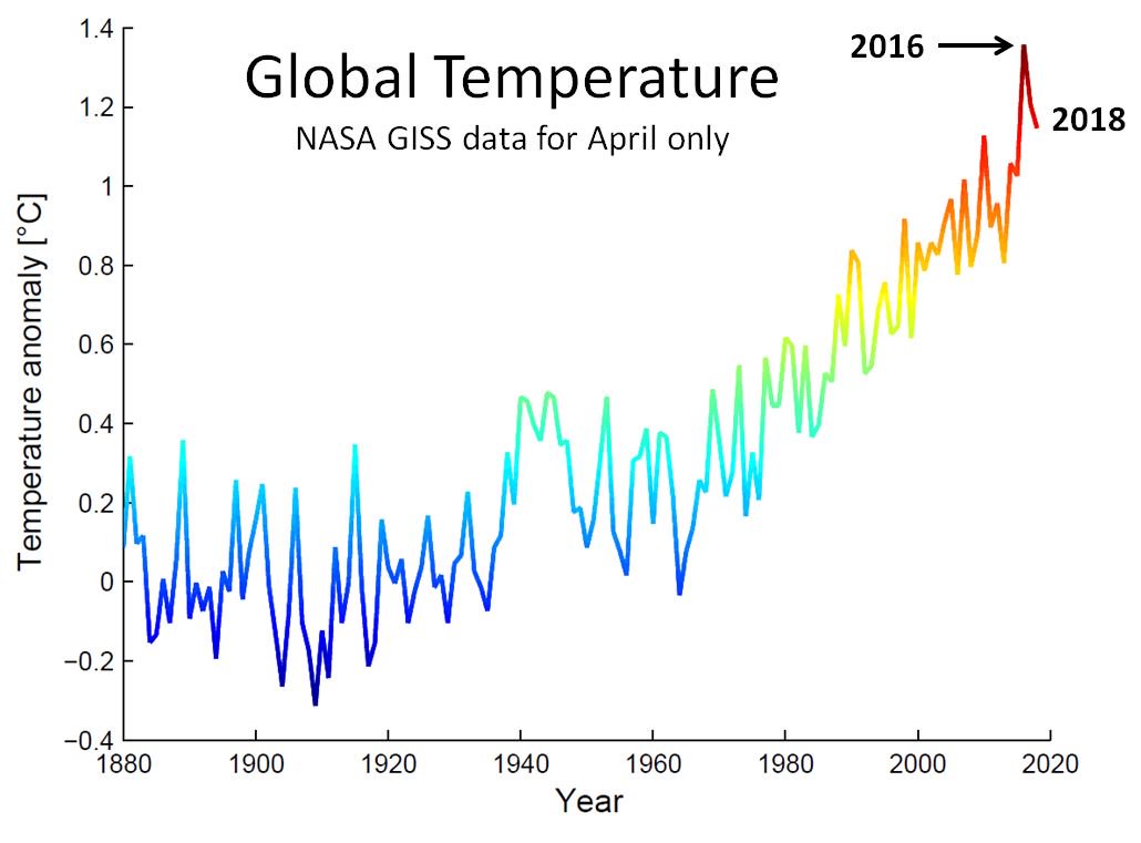
The presenter of this old chart made the claim that there wasn’t much warming since the record El Nino of 1998, which relative to 1983-2012 was true, but the time frame to pick up on a true trend was too narrow. Looking at a more recent, broader chart presenting a longer time frame we can see the true trend:

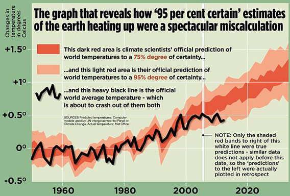
On the above chart one can make out that between 1998-2012 there wasn’t much warming, but warming resumed thereafter. Also, there has been a great deal of warming since 1880. I suppose that since the last big El Nino of 2016 cherry pickers will start to hone in on the slowdown of global warming again after a couple more years. I’ll jump on them when they do. Here is another cherry picked graph:

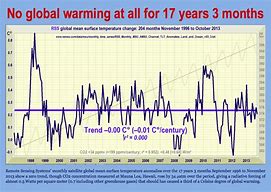
Again here we are presented with a shorter time span and the same data showing a slowdown in the overall warming trend from 1998 to about 2012. I do remember that around the year 2010 global temperature verification of climate models came out on the lowest ends of predictions. Denialists were getting giddy. Here is yet another chart with an even shorter time frame:

The lesson here is to not get too overly enthusiastic about a short trend well after a strong El Nino event has occurred as was the case in 2010, or a temperature spike when a strong El Nino event is happening as was the case in 2016. It’s important to learn why spikes and nadirs are occurring on these charts from year to year be they from volcanic eruptions to changes in sea ice extent; however, one must look at broad views to try answering those “how bad how soon” questions.
…………………………………………………………………………………………….
If I see any ETs I’ll report them in this space later today.
(If you like these posts and my work please contribute via the PayPal widget, which has recently been added to this site. Thanks in advance for any support.)
The Climate Guy
