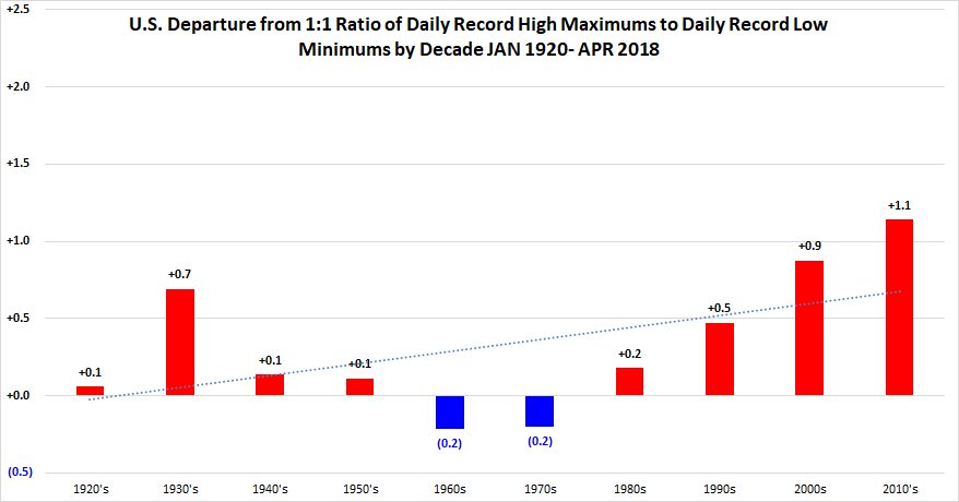
Friday May 18th… Dear Diary. The main purpose of this ongoing post will be to track United States extreme or record temperatures related to climate change. Any reports I see of ETs will be listed below the main topic of the day. I’ll refer to extreme or record temperatures as ETs (not extraterrestrials)😊. Here is today’s main climate change related topic:
Up Up and Away…Graphic Trends
Sometimes I don’t know whether to cry or laugh after seeing a myriad of updated charts each day in association with climate change. I constantly ask myself after seeing this onslaught of data, why don’t climate change denialists admit that they are in error? The simple answer is that in this day and age people don’t admit they are wrong so as not to look weak, but I was taught that a strong person admits their errors, corrects them when possible, then presses on. Today I’m going to present some charts that I saw just this morning depicting the relentless increase of climate change effects.
A couple of days ago I tore apart an article basically saying that sea level rise was not due to carbon pollution. Here is yet more proof of the article’s error:
SERIOUS: Why global warming raises sea levels, how we are so certain, and why it’s bad. My response to WSJ/Singer.
9:11 AM – 18 May 2018

 Marshall ShepherdVerified account @DrShepherd2013

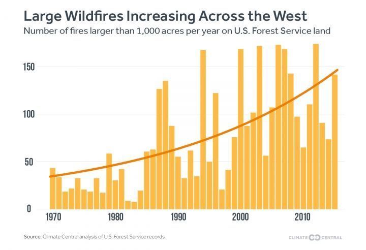
Next I saw this chart from Climate Central pertaining to western forest fires:
Across the Western U.S., the average annual number of large fires (larger than 1,000 acres) burning each year has more than tripled between the 1970s and the 2010s https://buff.ly/2rxkDaC

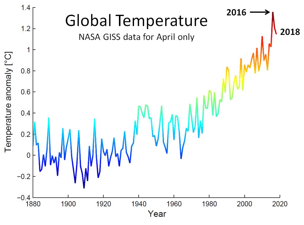
NASA global temperature value for April is out. The hottest Aprils on record are 2016, 2017, 2018. #globalwarming#climatechange@NASAClimate

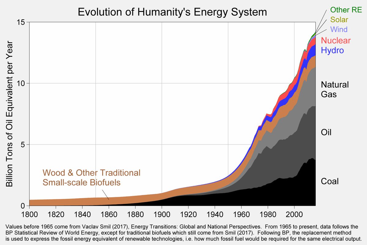
Over 200 years, humanity’s energy system has been transformed from one based on wood and traditional biofuels to one dominated by fossil fuels. This has benefited us greatly, but has ultimately left the world dependent on a finite and polluting resource.


(If you like these posts and my work please contribute via the PayPal widget, which has recently been added to this site. Thanks in advance for any support.)
The Climate


