Saturday September 7th… Dear Diary. The main purpose of this ongoing blog will be to track United States extreme or record temperatures related to climate change. Any reports I see of ETs will be listed below the main topic of the day. I’ll refer to extreme or record temperatures as ETs (not extraterrestrials).😉
August U.S. Record Count Scoreboard Update And Climatological Review + Dorian Still In The Headlines
August 2019 got ranked by the National Center for Environmental Information as a well above average August, temperature wise, for the lower 48 states coming in as 113th coolest or 13th warmest since records began being kept in 1895:
https://www.ncdc.noaa.gov/cag/national/rankings/110/tavg/201908
Here we see rankings for each state in the contiguous United States:
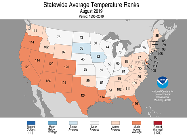
The southern states were extra hot, most being well above the 90th percentage range:

An “almost stealth” heatwave for the southern tier of states persists into September that has not made much news. I write this because southerners are used to levels of heat close to or just above 100F for maxes, most of whom have powerful enough air conditioning to stay comfortable. Still, residing in Atlanta, I know it has been difficult to stay outdoors for too long.
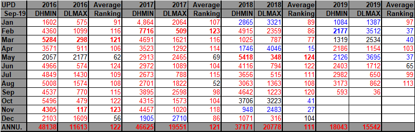
Here are my two U.S. Daily Record Scoreboards updated through 9/7/2019 (data compiled from the following NCEI site):
https://www.ncdc.noaa.gov/cdo-web/datatools/records
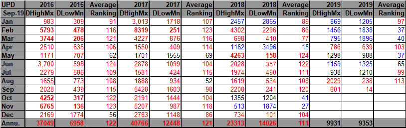

This time around I am starting out with the year 2016 so that numbers will appear larger on this post. I have included enough data so that trends can be spotted.
For these data sets all monthly ratios of > 10 to 1 DHMX to DLMN or > 10 to 1 DLMN to DHMX are in bold type. The rankings are for the lower 48 states with the warmest ranking since 1895 of average temperatures being 124 and 1 being the coldest as of 2019. Blue colors represent cold months and red warm. Those months and years with counts close to a 1 to 1 ratio of highs to lows are colored black. Boldly colored months, such as May 2018, have ratios of more than 10 to 1 daily record highs to lows or lows to highs, and are either historically hot or cold, most of which have made news.
August 2019 had a near 9-1 ratio of record DHMX to DLMN individual record counts, so the color I used for this month was red on the top chart…not quite high enough to get bold type.
August 2019 had a near 4-1 ratio of record DHMN to DLMX individual record counts, so the color I used for this month was red on the bottom chart.
The bottom line here is that there were many more warm or hot records than cool set or tied during August 2019, a statistic matching up well with the figure of a ranking of 113 for the month. Due to climate change we will see less blue colors on these Record Scoreboards with time.
As stated, the ranking for the month was 113, which was colored red. I color rankings +10 or -10 from the average ranking of 62 black indicating that these are near average temperature wise.
September 2019 has gotten off to being another well above average month looking at record counts. Meteorological models forecast above average warmth to continue for most of the CONUS well into the month.
So far, the U.S. has seen a near average 2019 looking at temperature averages and record counts, but we may be experiencing one of the last “tolerable” years, temperature wise, in the face of global warming. Also, after September’s averages are calculated those for the year as a whole may end up being above average. We will see if this chart changes much for 2019 through the end of this year (As of this writing 2019 goes into the red column…but barely.):
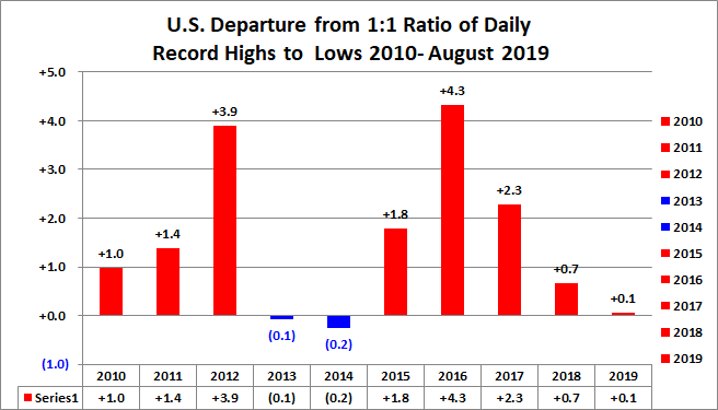
For forecasters I have an interesting take. Through July 2019 the 2019 bar on the above chart was “blue” since through 8/1/2019 there were more DHMX to DLMN records being recorded, much like in 2013 and 2014. Remember that long ago I stated that I was very interested in “bumps and oscillations” on charts and graphs because they can tell us something. After 2014 we had a big “spike” of warmth in 2016 followed by what I would have expected, a slow decrease in record ratio warmth. We may have started to experience another surge in warmth, being quite due after July 2019, particularly just following another El Nino event, albeit a weak one. Those of 1998 and 2016 were the most powerful ever recorded.
Given that the “average” ratio for the 2010s is about 2.1 to 1 of DHMX to DLMN for an individual year, we might be able to forecast what will happen for the rest of 2019. The year started out cool but could end up warm, getting closer to the “equilibrium” 2.1-1 ratio. Conversely, a year that starts out quite warm through 8/1 may end up cooler. Perhaps this has seasonal forecasting possibilities.
This happened in 2017 and 2018 but not so much in 2016 when a near record El Nino was the biggest climatological factor overriding any other trends:

Here are my top three climate stories for August 2019.
- Amazonian and other tropical rainforest fires
- The Greenland heat wave ended, but Arctic sea ice remained at near record low extent and volume.
- Hurricane Dorian formed in the Atlantic setting its eye on Bermuda.
Here is more climate and weather news from Saturday:
(As usual, this will be a fluid post in which more information gets added during the day as it crosses my radar, crediting all who have put it on-line. Items will be archived on this site for posterity. In most instances click on the pictures of each tweet to see each article.)
More Dorian notes:
Other stuff:
Some major “ETs” reported from Saturday:
(If you like these posts and my work please contribute via the PayPal widget, which has recently been added to this site. Thanks in advance for any support.)
Guy Walton- “The Climate Guy”