Saturday March 10th… Dear Diary. The main purpose of this ongoing post will be to track United States extreme or record temperatures related to climate change. Any reports I see of ETs will be listed below the main topic of the day. I’ll refer to extreme temperatures as ETs (not extraterrestrials)😊. Here is today’s main climate change related topic: (If you like these posts and my work please contribute via the PayPal widget, which has recently been added to this site. Thanks in advance for any support.)
All-Time Records and the Extreme Temperature Index
Yesterday in the categories section under “NCEI Record Count Archive” I posted my all-time record counts for the United States:
https://guyonclimate.com/2018/03/10/ncei-united-states-all-time-record-count-archive/
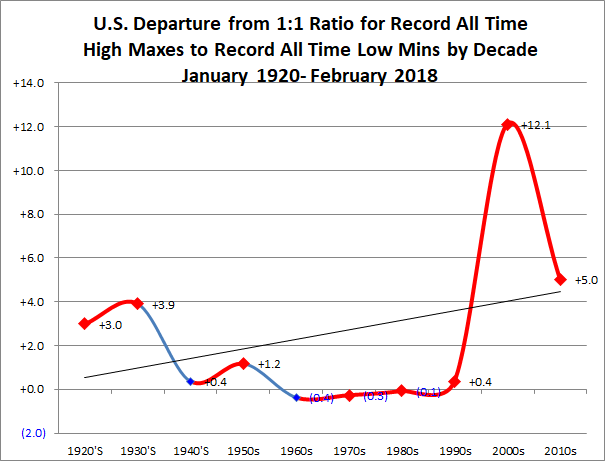
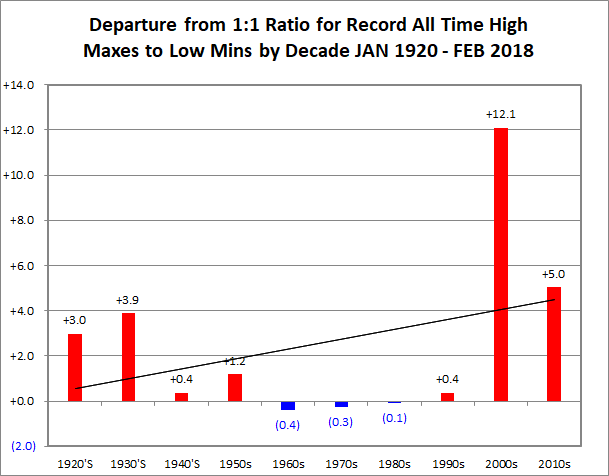
Now all can peruse and copy the data for research purposes if so desired. Before I discuss some statistical science it has been brought to my attention that my decadal charts could use some work for the sake of public consumption. I agree. Meteorologists and climatologists are often asked to cross fields and become graphic designers and artists when presenting their work, so here are my novice efforts for all-time records charts using Excel programs. Which chart looks better for the public to understand, the one with curves or bar graphs? Drop me a line for your vote:


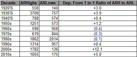
Both charts are derived from the same record count data from the National Center for Environmental Information. As a reminder one count could be a tied record or one set by several degrees. Also, this is the “kitchen sink” of NCEI data with all counts reported. These counts have different periods of record meaning one tally could be from a station that has been valid and recording data for as little as 30 years while another has more than 100 years of record keeping. Here is that kitchen sink for all-time record report talleys since 1920:

Let’s do some simple arithmetic with this data for kicks and grins. We know that the decades of the 1990s, 2000s and now the 2010s have been relatively toasty due to just the start, unfortunately, of carbon pollution warming up the globe. What’s the ratio of the last three decades compared with that of the 1920s-1980s?
To get that answer we add the counts of 1990-2018 coming up with 2837 DHMX and 311 DLMN and from 1920-1989…9383 DHMX and 5860 DLMN.
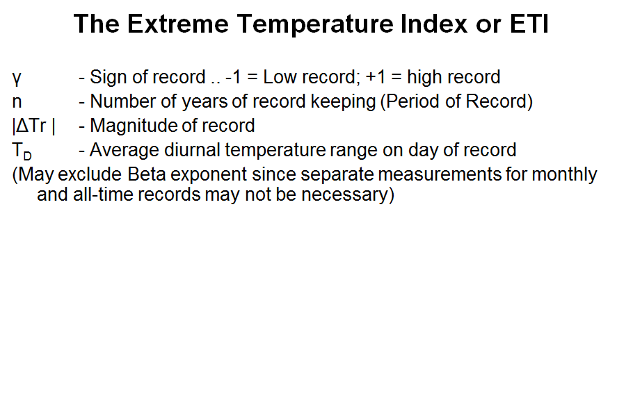
Wow! The ratio for the past three decades is 9.12 to 1 while that of the prior seven before 1990 is only 1.6 to 1, probably some of the best proof of the global warming trend I can come up with using counts of the most extreme records…all-timers. But hold your horses Climate Guy. Remember that I pointed out that problem with period of record or POR? People will question the validity of these results until the POR problem can be addressed. That’s where something like a mathematical index might help. We need something that can weigh or scale set records from different years in the past. Perhaps this algorithm is the answer.
Groan. I keep presenting the Extreme Temperature Index, but there are have been no takers for research. Anyway, here is the latest ETI algorithm:


For some ETI calculations and comparisons see: https://guyonclimate.com/2017/03/24/extreme-temperature-index-some-calculations-and-comparisons/
In any case up to this point, dear diary, I’ll state that I am just presenting trends until a clever person or group can come along addressing the many variables in association with the technique of using surface record temperature ratios as a proxy to measure climate change. Why is this important? Because by looking at trends for all-time records we can better forecast what deadly heat waves will entail in a hot future due to climate change, perhaps even saving lives. I hope that all reading will follow along and help solve this mathematical and climatological puzzle.
The Climate Guy