The main purpose of this ongoing blog will be to track planetary extreme, or record temperatures related to climate change. Any reports I see of ETs will be listed below the main topic of the day. I’ll refer to extreme or record temperatures as ETs (not extraterrestrials).😉
Main Topic: Zack Labe’s New Climate Visualization Site
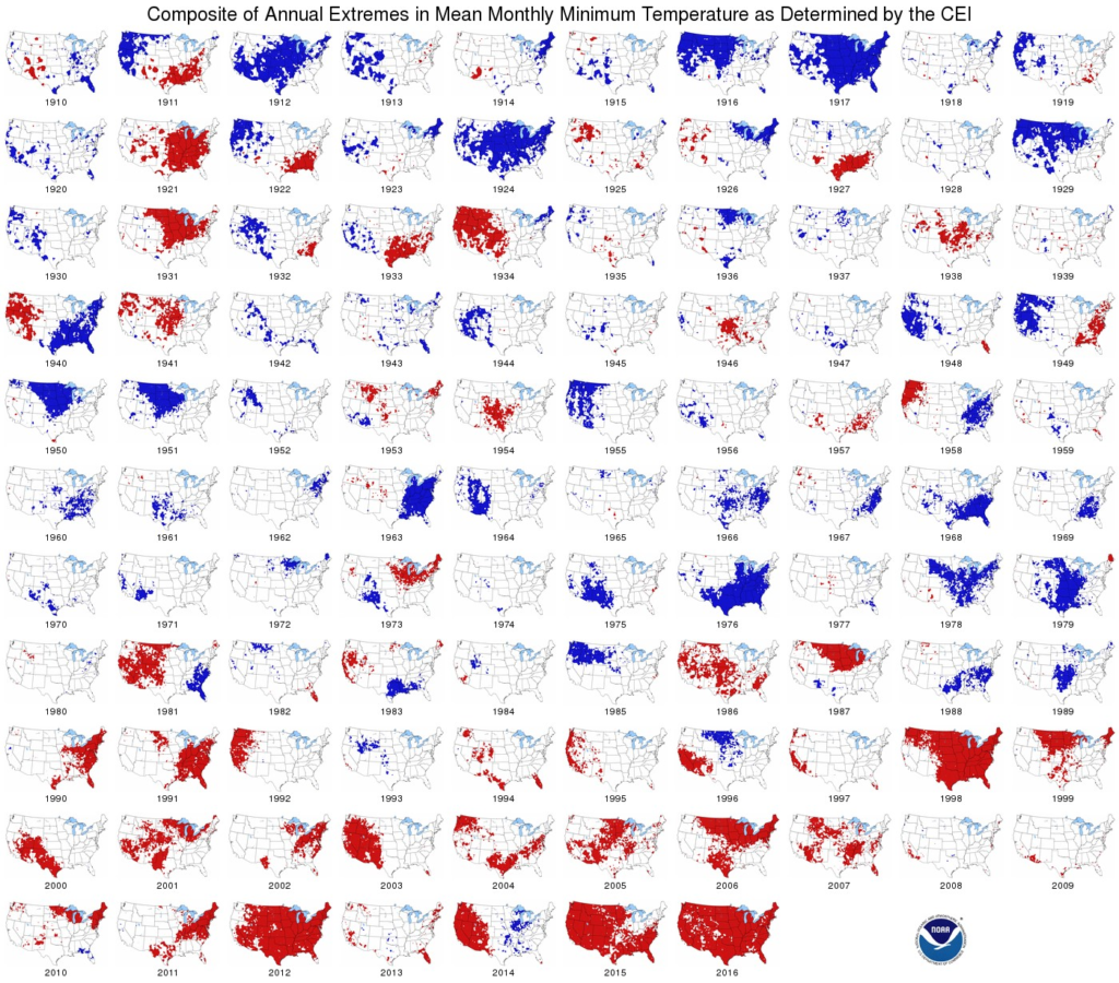
Dear Diary. Way back in 2017 when I started this site, I penned an early post indicating that a picture was a thousand words when it came to our climate (only my 4th post on guyonclimate.com):
Post 4. A Picture Is Worth a Thousand Words – Guy On Climate
Here is one of the pictograms I used in that post:

Since 2017 many other climate scientists have used the method of employing stark images and concise, easily readable graphs go get the message towards the public that our climate, and we as a species in turn, are in a lot of trouble. That message as of 2023 is winning out, with climate denialists being relegated to the fringe of debate, having less and less credibility as the planet continues to warm.
Since 2016/2017 Ed Hawkings came up with warming stripes images, which can be seen all over social media and on everything from umbrellas to coffee cups:

From: Warming stripes – Wikipedia
An early warming stripes graphic published by their originator, climatologist Ed Hawkins.[1] The progression from blue (cooler) to red (warmer) stripes portrays the long-term increase of average global temperature from 1850 (left side of graphic) to 2018 (right side of graphic).[2]
Over the last few years another climate scientist, Zack Labe, has taken up the mantle of putting a lot of stark climate visuals on social media and on his new site linked here:
Climate change indicators – Zachary Labe (zacklabe.com)
Here are the first four visualizations from his site. Please check the rest out at your leisure. All graphics are frequently updated by Zack. Over the last few months and occasionally most every day on his blog I will be adding Zack’s updated graphics in my news section. Thanks Zack for all of your hard work!
CLIMATE CHANGE INDICATORS

Global average surface temperature anomalies for centered running 60-month periods. Monthly anomalies are calculated relative to pre-industrial levels (1850-1900 – outlined in the IPCC Special Report on Global Warming of 1.5°C). Data is from Berkeley Earth Surface Temperatures (BEST; http://berkeleyearth.org/data/). Graphic updated using data through March 2023.

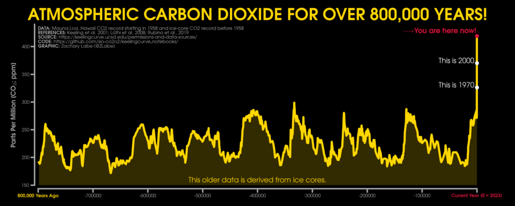
Carbon dioxide levels over the last 800,000 years, which are merged from ice cores (https://www.nature.com/articles/nature06949 & https://data.csiro.au/collection/csiro:37077) and recent Mauna Loa observations (starting in 1958). Updated 4/25/2023.

Decadal trends in annual mean surface air temperatures over land areas from 1900 to 2022, 1940 to 2022, 1980 to 2022, and 2000 to 2022. Data are from NASA GISS Surface Temperature Analysis (GISTEMPv4; https://data.giss.nasa.gov/gistemp/).

Here are some other “ET’s” recorded from around the planet the last couple of days, their consequences, and some extreme temperature outlooks, as well as any extreme precipitation reports:
Here is more climate and weather news from Wednesday:
(As usual, this will be a fluid post in which more information gets added during the day as it crosses my radar, crediting all who have put it on-line. Items will be archived on this site for posterity. In most instances click on the pictures of each tweet to see each article. The most noteworthy items will be listed first.)
If you like these posts and my work please contribute via the PayPal widget, which has recently been added to this site. Thanks in advance for any support.)
Guy Walton… “The Climate Guy”