The main purpose of this ongoing blog will be to track planetary extreme, or record temperatures related to climate change. Any reports I see of ETs will be listed below the main topic of the day. I’ll refer to extreme or record temperatures as ETs (not extraterrestrials).😜
Main Topic: How Many People Does Heat Actually Kill?
Dear Diary. I ran across another brilliant article by Andrew Dessler yesterday that I am sharing for our main topic of the day. Heat fatalities and how they are tallied are discussed in it. As far as deadly weather goes, excessive heat kills more than tornadoes or hurricanes, which are localized events. Heatwaves can be broad, affecting half a continent and lasting weeks. Mostly older and vulnerable people with little access to air conditioning are most at risk and account for the majority fatalities.
Still, how are heat statistics tabulated? Here Andrew Dressler gives us answers. Unfortunately, there is not one standard for heat death statistics:
How many people does heat actually kill?
How many people does heat actually kill?
It depends on how you count it
Apr 13, 2026
You have likely seen a headline like this: 62,000 people died from record-breaking heat in Europe:
link
It’s a striking number. It’s also not clear what it means. Is this the number of people killed by extreme heat? Or climate change’s contributions to the extreme heat? Or the number of deaths above what we would expect in a normal summer? Or something else.
This matters a lot. If we want to accurately communicate the impact of climate change on human mortality, we need to be precise about what we’re actually counting.
A graduate student and I just published a paper on this in GeoHealth (link), using heat-related mortality in Texas to demonstrate the issue. Here’s what we found.
the basic picture: a u-shaped curve
The relationship between daily average temperature and daily mortality is a U-shaped curve. The temperature at which the minimum number of deaths occur, often called the optimal temperature (abbreviated OT)1, is around 20°C (70°F) in most places. Mortality goes up as the temperature departs from the OT towards either hotter or colder temperatures.
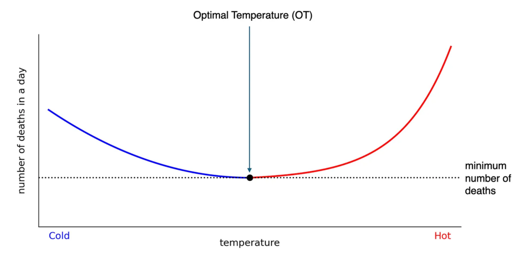
This temperature-related mortality curve is calculated statistically by looking at how total (non-accidental) deaths vary with temperature. This produces curves like the one above.
By convention, the number of deaths occurring at the OT provides an estimate of the baseline (non-heat-related) deaths. At any other temperature, deaths above this baseline are assumed to be heat related.
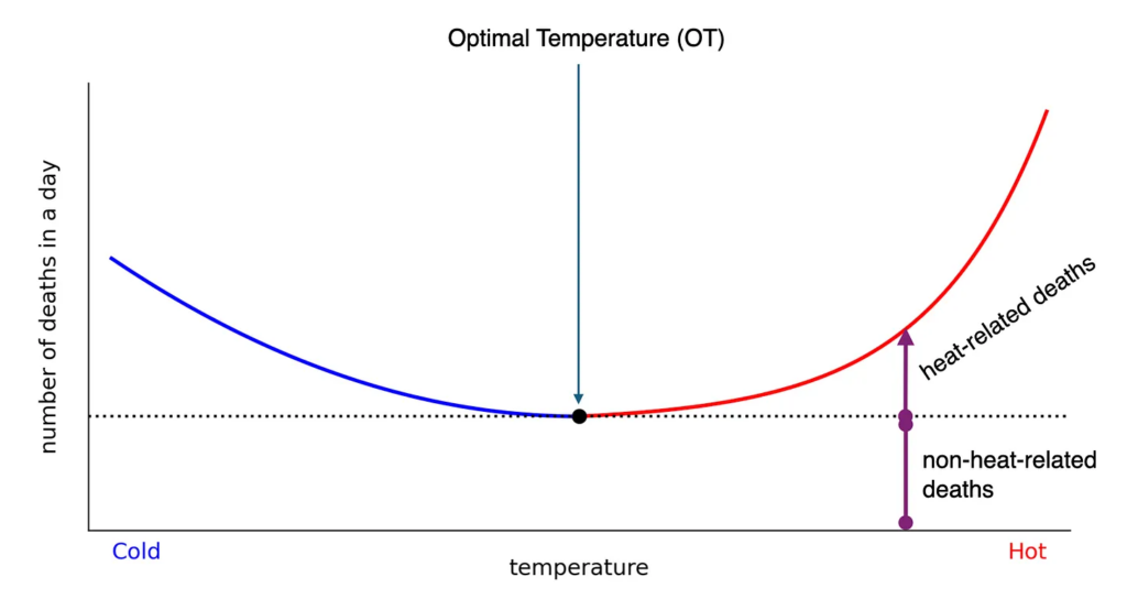
For example, if there are 50 deaths on a day at the OT and 75 deaths at 10°C above the OT, we attribute the difference — 25 deaths — to heat.
Now that’s out of the way, let’s go over the different ways of quantifying heat-related mortality.
method 1: the optimal temperature method (OTM)
The most common approach in the scientific literature counts all deaths above the OT. In other words, for all days where the daily average temperature was above the OT, we calculate the heat-related deaths on those days and sum them. This gives us an estimate of the total number of heat-related deaths. The red shaded region in the plot below shows this graphically.
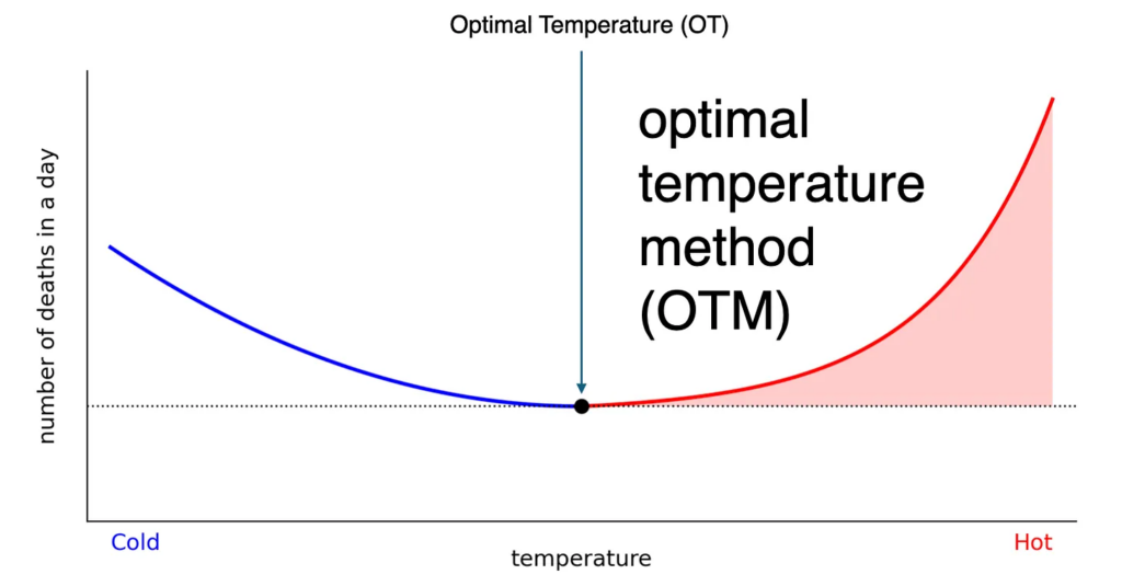
We will refer to this as the optimal temperature method (OTM).
That European headline of 62,000 deaths? That’s this method. The problem is that a lot of these heat-related deaths are occurring at temperatures like 75°F, 80°F, 85°F — temperatures that nobody would consider extreme. While the number of deaths on these days is small, those temperatures occur often, so they dominate the total number of heat-related deaths.
So most of what this method counts isn’t really about heatwaves or record-breaking temperatures. It’s just… summer. It also means that the CNN headline was wrong: most of those 62,000 deaths were not due to extreme temperatures and many of them would have occurred even if the summer had been mild.
For Texas, we estimate roughly 1,130 deaths per year (over 2010-2023) using this method — about 2.2% of all summer deaths.
method 2: the extreme heat method (XHM)
A more intuitive approach is to sum heat-related mortality occurring on days that are extremely hot — say, days above the 95th percentile daily average temperature threshold (the red shaded area in the plot below). This is a more direct metric for what the warmest temperatures are doing.
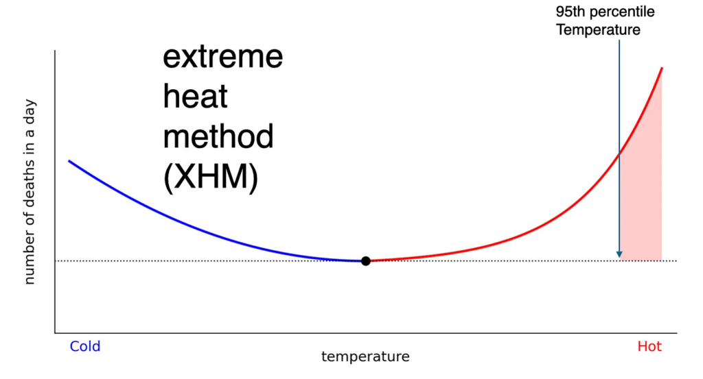
We will refer to this as the extreme heat method (XHM). Using this method for Texas, we estimate that extreme heat caused an average of 248 summertime deaths per year or about 0.5% of summertime deaths. This is much lower than the OTM because we’re not counting the large number of deaths that occur at moderately hot temperatures.
When we compare these numbers to the official death certificate numbers provided by the Texas Department of State Health Services — which counts cases where a medical examiner determined heat was the cause or a contributor to death — the agreement is good, at least in normal years. In extremely hot years like 2011 or 2023, the official death numbers appear to significantly undercount the true number.
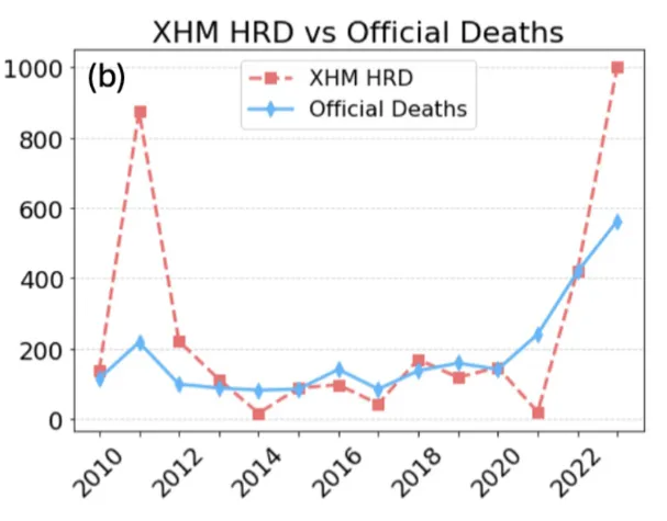
comparison between heat-related deaths from the Extreme Heat Method (XHM) and the official number from the State of Texas (Official Deaths)
The overall agreement between the extreme heat method and the official count makes sense. A medical professional will only attribute a death to heat when the connection is unambiguous and extreme (e.g., a patient comes into the emergency room with core body temperature of 106°F). Such deaths will mainly occur on very hot days.
On the other hand, if someone has a heart attack when it’s 85°F outside, no medical examiner is going to attribute that to heat. The only way to see the impact of heat on such deaths is with a statistical analysis, so you don’t expect these to show up in the official count.
method 3: the excess death method — what climate change actually did
Neither of the first two methods answers the question most people actually want the answer to: how many people did climate change kill?
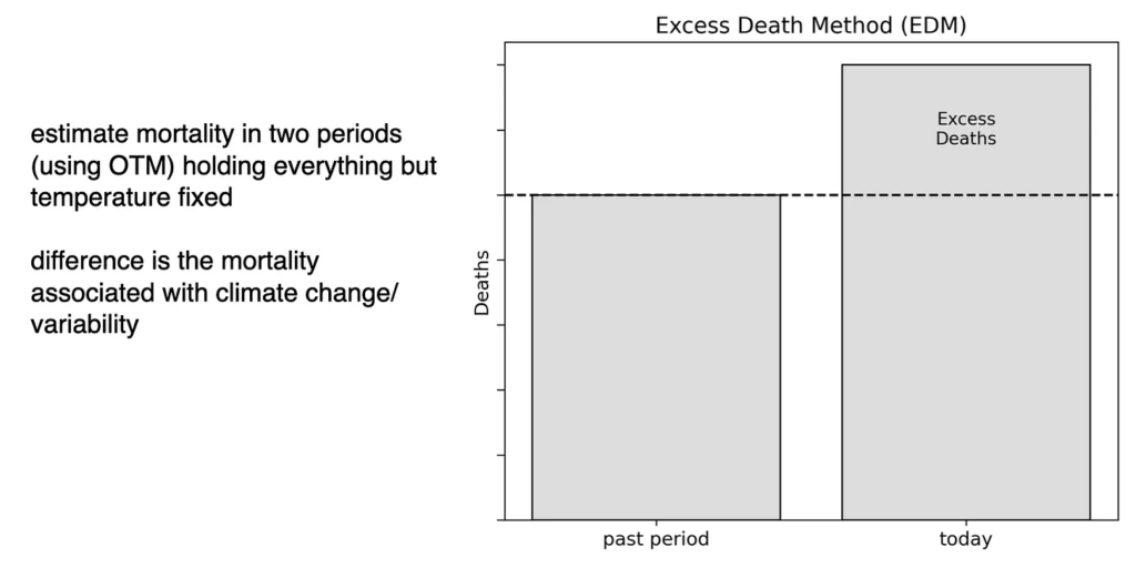
For that, we use what we refer to as the Excess Death Method (EDM). Our approach is to take today’s mortality risk curve (based on today’s population, today’s demographics, today’s level of adaptation to heat), but plug in the temperatures from a past period — in our analysis, we used 1950-1963.
This gives us an estimate of what today’s mortality would have been had we had temperatures of the mid-20th century. Then we subtract that from the same calculation using the present-day (2010-2023) temperatures. The difference is a measure of the deaths attributable to global warming.
For Texas, this comes out to roughly 900 additional deaths per year due to climate change that occurred since the 1950s, equal to 1.7% of summertime deaths. Using a typical value of a statistical life of $10 million, this corresponds to a value of $9 billion per year due to climate change, or about $300 per Texas resident.
why this matters
The optimal temperature method counts all deaths above the optimal temperature. It’s the most common method in the literature and produces the largest numbers. It’s not wrong, but you should remember that most of these deaths are occurring at mild temperatures that happen every year, so it’s not measuring the impact of “extreme heat” in any intuitive sense2.
The extreme heat method counts only deaths on genuinely hot days. It produces smaller numbers that align well with official death counts from the medical examiners. It’s the better proxy if you want to understand the impact of acute heatwaves.
The excess death method compares mortality in two periods with different climates, holding everything else constant. It’s the best answer to the question “how many people did global warming kill?” For Texas, it’s about 900 people per year or about 1.7% of summertime deaths.
The official numbers from death certificates are almost always lower than all three modeled estimates because it is genuinely hard to establish heat as a cause of death except in the clearest cases. They should be treated in most cases as a lower bound.
The different ways of counting mortality from heat are fundamentally answering different things. Using them interchangeably, or reporting one without specifying which method, creates confusion about the impacts of climate change on mortality.
Because of this, the field would benefit enormously from agreeing on standard metrics. Right now, if you read ten papers on heat mortality, you may be seeing estimates from ten different methods. Getting them standardized and clearly defined matters for accurately reporting the impacts of heat to the public and policymakers.
Our paper: “Quantifying Heat-Related Mortality in Texas: A Comparison of Methods,” published in GeoHealth. Read it here.
You can also watch a talk I gave at NCAR over this material.
If you’re a reporter who wants to do a story on this, email me.
related posts
I’ve written a bunch of other posts about mortality related to extreme heat & cold:
- How extreme heat kills you
- Unraveling the debate: Does heat or cold cause more deaths? Part 1
- Unraveling the debate: Does heat or cold cause more deaths? Part 2
- Adaptation to climate change will be an absolute nightmare
Here are some “ETs” recorded from around the U.S. the last couple of days, their consequences, and some extreme temperature outlooks, as well as any extreme precipitation reports:
Here is More Climate News from Tuesday:
(As usual, this will be a fluid post in which more information gets added during the day as it crosses my radar, crediting all who have put it on-line. Items will be archived on this site for posterity. In most instances click on the pictures of each tweet to see each article. The most noteworthy items will be listed first.)