The main purpose of this ongoing blog will be to track planetary extreme, or record temperatures related to climate change. Any reports I see of ETs will be listed below the main topic of the day. I’ll refer to record temperatures as ETs (not extraterrestrials)😉
Main Topic: Recent Anomalous Global Warmth Is Not Outside the Bounds of Projections
Dear Diary. Over the last few months climate scientists and environmentalists have been amazed at how hot our planet is getting, even before what appears to be a record warm El Niño kicks in. Some are having second thoughts that climate models are not handling this recent warmth very well. This is simply not true. The earth appears to have had a “hiccup” of warmth and might be coming down withing the bounds of projections:
Now at October's end, the monster anomaly of Sep/early Oct has largely dissipated. The past couple weeks are much more like what we expect: Global temps ~0.3C warmer than 2022, consistent w/ transition from major La Nina to major El Nino + ongoing global warming (~0.02C/yr). https://t.co/PMzpb6PwHF pic.twitter.com/WUpbiBrC0M
— Prof Michael E. Mann (@MichaelEMann) October 31, 2023
This is not to write that everything is fine. Far from it. We are still on a path towards global average temperatures above the recommended limit of +2.0 degrees above preindustrial conditions, which can only be averted by hard core limits on carbon and methane pollution. At least we have a little more time for that correction looking at science.
Here is much more from Zeke Hausfather:
Despite the extremes over the past few months, global temperatures remain broadly consistent with climate model projections.
— Zeke Hausfather (@hausfath) October 31, 2023
Over at The Climate Brink we take a deep dive on comparing climate models and the latest observations: https://t.co/t0DJbP1Wnv pic.twitter.com/e7xscvfpoz
Global temperatures remain consistent with climate model projections (theclimatebrink.com)
Global temperatures remain consistent with climate model projections
Here we update the comparison of climate models and observations through October 2023

OCT 31, 2023
With extreme global temperatures in recent months I see one question asked over and over again: does this mean that global warming is happening faster than we thought?
While there is growing evidence that the rate of warming has increased in recent decades compared to what we’ve experienced since the 1970s, this acceleration is largely included in our climate models, which show around 40% faster warming in the period between 2015 and 2030 compared to 1970-2014.1
In many ways, the more interesting question is how do temperatures in recent years (and months!) compare to what climate models have projected for this period.
The figure below shows the multimodel mean and the range (5th to 95th percentile) across model runs for the latest generation of climate models (CMIP6), along with the latest observations from Berkeley Earth. I’ve even included a preliminary estimate of October temperatures based on reanalysis data from JRA-55 for the month to-date.
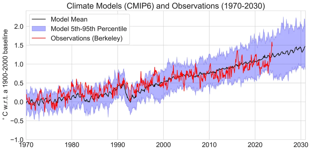
Monthly global surface temperature anomalies from CMIP6 climate models (using SSP2-4.5) and observations between 1970 and 2030 using a 1900-2000 baseline period. Model projections shown here include one run per unique model.
In the CMIP6 ensemble the past few months (September and October) are above the multimodel mean, but remain well within the envelope of model projections.
However, the full CMIP6 ensemble might not represent the most accurate assessment of future temperatures; as we argued in Nature last year, CMIP6 contains a subset of models that are running quite hot (>5C climate sensitivity per doubling CO2) that generally do a poor job of representing historical global surface temperatures.
For this reason, the most recent IPCC report created Assessed Warming Projections that weight the CMIP6 ensemble by its performance in matching historical temperatures, and tend to show future warming more in-line with the prior generation of climate models (CMIP5).2
The figure below shows a comparison between CMIP5 models (which were developed in the lead-up to the 2014 IPCC 5th Assessment Report. Here we see that observations are on the high end of the model range in recent months, with September slightly above the 95th percentile of the model envelope.
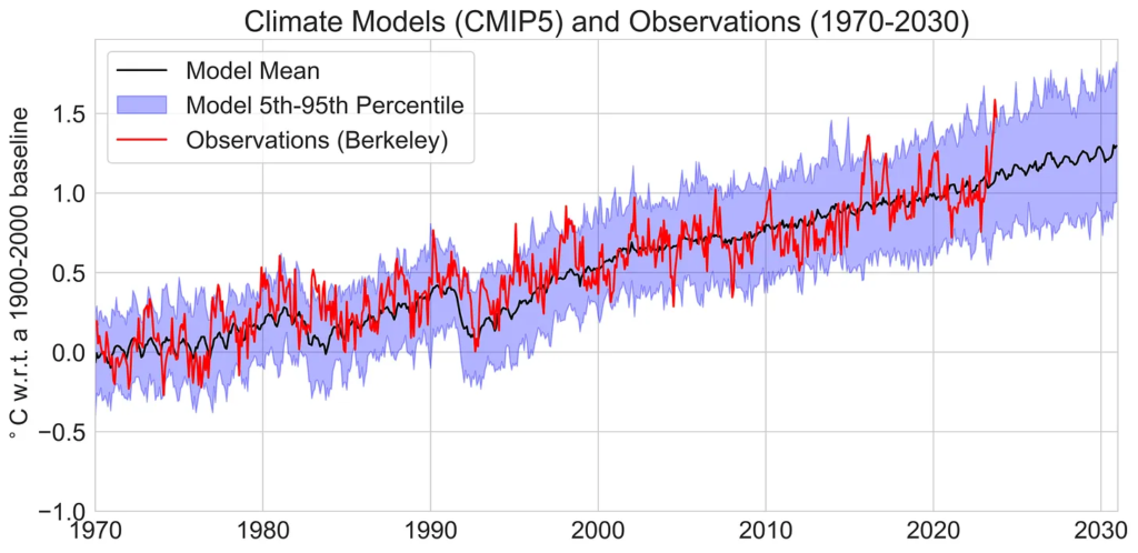
Monthly global surface temperature anomalies from CMIP5 climate models (using RCP4.5) and observations between 1970 and 2030 using a 1900-2000 baseline period.
However, we should not read too much into an individual month exceeding the model envelope. This has happened before – notably in large El Nino events like 1998 and 2016. In fact, we would expect roughly one in 20 months to be above the 95th percentile if models are accurately representing real-world variability.
While climate models include El Nino and La Nina behavior, these are emergent properties of the climate system and may occur in climate models spun-up in the mid-1800s at very different times than they occur in the real world. Because only a fraction of the 40-odd CMIP5 or CMIP6 models have an El Nino event occurring in 2023, its not surprising that they might not fully capture El Nino-related climate variability in any given year.
That being said, its worth noting that we are still pretty early in the current El Nino cycle. In terms of current conditions, 2023 is more similar to 1997 or 2015 than the (at the time) record-warm 1998 or 2016. It remains to be seen if we will see more exceptional warmth in the latter part of this year and early next as the El Nino event peaks or if this El Nino is behaving differently – potentially contributing more warming early on due to the rapid transition out of unusually persistent La Nina conditions – than we’ve seen in past events.
Finally, its useful to take a longer view of how climate models and observations have historically stacked up. The figure below shows CMIP5 model temperatures between 1900 and 2030 compared to Berkeley Earth observations over the same period:

Monthly global surface temperature anomalies from CMIP5 climate models and observations between 1900 and 2030 using a 1900-2000 baseline period.
Its also worth noting that the comparisons presented above use a 1900-2000 baseline period to align models and observations; the apparent visual agreement or disagreement between models and observations is quite sensitive to the choice of baseline period. Thankfully, there is a way to avoid the baseline sensitivity issue by looking at trends rather than just anomalies over time.
Taking the trendy view
The rate of warming over time (the trend) is insensitive to the choice of baseline period. That makes it a particularly useful way to compare climate models and observations.
The figure below shows a histogram of the trends in all the individual CMIP6 models compared to observations over the prior 15 year period (January 2008 through September 2023). Four different observational records are analyzed – Berkeley, NASA’s GISTEMP, NOAA’s GlobalTemp, and Copernicus/ECMWF’s ERA5 reanalysis product.
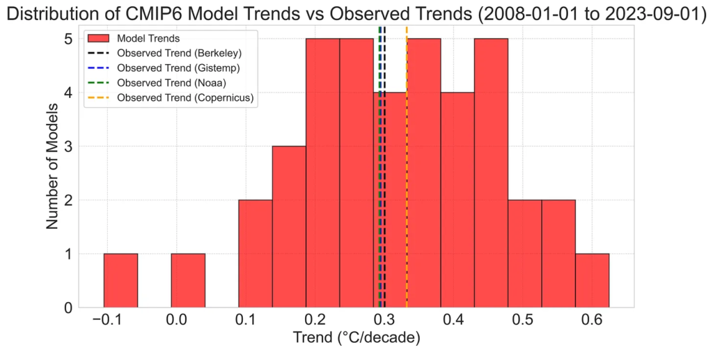
Histogram of global mean surface temperature trends in individual CMIP6 models compared to observations between Jan 2008 and Sept 2023.
In general, observations are pretty close (albeit slightly below) the CMIP6 multimodel mean trend over the past 15 year period. While Berkeley, NASA, and NOAA all show similar trends of just above 0.3C per decade, Copernicus shows a bit more warming (perhaps reflecting its measurement of surface temperatures over the oceans rather than sea surface temperatures). However, there is a wide range of model warming over this period, with some models showing nearly twice as much warming over this short period and some showing no warming at all.
We can also look further back in time; the figure below compares the trend since 1970 (e.g. 53 years) rather than just examining the past 15 years.
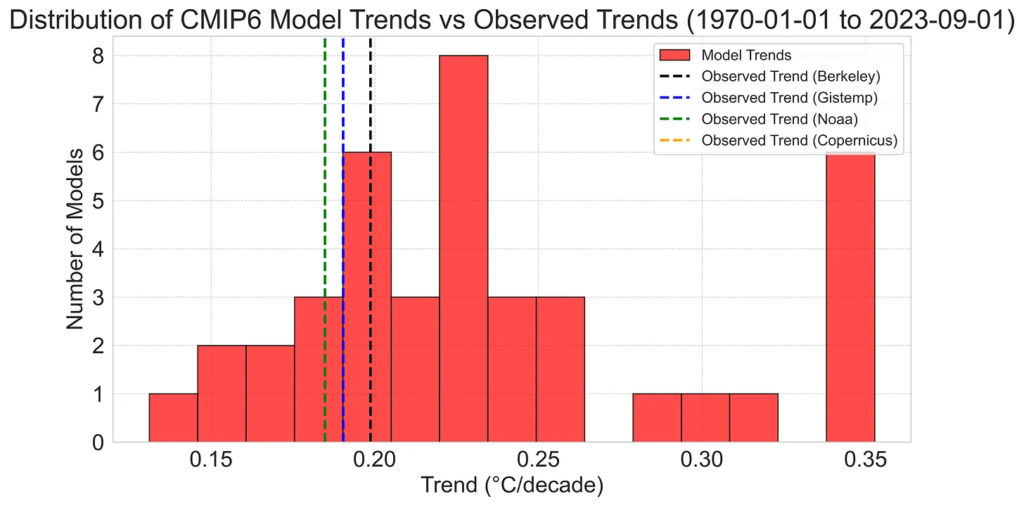
Histogram of global mean surface temperature trends in individual CMIP6 models compared to observations between Jan 1970 and Sept 2023.
Here we see a narrower range of model trends, and that observations are more notably on the low end of the CMIP6 ensemble for the full period. There is also a clear bifurcation between warming rates, with a subset of models showing warming rates of 0.3C to 0.35C per decade with the rest clustered around 0.15 to 0.25C per decade.
If we look at CMIP5 models instead, we see that observed trends over the past 15 years are in the upper half of model projections, but still well within the range. Here the range of trends over the past 15 years is notably narrower than we saw for the same period in CMIP6, representing the more realistic range of climate sensitivity (and transient climate response) across the CMIP5 ensemble.

Histogram of global mean surface temperature trends in individual CMIP5 models compared to observations between Jan 2008 and Sept 2023.
If we look at CMIP5 trends since 1970, we see that observations are well within the range, though slightly below the mean CMIP5 model.

Histogram of global mean surface temperature trends in individual CMIP5 models compared to observations between Jan 1970 and Sept 2023.
Sampling the whole cherry tree
While its useful to look at trends over the past 15 years (or 53 years), it is also a bit of an arbitrary period of time to select, out of all period where we could have looked at trends. The past 15 years in particular may be a bit unrepresentative, as it starts with a moderately strong La Nina event and ends in the current El Nino event.
However, there is a way to examine trends over time that does not depend on the choice of start date: simply look the trends for all possible start dates. The figure below shows the trend between today (September 2023) and each possible start date from January 1970 to October 2013 (e.g. 10 years ago).3
This figure is a tad complicated, so lets take some time to explain it. A point on the x-axis (say, 1980) shows the model mean trend and 5th-95th percentile of trends across all the CMIP6 models. Trends for each start date are also shown for the four different observational temperature records we are looking at in this analysis.
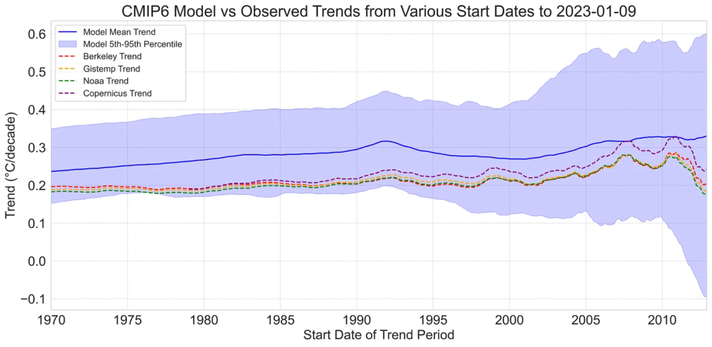
Trends in global mean surface temperature trends across all individual CMIP6 models between present (September 2023) and possible start date between January 1970 and October 2013.
Here we see that observations are below the CMIP6 multimodel mean for virtually all possible trend periods. This is not a particularly surprising result, given that a subset of CMIP6 models is known to be running hot and the Assessed Warming Projections in the recent AR6 are notably lower than the multimodel mean (e.g. have a trend of 0.26C per decade from 2015-2030, vs 0.31C per decade for the CMIP6 multimodel mean).
That being said, CMIP6 contains a wide range of model projections, and observed trends remain well within this range for all trend periods examined.
If we turn to CMIP5 models, we find greater agreement between observed trends and model projections. Observed trends since 1970 are still slightly below the multimodel mean, but well within the envelope of model projections. In recent years (post-1998) there are periods where the observed trends are above the multimodel mean.

Trends in global mean surface temperature trends across all individual CMIP5 models between present (September 2023) and possible start date between January 1970 and October 2013.
Overall, an examination of models and observations through present provides a number of useful takeaways:
- Despite the extreme global temperatures experienced in the summer of 2023, observations remain broadly consistent with climate model projections this year, though this potentially change as the current El Nino continues to develop.
- The a subset of the latest generation of models (CMIP6) continues to run well above observations despite recent warmth. Researchers should avoid using an unweighted CMIP6 ensemble for global temperature analyses when possible as discussed here.
- The prior generation of models (CMIP5) continues to perform quite well, and is consistent with the new Assessed Warming Projections used in the recent IPCC AR6.
1 2015 is used as a dividing point here as its when the latest generation of models switches between historical runs and future projections. Its also the date when the assessed warming projections in the recent IPCC report become available.
2 The IPCC AR6 Assessed Warming Projections begin in 2015 and only provide annual values, so they are less useful to use to compare to observations. There are ways of selecting a subset of CMIP6 models consistent with assessed warming (as we suggest in our paper), but I’m focusing on comparisons with CMIP5 for simplicity here.
3 Trends shorter than 10 years are not shown as the uncertainties balloon over short periods due to year-to-year variability. Also, while exploring all possible start dates is a useful sensitivity test, there can still be some unintentional cherry-picking when ending the timeseries during an El Nino event. The longer the trend period examined, the less sensitive the results will be to choice of end point (or start point).
More:
The pattern of sea surface temperatures in this El Niño year is anomalous. Essential observation by the deeply insightful European climate scientist Stefan @Rahmstorf. https://t.co/3bSxiA64Jl pic.twitter.com/hF53Nog7QX
— Deirdre Des Jardins💧🔥💨 (@flowinguphill) November 1, 2023
Analysis: ‘Greater than 99% chance’ 2023 will be hottest year on record | @hausfath
— Carbon Brief (@CarbonBrief) November 1, 2023
Read here: https://t.co/UngBIKT2UI pic.twitter.com/oJWYNFhefe
The September global temperature anomaly from HadCRUT5 was released yesterday. Updated time series of annual values plus details of the monthly values in 2023 compared with previous monthly records. Get more graphics here: https://t.co/qiezVcLVMO pic.twitter.com/5lLgofDjWZ
— Tim Osborn (@TimOsbornClim) November 1, 2023
Here are some “ET’s” recorded from around the planet the last couple of days, their consequences, and some extreme temperature outlooks, as well as any extreme precipitation reports:
CRAZY HEAT IN RUSSIA over 30 DEGREES
— Extreme Temperatures Around The World (@extremetemps) November 1, 2023
RECORDS
30.1 Goryachy Klyuch
28.4 Akthy 1000m asl !
28.2 Majkop
27.4 Armavir
etc
It's November, it's Russia and you can go to the swimming pool at >1000m asl.
And if you think it's over you are so wrong,in the weekend can get even worse. pic.twitter.com/LhAPAcpiIw
Exceptional heat also in INDONESIA with extreme temperatures in all islands from Borneo to Java (37.6 Curug is a monthly record) to the small islands like Flores with 37C. https://t.co/hFu8oDKhOt
— Extreme Temperatures Around The World (@extremetemps) November 1, 2023
HOTTEST NOVEMBER DAY IN MALTA HISTORY
— Extreme Temperatures Around The World (@extremetemps) November 1, 2023
29.1 Luqa
Historic heat in TURKEY:
Temperatures beat the records in several stations including Alanya which rose to 31C for the first time in November. 30c also in the Black Sea coast, it's mid summer.
Minimum temperatures up to 24C. pic.twitter.com/TP349jxmCm
HOTTEST NOVEMBER DAY IN CYPRUS HISTORY
— Extreme Temperatures Around The World (@extremetemps) November 1, 2023
Unprecedented heat wave in Middle East/Caucasus/Mediterranean
34.3 Kouris New National record for Cyprus
GEORGIA
Crazy hot night with Tmin 21.8C at Kutaisi, it's like mid summer
IRAN
35.2 Abu Musa Island
Many more to come…Stay tuned.. pic.twitter.com/4Vi1LGwWv3
HOTTEST NOVEMBER DAY IN BANGLADESH
— Extreme Temperatures Around The World (@extremetemps) November 1, 2023
35.8 Sitakundu,records fell allover the country#Iran is also destroying records with >35C at 500m asl
Thousands of records are being swept away in just few hours allover Eurasia: World has never seen anything like this in its climatic history pic.twitter.com/qbmE7Kwm81
Chinese climatic history is being rewritten with
— Extreme Temperatures Around The World (@extremetemps) November 1, 2023
the most record breaking heat wave ever recorded:👎
705 monthly records broken today,9 provincial records and hundreds more in Mongolia,Japan,Koreas,Russia
The most extreme heat wave in world climatic history is just starting
tbc https://t.co/weAbbYgYbT
#Japan also broke November records today but many more will fall next days, possibly hundreds.
— Extreme Temperatures Around The World (@extremetemps) November 1, 2023
See list by JMA.
In North Korea besides 26.6 at Wonsan, records fell in many stations including 24.0 Pyongyang, 25.4 Changjon,24.4 Sariwon, 24.3 Nampo,24.0 Ryongyon (tie) pic.twitter.com/RexcPPdyaD
HOTTEST NOVEMBER DAY IN MONGOLIAN HISTORY
— Extreme Temperatures Around The World (@extremetemps) November 1, 2023
Incredible warmth >1000m asl in November in Mongolian highlands,national record was pulverized:
21.8 Khovsgol and Zamyn Uud,21.2 at Khanbogd
More to come:An avalanche of thousands records will sweep dozens countries in 5 continents pic.twitter.com/yrA9eStyHj
HOTTEST NOVEMBER DAY IN BOTH KOREAS
— Extreme Temperatures Around The World (@extremetemps) November 1, 2023
Exceptional 26.6C at Wonsan NORTH KOREA destroys the national record set at Hamheung in 2003.
In just few hours several thousands records fell by huge margins and thousands more will fall in the next hours. https://t.co/FobKAXTQDB
Exceptional heat wave in the Caribbeans as well.
— Extreme Temperatures Around The World (@extremetemps) October 31, 2023
Today Roseau Canefield AP of Dominica rose to 35.6C, the hottest October day ever recorded in Dominica.
November national record is 34.2C: Will Dominica beat both national heat records in 2 days?
Stay here and you'll know tomorrow pic.twitter.com/tScXB5m8sD
Record heat is going on in Africa with temperatures up to 42C in Chad.
— Extreme Temperatures Around The World (@extremetemps) October 31, 2023
October record was broken at Boromo in Burkina Faso with 40.1C.
Crazy heat in Algeria and Libya up to 39C.
Next days records will fall in a large quantity. https://t.co/VzuHVC1DS6
Here is some more new October 2023 climatology:
October in #Australia was again warm and *very* dry. Mean temp was 1.05c above the 1961-90 avg (15th warmest). WA at 5th hottest mean Oct
— Cameron H 🇦🇺 (@Hitchy04) November 1, 2023
Rain was 65.4% below avg. 5th driest Oct on record, and driest since 2002. Driest for WA. Exception was east Vic with flooding in early Oct pic.twitter.com/K9Yj8ij8Qi
October 2023 in #Japan had a temperature anomaly of +0.43C. It was warmer and wetter than normal in Hokkaido and very dry and somewhat cooler in the South.
— Extreme Temperatures Around The World (@extremetemps) November 1, 2023
See temperatures, rainfalls and sunshine anomalies maps by JMA. pic.twitter.com/wwOAhpmgFs
October 2023 in the South Pole Station had an average temperature of -52.8C which is 1.9C below the 1991-2020 baseline. It is the first month below the reference since May.
— Extreme Temperatures Around The World (@extremetemps) November 1, 2023
Most of Antarctic Plateau was well below average in October. https://t.co/85Efk4mEgP
Observed temperature and precipitation departures for the month on October. Overall, warm and dry. pic.twitter.com/czMUkoTUTR
— Brian Brettschneider (@Climatologist49) November 1, 2023
Here is More Climate and Weather News from Wednesday:
(As usual, this will be a fluid post in which more information gets added during the day as it crosses my radar, crediting all who have put it on-line. Items will be archived on this site for posterity. In most instances click on the pictures of each tweet to see each article. The most noteworthy items will be listed first.)
@Guardian publishes the final writing of @SaleemulHuq and it’s a warning to rich countries to step up for #Cop28 urgently, as climate crisis accelerates around us. Powerful writing as ever. Co-authored with @Prof_FSultana https://t.co/nWMuBsX4lc
— Fiona Harvey (@fionaharvey) November 1, 2023
When Hurricane Otis slammed into Acapulco, it unleashed a wind gust of 205 mph –ranking among most extreme ever observed globally. Death toll is now up to at least 46, with 58 people missing. Economic damages may top $10 billion.
— Capital Weather Gang (@capitalweather) November 1, 2023
More info: https://t.co/79tiCV4jpS pic.twitter.com/sxDcbjnbrr
For now, global sea ice extent is no longer a record low for the date thanks to a quick freeze-up in the #Arctic and slightly slower decline in the #Antarctic to start their melt season.
— Zack Labe (@ZLabe) November 1, 2023
More sea ice graphics available at https://t.co/ecHYax1KfT pic.twitter.com/jN8KsMVURL
The planet was 1.55°C above the 1850-1900 IPCC baseline for the period Jan. 1 – Oct. 31.
— Prof. Eliot Jacobson (@EliotJacobson) November 1, 2023
We're going to need either a huge sulfur emitting volcanic eruption, or near total collapse of global industrial civilization, to make it to 2030 without crossing the Paris limit. pic.twitter.com/58241SIaOM
This is a climate bomb of utter devastation
— GO GREEN (@ECOWARRIORSS) November 1, 2023
In a warming world and ocean heat off the scale, intensification of hurricanes can happen in a matter of hours
This is not the new normal but beginning of something much worse https://t.co/BooiS0pZEE
Claimants take UK government to court over inadequate climate adaptation https://t.co/eJJnclASkV
— Guardian Environment (@guardianeco) November 1, 2023
King tide floods offer glimpse of Miami’s soggy, salty future. Can anything be done?
— Brian McNoldy (@BMcNoldy) November 1, 2023
Read more at: https://t.co/GacsjD1M9P
To make COP28 a true 'health COP' we must confront the root cause of the climate crisis: burning fossil fuels. We need a just and equitable transition to clean, renewable energy that leaves no-one behind and leads to well-being for all. https://t.co/IKP9SLdVh3 #FossilFree4Health
— Vanessa Nakate (@vanessa_vash) November 1, 2023
Today’s News on Sustainable, Traditional Polluting Energy from Fossil Fuel, and the Green Revolution:
What states are benefiting most from the US Inflation Reduction Act's clean energy manufacturing subsidies? GA, SC, and MI top the list. https://t.co/2WI7wuOO5J
— The Real Prof. Katharine Hayhoe (@KHayhoe) November 1, 2023
Good morning with good news: Spain is steadily decarbonizing its electricity, with zero-carbon electricity at 67.6% and fossil fuels at 32.4% in September. Then wind was 18.79%, solar 18.98%, nuclear 23.84%, hydro 4.91%, other RE 1.8%, gas 29% & coal 2%! https://t.co/H98Dzi1BOs pic.twitter.com/df0T1ERda4
— John Raymond Hanger (@johnrhanger) November 1, 2023
Weather Extremes Hit Utility Rates in Heartland https://t.co/DXMaTz60h3 pic.twitter.com/fq8gvjKoD6
— Peter Sinclair (@PeterWSinclair) November 1, 2023
FACTCHECK
— Simon Evans (@DrSimEvans) November 1, 2023
Another Daily Telegraph comment by Michael Kelly, trustee of Tufton St climate-sceptic lobbyists the GWPF, fails to mention his affiliation
Under an obviously false headline, Kelly makes what appears to be a schoolboy error, confusing annual costs with total costs 🧵 pic.twitter.com/uemp6sDpin
More from the Weather Department:
Parts of Europe are bracing for Storm #Ciaran. Forecast to bring hurricane-force winds, waves of up to 10 meters, heavy rainfall.
— World Meteorological Organization (@WMO) November 1, 2023
Please heed #EarlyWarningsForAll from meteorological services and stay safe.
Meteosat Airmass imagery via Jochen Kerkmann and @eumetsat_users pic.twitter.com/E8yb4I9UWO
If these forecasts are right, it looks like #Cornwall is about to be hammered by #StormCiarán. 95 mph winds possible. This is going to be worse than the 87 storm in some parts. The energy in the system is incredible, and these storms will become much more frequent as a result. pic.twitter.com/uSYb5wBlwD
— Peter Dynes (@PGDynes) November 1, 2023
Storm Ciarán is undergoing explosive cyclogenesis, rapidly deepening out in the Atlantic 🌀
— Met Office (@metoffice) November 1, 2023
Check out the latest view from above 🛰️👇 pic.twitter.com/jwgcZLb86S
Buoy K1 is now pretty close to the center of Storm Ciarán as it approaches western Europe. Pressure falling like a rock! It’s down to 967 hPa as of the latest observation. pic.twitter.com/4ZHLATwQZK
— Nahel Belgherze (@WxNB_) November 1, 2023
Never seen this in shipping forecast before a forecast for hurricane-force 12 to waters between southern coasts of SW and Brittany’s north coast.
— London & Southeast 🔆 (@TheSnowDreamer) November 1, 2023
The highest in Beaufort scale – this means sustained winds of over 74mph out in sea, this is equivalent to a low end hurricane. pic.twitter.com/ja84sypyOg
24 hours out — trending stronger, now back to 949mb, about the same winds as a strong category 3 hurricane. pic.twitter.com/45eiz73mWs
— Prof. Eliot Jacobson (@EliotJacobson) November 1, 2023
"Heavy floods due to extreme rain fall in the Teresopolis of #RIO de Janeiro, #Brazil (31.10.2023)
— Robert Redmayne Hosking 🔥🌍🔥 (@rhosking252) November 1, 2023
Could any semblance of responsibility for billions of lives on the line from climate collapse at #COP28 be forthcoming…..??????
Or is accountability really dead…???????? https://t.co/fL1ujMwiGT
🚨New paper alert!
— Cameron Nixon (@CameronJNixon) November 1, 2023
We challenge traditional hail forecasting, and explore new concepts such as the "balance" between SR inflow and CAPE below the hail growth zone. Enjoy, this paper is NOT paywalled! 😊https://t.co/V1IQKnfAfL pic.twitter.com/kR8RFUp8ke
Guess who's back, back again? SNOW is back, tell a friend! 🥶❄️ pic.twitter.com/YG9uhpCuKp
— AccuWeather (@accuweather) November 1, 2023
Wow! Most snow in Lower 48 on Nov. 1 in at least 20 years. Cities with snow of late? Glasgow, Mont., Bismarck, N.D., Denver, Minneapolis, Milwaukee, Chicago, Cleveland + Buffalo. Even some snow in western Maryland.
— Capital Weather Gang (@capitalweather) November 1, 2023
Details: https://t.co/KNlVifbk7e pic.twitter.com/H12IEBnTZY
More on the Environment and Nature:
JUST IN: 2023 ozone hole ranks 16th largest on record, NOAA and NASA researchers find.
— NOAA (@NOAA) November 1, 2023
Scientists report “a very modest ozone hole.”
Get the details: https://t.co/vBuWZQaN4l@NOAAResearch
Video credit: @NASAGoddard. pic.twitter.com/HHXbArs09x
Never seen this in shipping forecast before a forecast for hurricane-force 12 to waters between southern coasts of SW and Brittany’s north coast.
— London & Southeast 🔆 (@TheSnowDreamer) November 1, 2023
The highest in Beaufort scale – this means sustained winds of over 74mph out in sea, this is equivalent to a low end hurricane. pic.twitter.com/ja84sypyOg
🚨BREAKING: A very big and very pink #Octoactivist Coral has just emerged at Westminster to call on the UK government to deliver its ocean protection promises now!
— Greenpeace UK (@GreenpeaceUK) November 1, 2023
The government must pass the Global Ocean Treaty into law immediately! pic.twitter.com/Zfk4lczfq3
There was only 8 left – but some evil person had to go and shoot one – only 7 now – headed towards extinction
— GO GREEN (@ECOWARRIORSS) November 1, 2023
Rare, red wolf shot and killed in eastern North Carolina. https://t.co/d0JuDj2CtH
More on Other Science and the Beauty of Earth and this Universe:
Japan's #Himawari9 satellite caught the ongoing eruption of Eurasia's tallest active volcano yesterday and today. The #KlyuchevskayaSopka #volcano in Russia's Kamchatka Peninsula shot huge plumes of ash miles into the air and closed schools around the region. pic.twitter.com/bVj9yItaSl
— NOAA Satellites (@NOAASatellites) November 1, 2023
Say it with me, Everyone:
— Laurie Garrett (@Laurie_Garrett) November 1, 2023
WOW! https://t.co/l96ruRgQWw
A fish in a drop of water on a lotus leafpic.twitter.com/ddVXeYsCct
— Science girl (@gunsnrosesgirl3) November 1, 2023