Tuesday April 10th… Dear Diary. The main purpose of this ongoing post will be to track United States extreme or record temperatures related to climate change. Any reports I see of ETs will be listed below the main topic of the day. I’ll refer to extreme or record temperatures as ETs (not extraterrestrials)😊. Here is today’s main climate change related topic:
How Much Warming is Forecast for the 2020s?
Those following me know that as far as AGW goes I’m now trying to warn people of “how much and how fast” since any debate about whether climate change is occurring is over on this site, so when I see a scientifically plausible forecast I report it. Dr. Michael Mann and Robert Fanney have made a forecast for the planet through the year 2031, which looks reasonable but oh s distressing. Today I will be quoting from Robert Finney’s post, which I will encourage all to read:
Beyond noting the alarming retreat of glaciers here is a key forecast from Robert’s article:
“Present global warming due to fossil fuel burning has now forced the world into a range of temperatures between 1.0 and 1.21 degrees Celsius above 1880s averages. This boundary is similar to that of the lower range of the Eemian 120,000 years ago when oceans where 10-20 feet higher than they are today.”
“Under present greenhouse gas forcing and planned emissions, additional warming is in store. Climate models produced by Dr. Michael E Mann indicate that we are likely to hit the 1.5 C global temperature boundary some time between 2027 and 2031 on the current emissions pathway. This predicted warming is significant because analysis of past climates appears to indicate a risk of more rapid rates of sea level rise when global temperatures rise to a range between 1.5 to 2.5 C above past base line averages (see meltwater pulse 1 A).”
:Since the 1990s, the global rate of sea level rise has proceeded at roughly 3.3 mm per year with an apparent acceleration to around 3.6 to 4.1 mm per year during the 2010 to present time period. Given observed ice sheet instability in West Antarctica, in East Antartica, and in Greenland, there is a serious risk that this rate of rise will continue to accelerate over the coming years and decades. The key question of concern is how much and how soon.”
O.K. So baring an uptick from volcanic activity producing blocking solar radiating SO4 or soot, even if we stop polluting carbon the mean anomaly above pre-industrial conditions would rise from about the current 1.1C to 1.5C. The Paris Accords Goal is to keep the planet below a +2.0C anomaly to keep Antarctic and Greenland ice in tact. Now I’m a half full glass, optimistic person, but as I live further into the future, even I think I may be in denial, fooling myself, particularly in light of what politics has done to mitigation since the turn of the century.
Last year I began a rough correlation between the ratio of record daily high records to lows for the purpose of forecasting dangerous heat waves, just going out to the year 2030 working on this principle: I believe that given X (the average surface temperature of the Earth) we can, on a handy sliding scale, predict Y (the high and low end of average yearly records ratios for a given country). If we know X and Y then we may be able to predict Z (the probability of getting dangerous record high maxes in a given country during their summer). This principle would involve floating averages (I know you guys will correct me if I am wrong). 😊
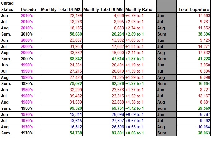
What I have presented in the below chart is hard data, or numbers that have occurred in the past. One can note that the ratios of DHMX to DLMN during the summer months are generally getting higher since the 1970’s. The 1990’s are an exception, which I will blame on the eruption of Mt. Pinatubo producing cool summers in 1992 and 1993. The next step is to come up with some sort of comparison tool to judge one set of data with another to get a warning scale. In an e-mail I came up with this or Y:

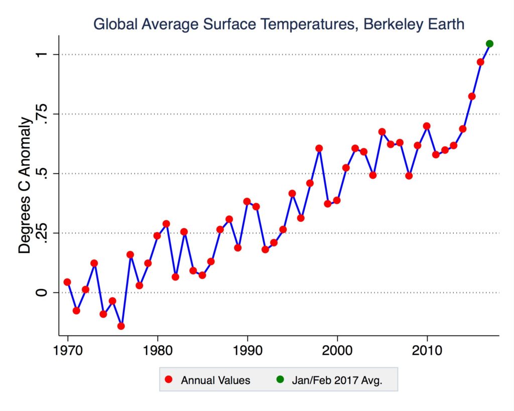
So for the next chart I used the following UC Berkeley graph from Zeke Hausfather to estimate average surface temperatures per decade to come up with X:

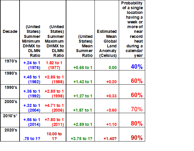
Here is my chart per decade to come up with a forecast for Y and Z for the 2020s:

When I first presented this material back on May 31st, 2017 I stated:
*Of course the 2010’s have three summers to go. Somewhat surprisingly there have been relatively cool summers despite the overall warming trend through the 2010’s, so I would expect one or two more during the 2020’s.
Again, I hope that the scientific community will find the data in this chart for past minimum and maximum ratios of DHMX to DLMN useful. My forecasts for the 2020’s are based off trends from the past five decades and are not set in stone. What’s most alarming to me is that it does not take much of a rise in global average temps to see ratios rise… that ongoing 29 month streak of more DHMX than DLMN is a good example. A huge volcanic eruption or meteor strike can throw a big monkey wrench into my forecasts, but that would be those would be the only two events to slow climate change down.
I look forward to comments leading to improvements on any methodology presented here.
This month I’m seeing wild swings in temperature across the globe, one sign of climate change. As warm as the planet is I’m somewhat surprised to see such a cold month across the lower 48 states:
Hmm..Is #globalwarmng over? Ratio of DHMX to DLMN records now 1- 29 in NCEI database for April 2018 for U.S.
 @Sustainable2050 @KHayhoe @MichaelEMann @JohnMoralesNBC6 @Climatologist49 @AarneClimate @bhensonweather @BernadetteWoods @ClimateCentral @DrShepherd2013 @robertscribbler

Above average temperatures prevalent in large parts of Europe at the moment


 Robert Fanney @robertscribbler
#Mildura above 38C today – new April record for Victoria #Sydney 35.4C yesterday – new April record for the city
#Adelaide above 35C today – third day in a row at or above 34C, an April record for the city
(If you like these posts and my work please contribute via the PayPal widget, which has recently been added to this site. Thanks in advance for any support.)
The Climate Guy


