Updated MAR 2023/NOV 2023/JAN 2025/MAR 2026/SEP 2026
The purpose of this post is to catalogue counts of daily records (high maximums, high minimums, low minimums, low maximums) for Canada coming into the National Centers for Environmental Information’s site and all related charts and graphs produced in my Excel files for those data sets. I am in the process of constantly updating these data verifying the 2009 Meehl et al surface Records published in Geophysical Research Letters that I initiated from 2000-2009. Each individual count could be a report of a tied surface record or one broken by several degrees Fahrenheit. Here is the link to the NCEI site:
https://www.ncdc.noaa.gov/cdo-web/datatools/records
Station density and availability change through time, so raw record counts should be interpreted with caution; the warm-to-cold relationship is more informative than treating the raw count itself as a homogeneous climate index.
More from NCEI:
“The daily records summarized here are compiled from a subset of stations in the Global Historical Climatological Network. A station is defined as the complete daily weather records at a particular location, having a unique identifier in the GHCN-Daily dataset.
For a station to be considered for any parameter, it must have a minimum of 30 years of data with more than 182 days complete each year. This is effectively a “30-year record of service” requirement, but allows for inclusion of some stations which routinely shut down during certain seasons. Small station moves, such as a move from one property to an adjacent property, may occur within a station history. However, larger moves, such as a station moving from downtown to the city airport, generally result in the commissioning of a new station identifier. This tool treats each of these histories as a different station. In this way, it does not “thread” the separate histories into one record for a city.
This tool provides simplistic counts of records to provide insight into recent climate behavior, but is not a definitive way to identify trends in the number of records set over time. This is particularly true outside the United States, where the number of records may be strongly influenced by station density from country to country and from year to year. These data are raw and have not been assessed for the effects of changing station instrumentation and time of observation.”
An updated 2016 study from Dr. Gerald Meehl indicates that the ratio from year to year will average around 15 to 1 by 2100 for the United States.
Per one of the authors of both the 2009 and 2016 studies, Claudia Tebaldi said “This climate is on a trajectory that goes somewhere we’ve never been. And records are a very easy measure of that.”
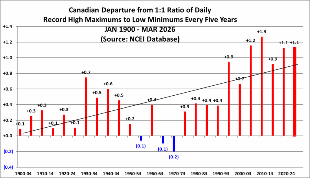
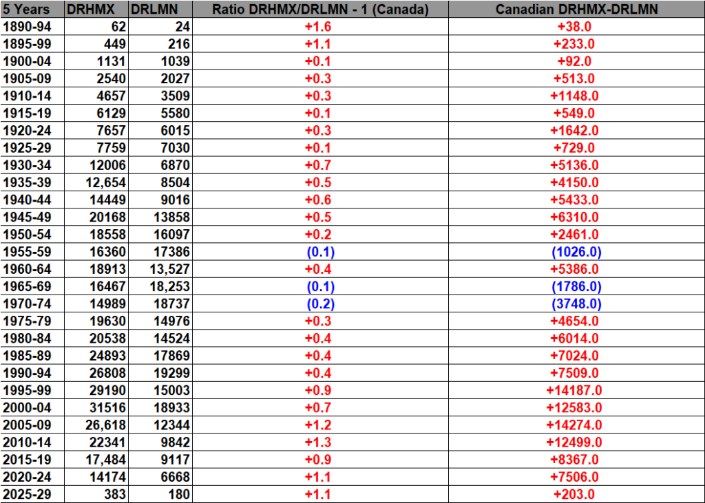
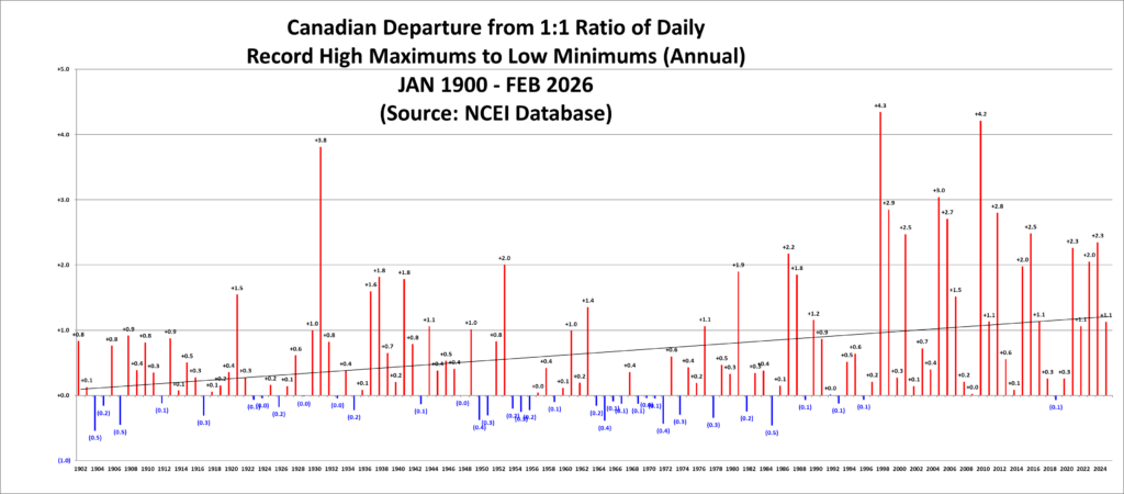
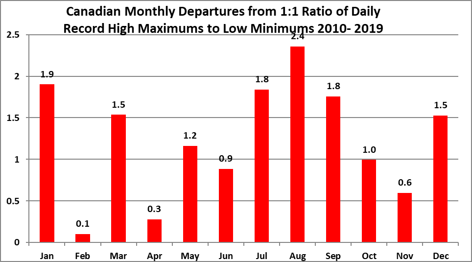
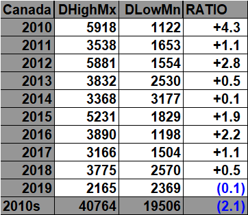
All of the data listed below is part of these three charts. The ratio of daily record highs to lows for the 2010s is higher than any decade since the 1890s:

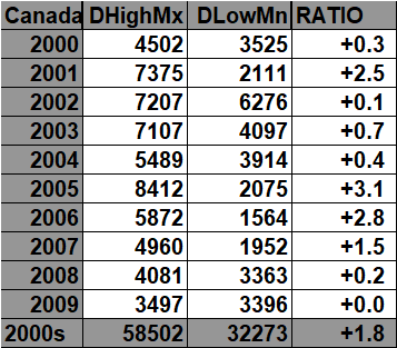
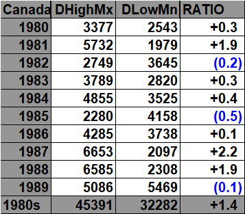
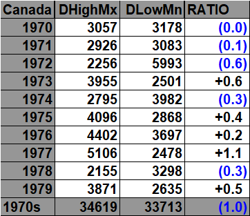
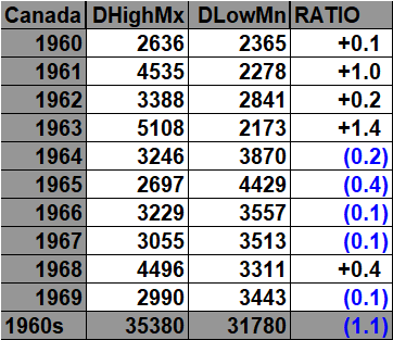
Here are the current daily record counts per decade, which have gone into the prior charts:

What the below chart represents
This chart compares the frequency of Canadian daily record high maximum temperatures (DHMX) with daily record low minimum temperatures (DLMN) as a function of the national monthly mean temperature anomaly.
Each month from January 1901 through December 2025 is assigned to a 0.10°C anomaly bin relative to a 1961–1990 Canadian temperature baseline. The record counts occurring in all months within a given anomaly bin are then summed.
For each bin:
- DHMX = total reports of record daily high maximum temperatures.
- DLMN = total reports of record daily low minimum temperatures.
- # of Mon. = number of calendar months falling into that anomaly bin.
- Signed Ratio/Count expresses which type of record dominates. Positive values indicate more DHMX records; negative values indicate more DLMN records.
- The final Signed √ Ratio applies a square-root transformation to the magnitude of that ratio. This compresses very large ratios so that extreme bins do not overwhelm the graph visually while preserving both the direction and relative strength of the warm/cold imbalance.
Thus, the chart is not simply showing how many records occurred during warm or cold months. It is measuring how the balance between record warmth and record cold changes as the mean temperature of Canada moves progressively farther above or below its climatological norm.
Scientific findings
The most striking result is the strong change in record balance across the anomaly spectrum.
During substantially colder-than-normal months, daily record low minimums overwhelmingly outnumber daily record high maximums. For example, the −5.05°C to −4.95°C bin contains 31 DHMX records versus 340 DLMN records, a ratio of roughly 11 cold records for every warm record. At −3.55°C to −3.45°C, the imbalance is even larger: 269 DHMX versus 1,935 DLMN.
As anomalies approach zero, that imbalance weakens markedly. Around the climatological mean the two record types become much more competitive. The −0.25°C to −0.15°C bin, for example, contains 8,256 DHMX versus 6,339 DLMN, while the −0.15°C to −0.05°C bin swings modestly toward the cold side at 9,583 versus 9,640. That crossover close to zero is physically sensible: when the monthly mean temperature is close to normal, neither warm nor cold record events have a large thermodynamic advantage.
Once monthly anomalies become distinctly positive, record highs increasingly dominate. At +1.05°C to +1.15°C there are 15,367 DHMX records versus 5,092 DLMN records, about 3.0 to 1. At +2.95°C to +3.05°C the ratio rises to roughly 8.7 to 1, and at +3.55°C to +3.65°C it reaches about 23.5 to 1.
The strongest warm-side ratios occur in some of the most extreme warm bins. For example, the +4.45°C to +4.55°C bin contains 856 DHMX records but only 3 DLMN records, a ratio near 285 to 1. That particular value should not be interpreted as a stable climatological ratio because the bin contains only one month; the far tails have very small sample sizes. The same caution applies to the most extreme cold bins.
The broader result, however, is robust across many well-populated bins: the warmer the Canadian monthly temperature anomaly becomes, the more strongly the daily record distribution shifts toward record highs; the colder the anomaly becomes, the more strongly it shifts toward record lows.
This is what would be expected in a warming climate. A shift in the underlying temperature distribution toward higher values makes excursions beyond historical warm thresholds more frequent while making excursions beyond historical cold thresholds less frequent. The chart provides an empirical Canadian demonstration of that relationship using observed station-record counts rather than climate-model output.
The pattern is also consistent with Environment and Climate Change Canada’s independent national temperature record. ECCC reports that Canada’s annual average temperature has risen substantially since 1948 and that recent decades are dominated by positive anomalies relative to 1961–1990. Canada
One important limitation should be stated explicitly: this chart demonstrates association, not a formal attribution calculation. Individual daily records arise from synoptic weather variability, station history, geography, and other factors. The scientific significance lies in the systematic change in the relative frequency of warm and cold records across progressively warmer or colder background conditions.
Data sources
The record-count data come from NOAA’s National Centers for Environmental Information (NCEI) Daily Weather Records database. NCEI’s records product is compiled from a subset of stations in the Global Historical Climatology Network. My Canadian archive has used this source for the DHMX, DLMN, DHMN, and DLMX record categories. Individual counts can include either newly broken records or tied records. guyonclimate.com
For this analysis, the Canadian DHMX and DLMN counts from the archive were paired with national monthly temperature values and anomalies. My archive itself identifies NCEI as the underlying source of the Canadian daily-record counts and describes these as reports entering the NCEI record system. guyonclimate.com
The Canadian temperature/anomaly series used in our recent processing is based on Environment and Climate Change Canada’s gridded/homogenized Canadian temperature products. ECCC’s current CanGridT Version 4 is generated from fourth-generation homogenized Canadian station temperature data and interpolated to a 10-km grid. Importantly, ECCC grids the 1961–1990 climatology and temperature anomalies separately, then combines them to produce gridded temperatures. Open Canada
The older CANGRD documentation describes the same conceptual anomaly framework: monthly temperature anomalies are calculated relative to the 1961–1990 reference period, using homogenized Canadian station observations and spatial interpolation. Canada
For the bin analysis shown here, we used 1,500 monthly Canadian anomaly/count pairs from January 1901 through December 2025. The 2026 record counts were deliberately excluded because that year is incomplete. The 0.10°C-bin analysis therefore compares complete monthly record-count/anomaly pairs through the end of 2025.


The 2020s:


These record scoreboards also serve as handy historical catalogues of a country’s monthly and annual average temperatures, placing those values alongside the corresponding monthly and yearly temperature anomalies and the numbers of record warm and record cold events. This makes it easy to compare the background climate state with the frequency of temperature records occurring within it.
In the following charts blue colors represent cold months and years, and red warm. Those months with counts close to a 1 to 1 ratio of highs to lows are colored black. Purpled colored items represent all-time hottest and coldest months and years. I have opted not to catalogue data prior to 1890 since record counts decrease substantially prior to that year. Time stamps for when I last updated counts are located in the upper left-hand corner of each chart. Drop me a note if you see an error or if you have suggestions for improvements.

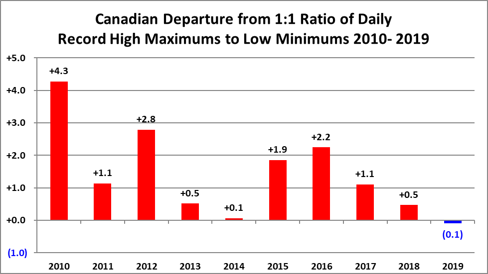
The 2010s:

The 2000s:
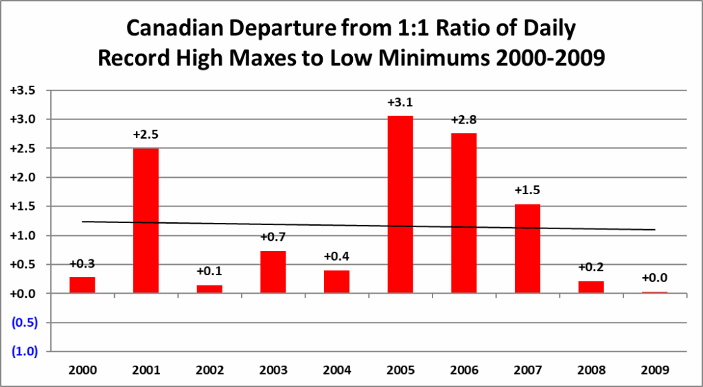
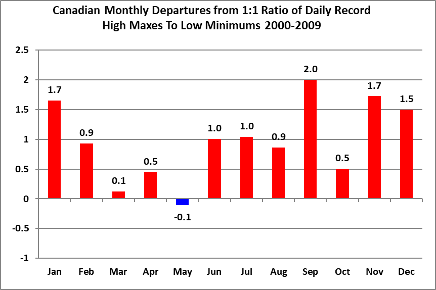

The 1990s:


The 1980s:



The 1970s:



The 1960s:



The 1950s:


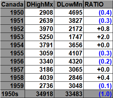

The 1940s:


The 1930s:

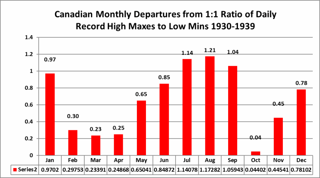


The 1920s:


The 1910s:
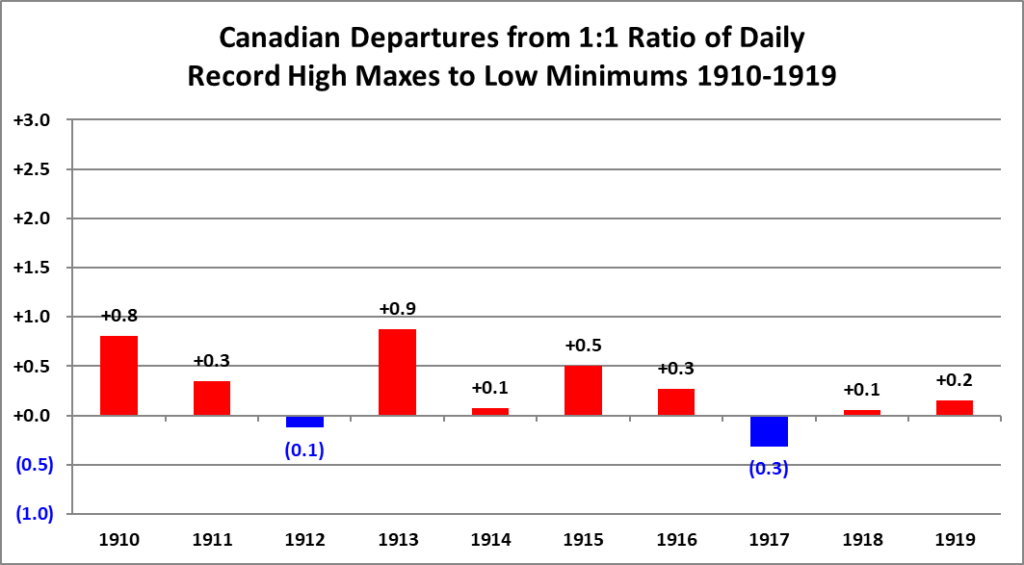


The 1900s:


The 1890s:
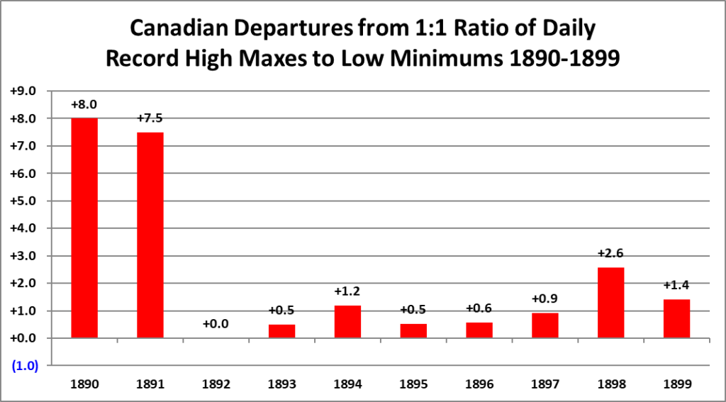



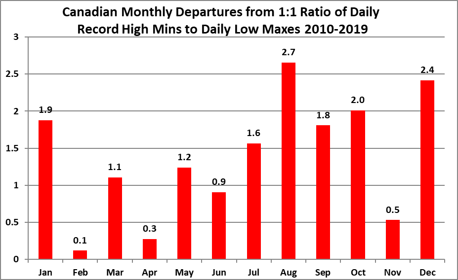
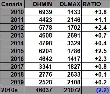
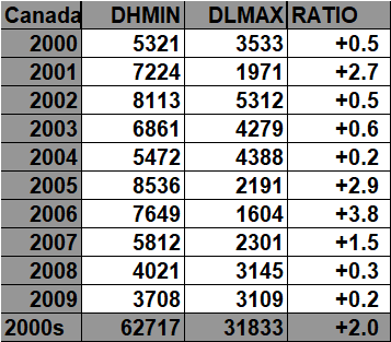
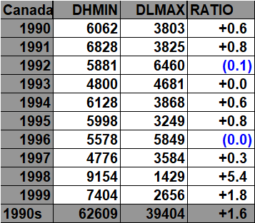
All of the data listed below is part of the following three charts. The ratio of daily record high minimums to low maximums for the 2020s (so far) is higher than any decade since the 1890s (For Canada):


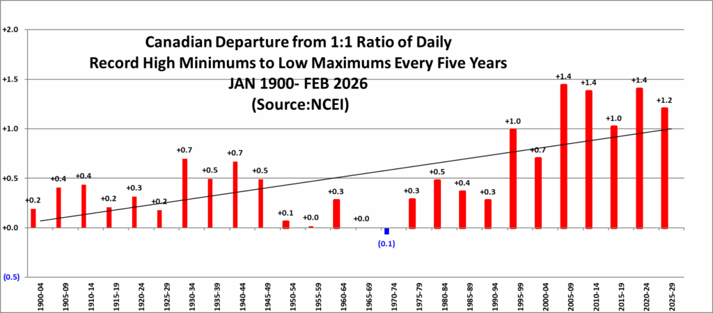
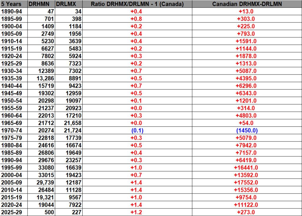

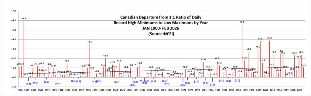
What the following chart represents
This chart compares the frequency of Canadian daily record high minimum temperatures (DHMN) with daily record low maximum temperatures (DLMX) as a function of the national monthly mean temperature anomaly.
In practical terms, DHMN records are exceptionally warm overnight or minimum-temperature records, while DLMX records are exceptionally cool daytime or maximum-temperature records. NOAA/NCEI’s Daily Weather Records system defines these categories as Highest Minimum Temperature and Lowest Maximum Temperature, respectively. NCEI
Each Canadian month from January 1901 through December 2025 is assigned to a 0.10°C temperature-anomaly bin. Within each bin, all DHMN and DLMX record reports occurring during those months are summed.
The table therefore shows, for each anomaly interval:
- DHMN — total daily record high minimum-temperature reports.
- DLMX — total daily record low maximum-temperature reports.
- # of Mon. — the number of months falling within that anomaly bin.
- Signed Ratio/Count — the ratio between the dominant and less-common record category. Positive values indicate DHMN dominance; negative values indicate DLMX dominance.
- Signed √ Ratio — the signed square root of that ratio, used for the bar graph. This transformation compresses very large ratios while retaining their direction and relative magnitude.
The purpose is to show how the balance between unusually warm minimum temperatures and unusually cool maximum temperatures changes as Canada’s overall monthly temperature moves from strongly colder-than-normal to strongly warmer-than-normal conditions.
Scientific findings
The relationship is quite clear.
During strongly cold Canadian months, DLMX records greatly outnumber DHMN records. For example, in the −5.05°C to −4.95°C anomaly bin, the data contain about 30 DHMN versus 369 DLMX records, or roughly 12 cold daytime records for every warm-minimum record. Around −3.5°C, the imbalance remains strong, with 277 DHMN compared with 2,354 DLMX, an approximately 8.5-to-1 cold-side ratio.
As monthly anomalies move toward the 1961–1990 climatological average, the difference between the two categories narrows considerably. Around −0.5°C, there are 8,225 DHMN versus 8,771 DLMX, very close to parity. The bins immediately surrounding zero fluctuate modestly from one side to the other because natural weather variability remains large when the background monthly temperature is close to normal.
At approximately the climatological mean, however, warm-minimum records begin to gain a clear advantage. The 0.0°C-centered bin contains approximately 13,339 DHMN versus 9,682 DLMX, a ratio of about 1.38 to 1. At +0.5°C, the ratio grows to approximately 1.87 to 1, with 19,877 DHMN compared with 10,625 DLMX.
The warm-side dominance becomes much stronger as the anomaly increases. At +1.0°C, the ratio is roughly 3.2 DHMN records for every DLMX record. Around +1.5°C it rises to about 5.6 to 1, and at +3.0°C it is about 7.6 to 1.
Some of the most extreme warm bins produce very large ratios. For example, the +4.45°C to +4.55°C bin contains about 1,143 DHMN versus only 10 DLMX reports, yielding a ratio above 114 to 1. The +5.65°C to +5.75°C bin is similarly extreme. Those tail values should be interpreted cautiously because they represent only one or a few months.
The broad pattern across the well-populated bins is much more important than any single extreme ratio: as Canada’s monthly mean temperature becomes warmer relative to normal, record high minimum temperatures become progressively more common relative to record low maximum temperatures.
This finding is particularly significant because minimum temperatures are closely associated with nighttime cooling. A rise in DHMN records means that nights are increasingly failing to cool to historically typical low values, while DLMX records—days that remain exceptionally cold—become less common as the background climate warms.
That is consistent with the broader observed warming of Canada. Environment and Climate Change Canada reports widespread increases in Canadian temperatures and notes that recent decades are dominated by positive departures from the 1961–1990 reference period. Canada
As with the DHMX/DLMN analysis, this chart should be interpreted as an observed statistical association, not as a formal attribution study. Individual records depend on synoptic weather, geography, station coverage, instrumentation, and other factors. NCEI itself cautions that raw record counts, particularly outside the United States, can be influenced by changes in station density and should not by themselves be treated as definitive trend measures. NCEI
Data sources
The DHMN and DLMX record counts come from NOAA’s National Centers for Environmental Information Daily Weather Records database.
That product is compiled from a subset of stations in the Global Historical Climatology Network-Daily (GHCN-Daily). NCEI includes both records that are newly broken and records that tie an existing record. Stations used in this system must generally have at least 30 years of observations, with more than 182 complete days in each qualifying year. NCEI
For this comparison:
- DHMN corresponds to NCEI’s Highest Minimum Temperature category.
- DLMX corresponds to NCEI’s Lowest Maximum Temperature category. NCEI
The Canadian average temperatures and temperature anomalies come from Environment and Climate Change Canada’s homogenized and gridded temperature datasets.
ECCC’s modern CanGridT products are based on homogenized Canadian station observations and use a gridding procedure in which the 1961–1990 station climatology and temperature anomalies are interpolated separately. The two are then combined to produce monthly gridded temperatures. Open Canada
The anomaly is defined as the difference between a month’s observed mean temperature and the corresponding 1961–1990 climatological mean. Positive anomalies indicate warmer-than-reference conditions, while negative anomalies indicate colder-than-reference conditions. Canada
The analysis uses complete monthly anomaly/record-count pairs from January 1901 through December 2025. The 2026 daily record counts are excluded because the year is incomplete.


The 2020s:


The 2020s:

In the following charts blue colors represent cold months and years, and red warm. Those months with counts close to a 1 to 1 ratio of highs to lows are colored black. I have opted not to catalogue data prior to 1890 since record counts decrease substantially prior to that year. Time stamps for when I last updated counts are located in the upper left-hand corner of each chart. Drop me a note if you see an error or if you have suggestions for improvements.
Why these scoreboards are useful
These Canadian record scoreboards also serve as handy historical catalogues of the country’s monthly and annual average temperatures, placing those values alongside the corresponding monthly and yearly temperature anomalies and the numbers of record warm and record cold events.
That makes it possible to compare the background climate state directly with the frequency of temperature records occurring within it, rather than viewing either dataset in isolation.
This one is especially interesting because it complements the DHMX/DLMN chart: the first chart documents the changing balance between record hot days and record cold nights, while this one documents the changing balance between record warm nights and record cold days. Together they describe warming from both sides of the daily temperature cycle.

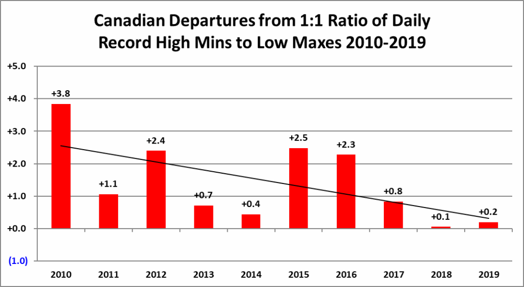
The 2010s:

The 2000s:



The 1990s:



The 1980s:


The 1970s:
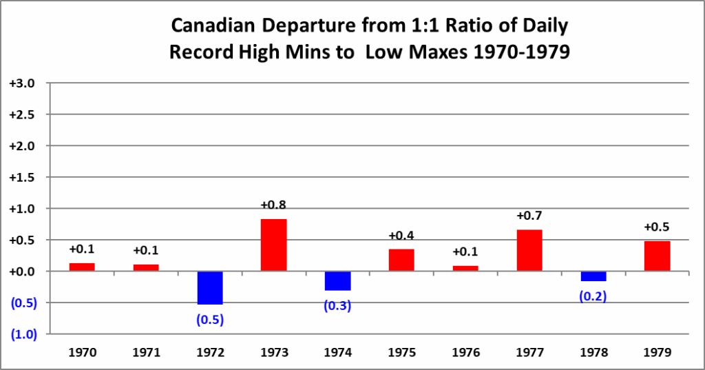

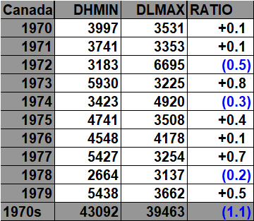

The 1960s:


The 1950s:


The 1940s:


The 1930s:


The 1920s:


The 1910s:


The 1900s:


The 1890s:


These are all of the numbers of reports of daily Canadian records in the NCEI database since 1890.
Guy Walton “The Climate Guy”