Made NOV 2022/Updated OCT 2023/MAY 2025/AUG 2026
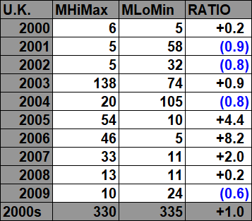
The purpose of this post is merely to catalogue counts of monthly record highs (high maximums, low minimums, high minimums, low maximums) coming into the National Center for Environmental Information’s site and all related charts and graphs produced in my Excel files for British data sets. Monthly records are those set for the entire period of one month. For example, the highest temperature set during the month of March at Atlanta Hartsville-Jackson Airport was 89F set on 3/23/1995. I am in the process of constantly updating this data verifying the 2009 Meehl et. all surface Records published in geophysical Science that I initiated from 2009. Each individual count could be a tied surface record or one broken by several degrees Fahrenheit.
Here is the link to the NCEI site:
https://www.ncdc.noaa.gov/cdo-web/datatools/records
More from NCEI:
“The monthly records summarized here are compiled from a subset of stations in the Global Historical Climatological Network. A station is defined as the complete daily weather records at a particular location, having a unique identifier in the GHCN-Daily dataset.
For a station to be considered for any parameter, it must have a minimum of 30 years of data with more than 182 days complete each year. This is effectively a “30-year record of service” requirement, but allows for inclusion of some stations which routinely shut down during certain seasons. Small station moves, such as a move from one property to an adjacent property, may occur within a station history. However, larger moves, such as a station moving from downtown to the city airport, generally result in the commissioning of a new station identifier. This tool treats each of these histories as a different station. In this way, it does not “thread” the separate histories into one record for a city.
This tool provides simplistic counts of records to provide insight into recent climate behavior but is not a definitive way to identify trends in the number of records set over time. This is particularly true outside the United States, where the number of records may be strongly influenced by station density from country to country and from year to year. These data are raw and have not been assessed for the effects of changing station instrumentation and time of observation.”
An updated 2016 study from Dr. Jerry Meehl indicates that the daily ratio from year to year will average around 15 to 1 by 2100:
Per one of the authors of both the 2009 and 2016 studies, Claudia Tebaldi said “This climate is on a trajectory that goes somewhere we’ve never been. And records are a very easy measure of that.”
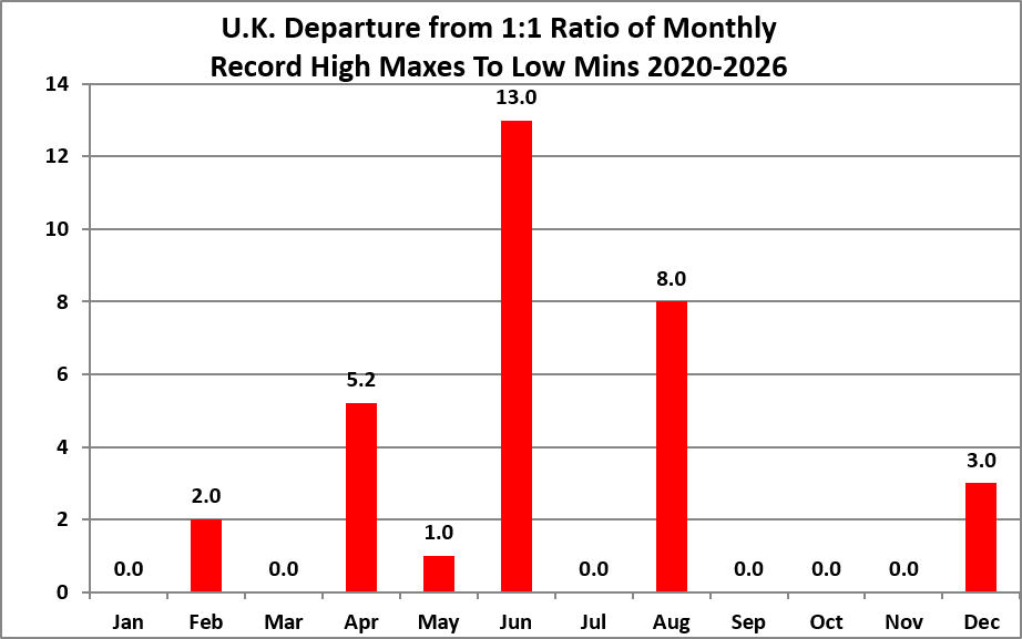
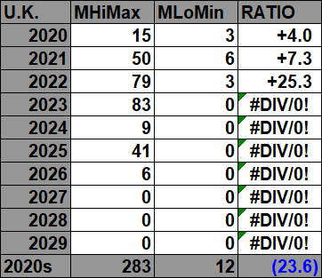
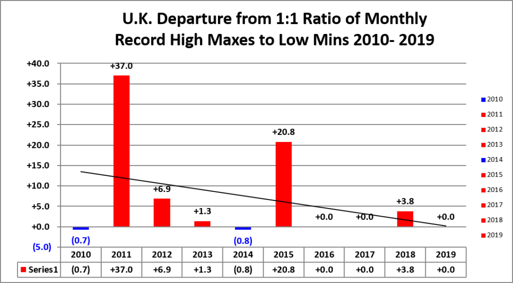
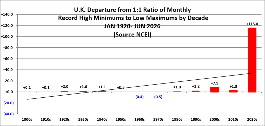
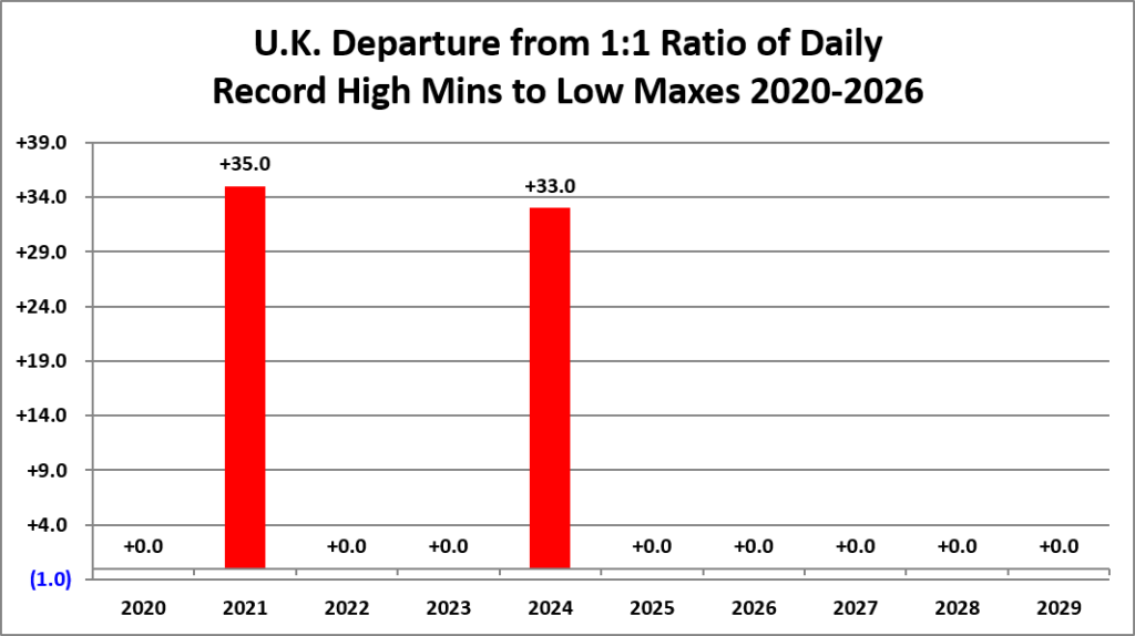
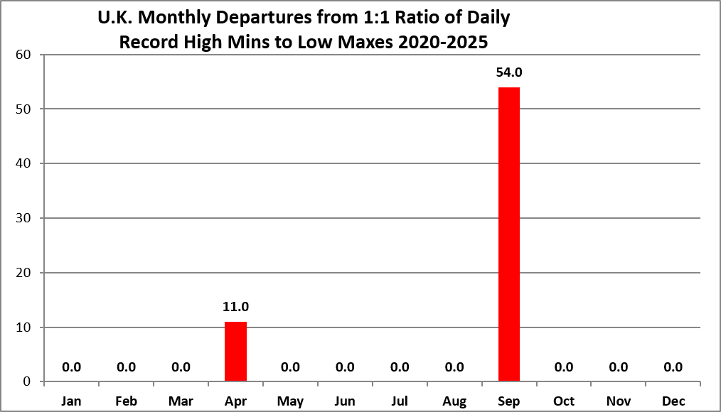
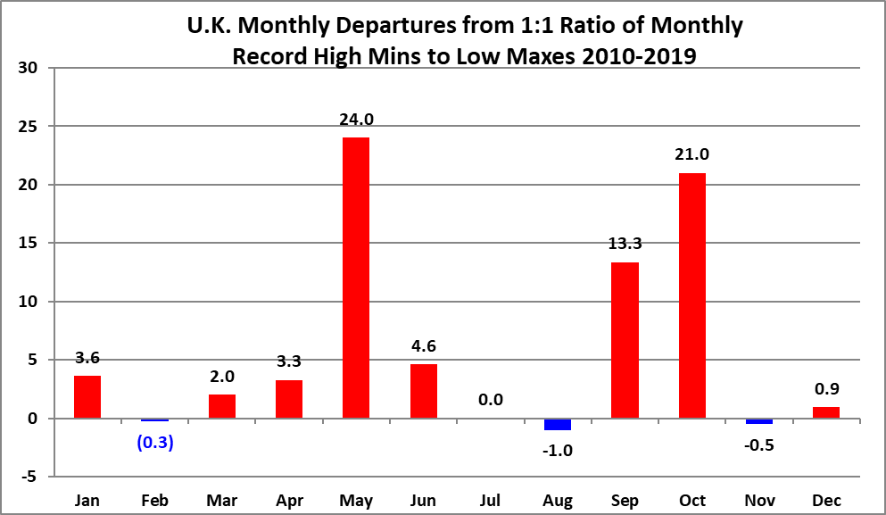
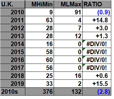
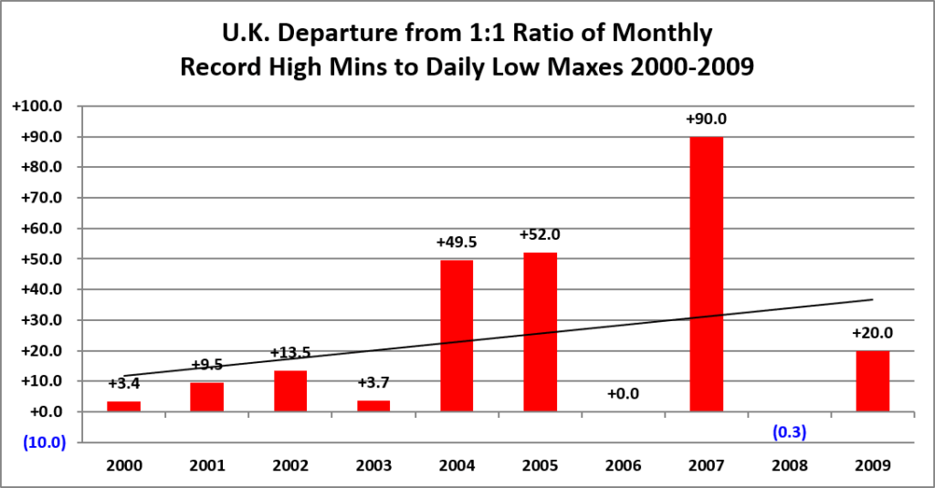
All of the data listed below is part of this one chart. The ratio of monthly record high maxes to low minimums for the 2020s, so far, is higher than any decade since the 1900s:
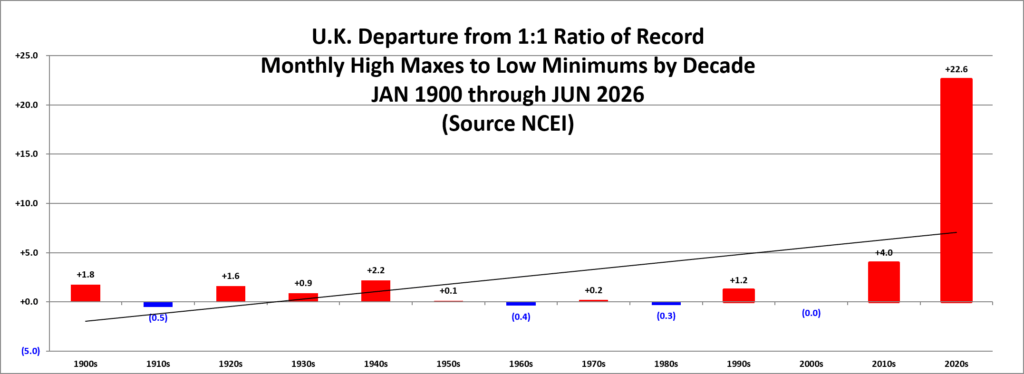
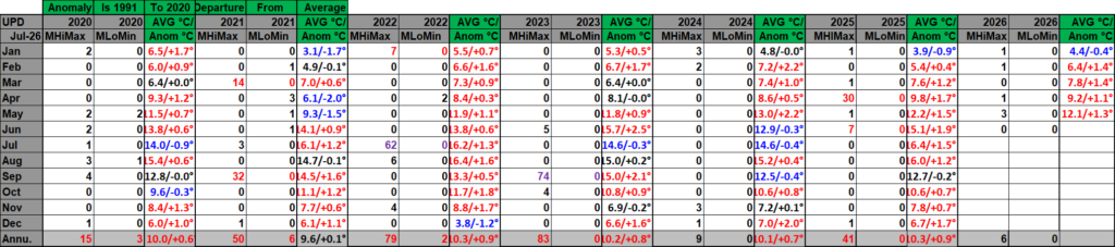
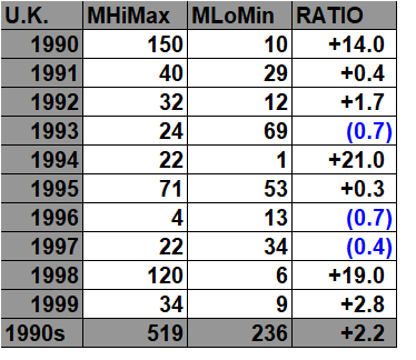
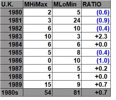
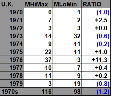
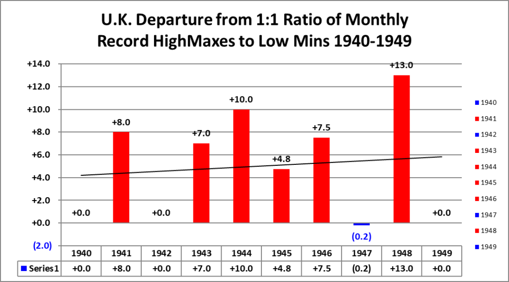
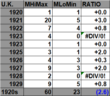
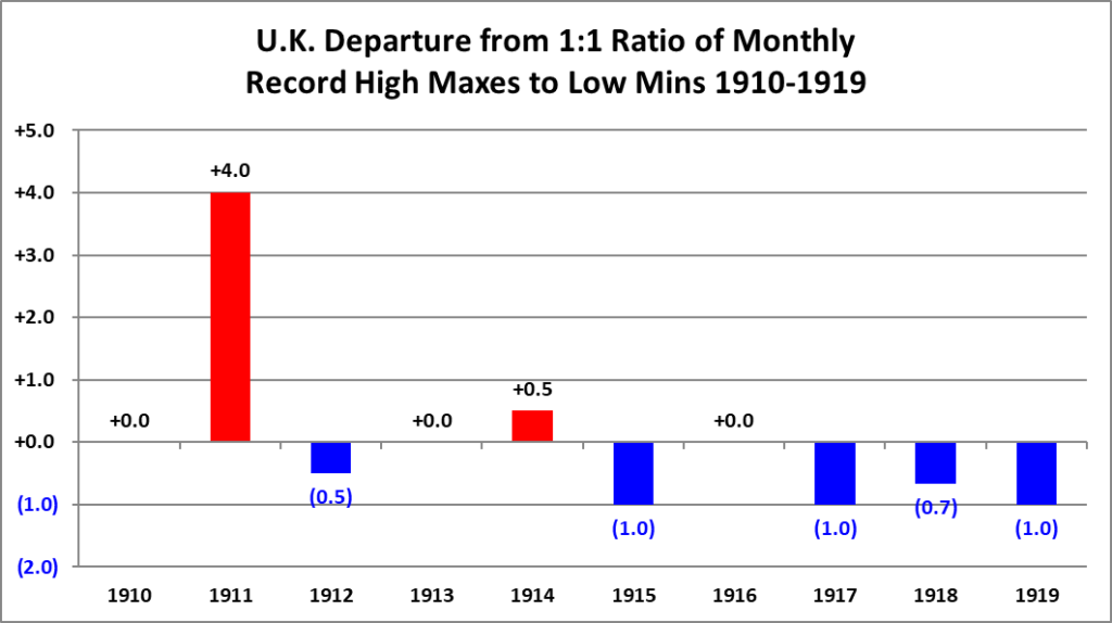
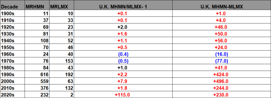
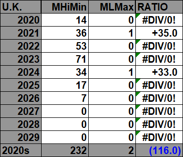
Here are the current United Kingdom monthly record counts per decade (including ties) that went into the above chart:

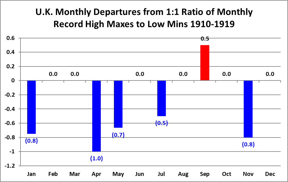
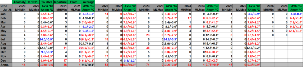
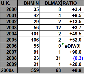
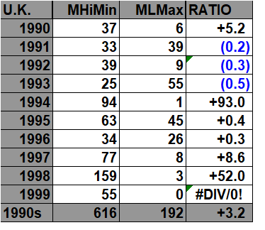
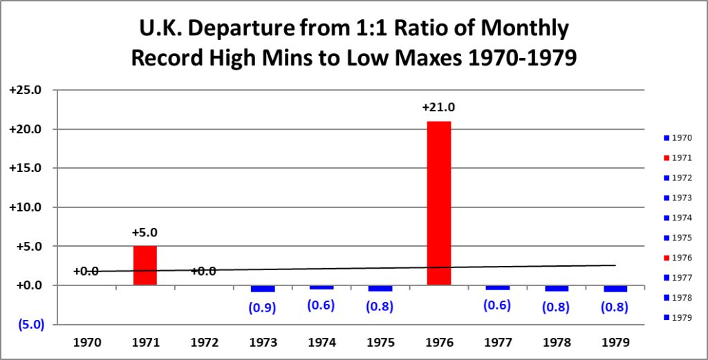
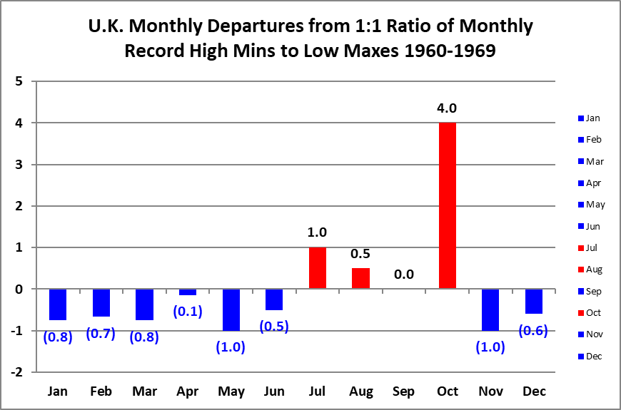
For the above and following data sets of record high maximums and low minimums blue colors represent cold months and red warm. Those months with counts close to a 1 to 1 ratio of highs to lows are colored black. Time stamps for when I last updated counts are located in the upper left-hand corner of each chart. Drop me a note if you see an error or if you have suggestions for improvements.
Our British monthly record analysis produced a fairly clear result, and it complements the stronger statistical signal we previously found in the UK daily records.
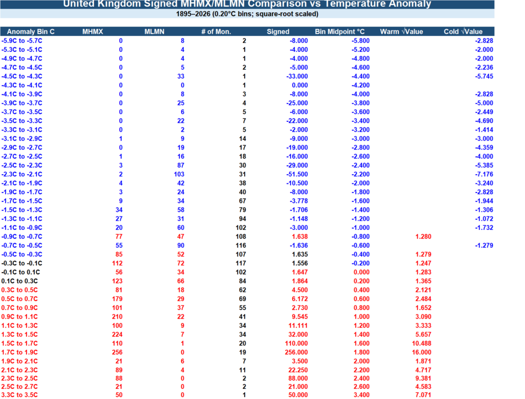
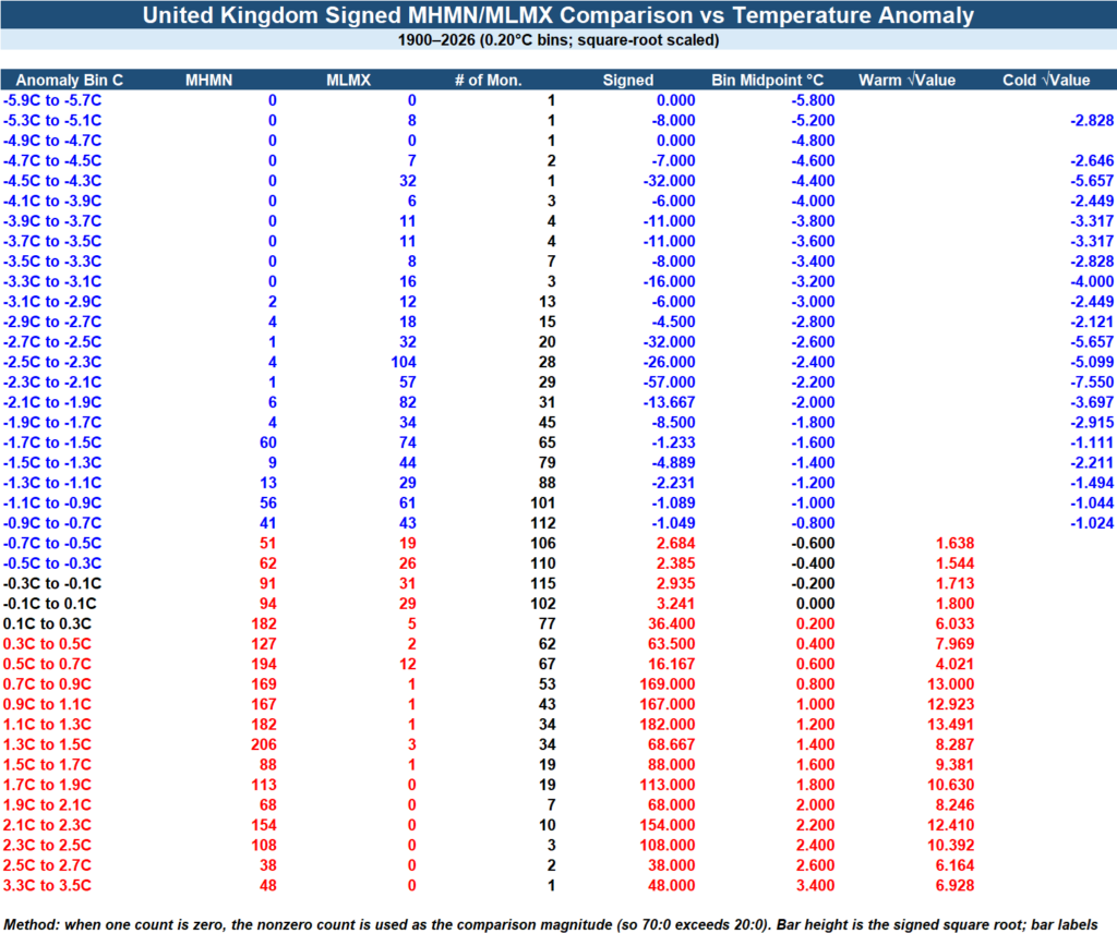
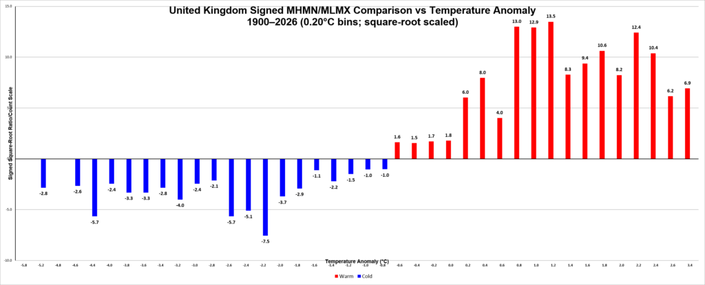
We analyzed the United Kingdom’s opposing monthly record categories in two principal pairings: MHMX versus MLMN (monthly highest maximum versus monthly lowest minimum) and MHMN versus MLMX (monthly highest minimum versus monthly lowest maximum). For each pairing, we sorted the monthly records according to the corresponding UK temperature anomaly and placed the anomalies into 0.20°C bins.
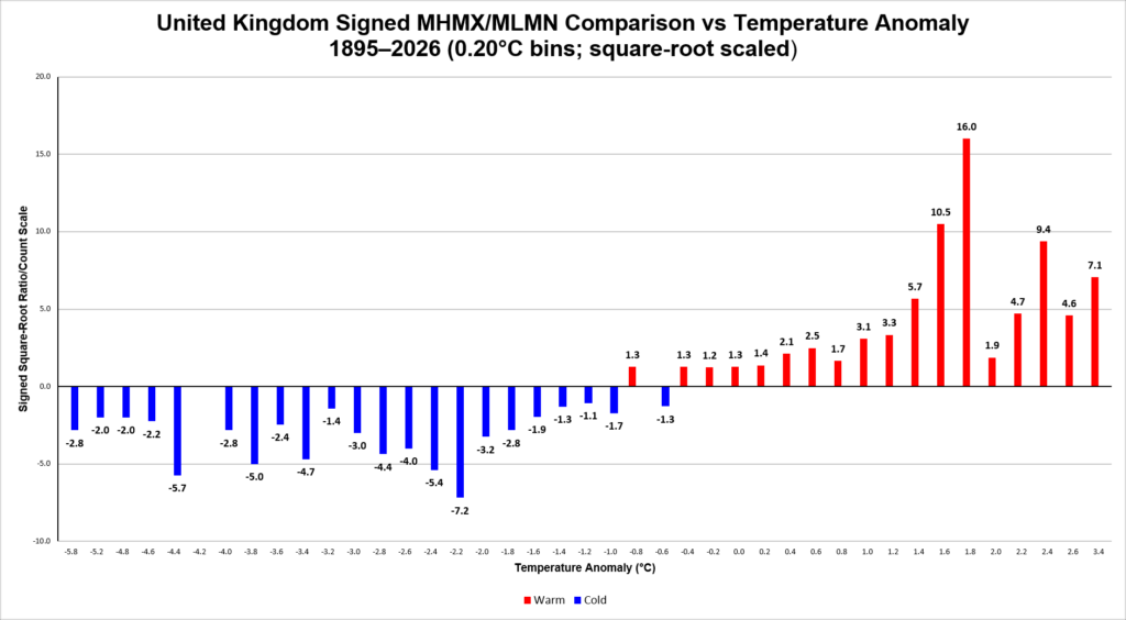
For every anomaly bin, we counted the competing warm and cold records and calculated their ratio. We then applied our signed square-root transformation to the ratios. That transformation was important because the raw ratios become extremely large when one type of record greatly outnumbers its opposite; taking the square root compresses those extremes while retaining both the direction and strength of the signal. Positive values represent warm-record dominance and negative values cold-record dominance.
The resulting British graphs showed the same fundamental behavior we’ve been looking for: cold anomaly bins favor cold records, while increasingly warm anomaly bins favor warm records. The transition through the anomaly spectrum is systematic rather than random. In the MHMX/MLMN analysis, for example, warm-record dominance becomes apparent around the mildly negative-to-neutral anomaly range and becomes very strong in the positive anomaly bins. Some of the raw ratios on the warm side became enormous—one bin reached roughly 256:1—which is exactly why the square-root treatment made the graphs much easier to interpret.
The MHMN/MLMX comparison independently showed the same broad temperature dependence. That matters scientifically because the two comparisons are measuring somewhat different aspects of the monthly temperature distribution. We aren’t relying upon one particular type of record to produce the warming signal.
One of the more interesting aspects is that this relationship appears clearly in Britain’s maritime climate. The surrounding Atlantic tends to moderate temperature extremes, so the fact that the record-ratio/anomaly relationship remains readily visible suggests that the phenomenon isn’t dependent upon an extremely continental climate with huge temperature swings.
There is also an important hierarchy in the British data. The daily record dataset provides the greatest statistical power, because it contains vastly more observations. The monthly records contain fewer events, but still enough to reproduce the same basic anomaly-dependent behavior. By contrast, we concluded that the British all-time record dataset is simply too sparse to justify the same kind of statistical treatment.
So the main British result can be summarized this way:
As United Kingdom temperature anomalies become warmer, the balance between opposing temperature records systematically shifts toward warm records; as anomalies become colder, it shifts toward cold records. This relationship appears in both daily and monthly record categories despite Britain’s strongly ocean-moderated climate.
That is probably the most scientifically interesting takeaway from the UK work. Britain has now provided an independent national test of the record-ratio methodology rather than merely another graph of rising average temperature.
The 2020s:
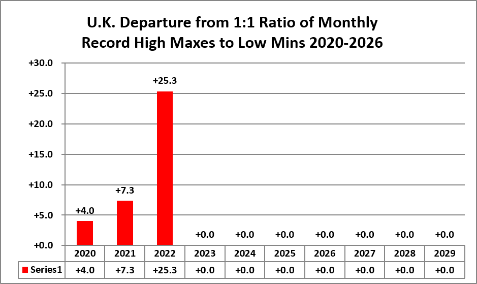
The 2010s:
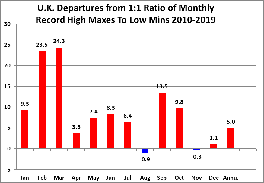
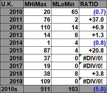

The 2000s:
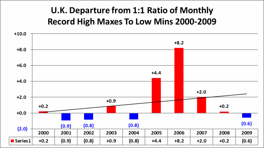
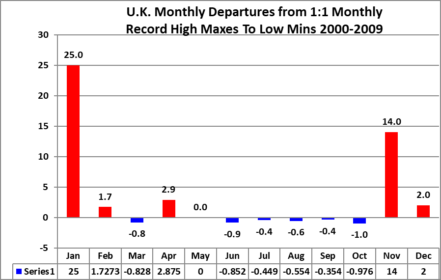

The 1990s:


The 1980s:



The 1970s:



The 1960s:



The 1950s:



The 1940s:



The 1930s:



The 1920s:



The 1910s:


The 1900s:



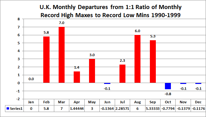
For the following data sets of record high maximums and low minimums blue colors represent cold months and red warm. Those months with counts close to a 1 to 1 ratio of highs to lows are colored black. Time stamps for when I last updated counts are located in the upper left-hand corner of each chart. Monthly departure from average data for Britain has been added on this update. Drop me a note if you see an error or if you have suggestions for improvements.
Here are the current monthly record counts per decade:
The 2020s:
The 2010s:


The 2000s:


The 1990s:



The 1980s:



The 1970s:



The 1960s:



The 1950s:
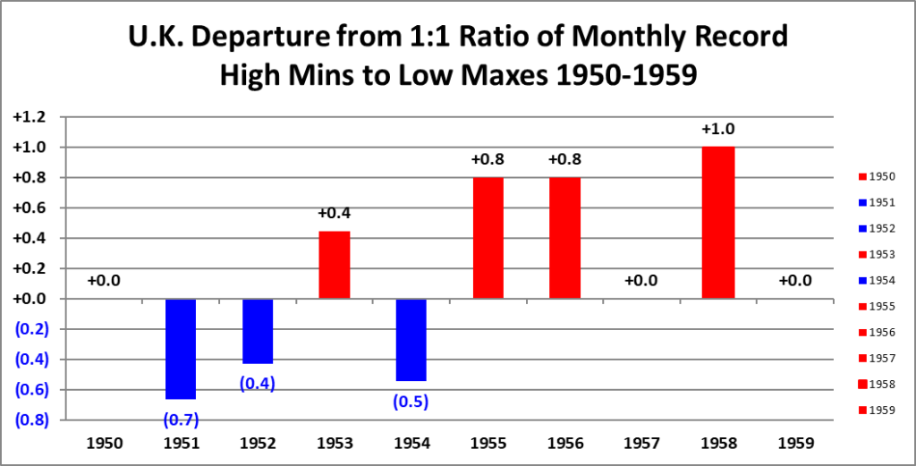
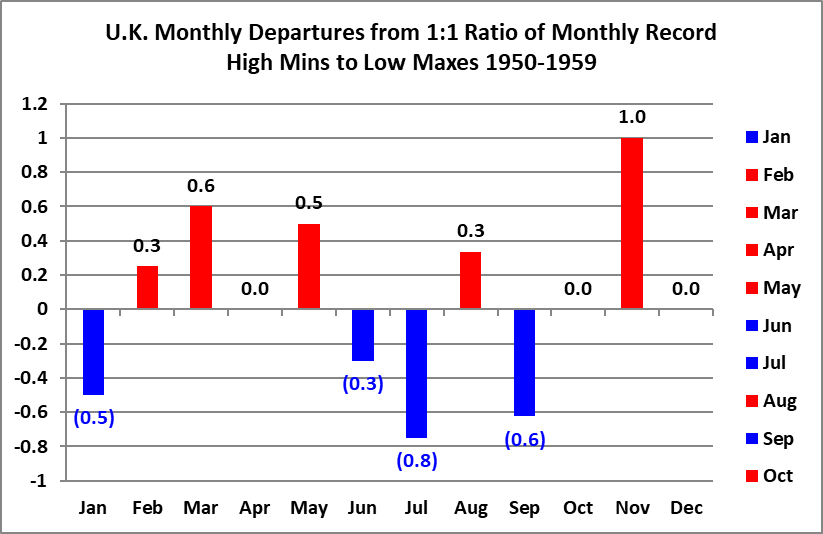


The 1940s:


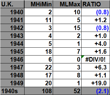

The 1930s:


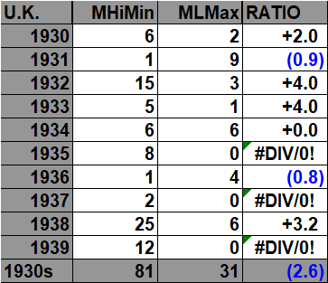

The 1920s:



The 1910s:



The 1900s:
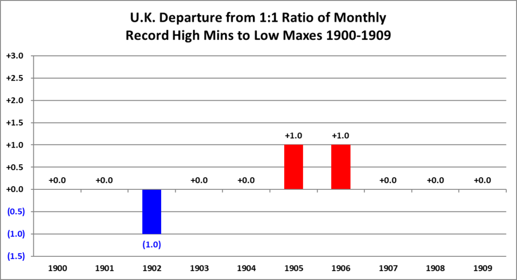
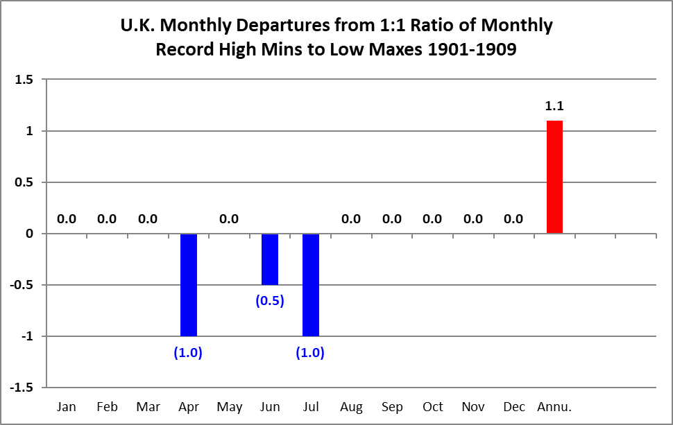


This is all of the NCEI United Kingdom monthly record count data going back to 1900.
Guy Walton…”The Climate Guy”