Made SEP 2020/Updated OCT 2023/MAY 2025/JUN 2026
The purpose of this post is merely to catalogue counts of daily record reports (high maximums, high minimums, low minimums, low maximums) coming into the National Center for Environmental Information’s site and all related charts and graphs produced in my Excel files for data sets from the United Kingdom. I am in the process of constantly updating this data verifying the 2009 Meehl et. all surface Records published in Geophysical Science that I initiated from 2000-2009. Each individual count could be a tied surface record or one broken by several degrees Fahrenheit. Here is the link to the NCEI site:
https://www.ncdc.noaa.gov/cdo-web/datatools/records
More from NCEI:
“The daily records summarized here are compiled from a subset of stations in the Global Historical Climatological Network. A station is defined as the complete daily weather records at a particular location, having a unique identifier in the GHCN-Daily dataset.
For a station to be considered for any parameter, it must have a minimum of 30 years of data with more than 182 days complete each year. This is effectively a “30-year record of service” requirement, but allows for inclusion of some stations which routinely shut down during certain seasons. Small station moves, such as a move from one property to an adjacent property, may occur within a station history. However, larger moves, such as a station moving from downtown to the city airport, generally result in the commissioning of a new station identifier. This tool treats each of these histories as a different station. In this way, it does not “thread” the separate histories into one record for a city.
This tool provides simplistic counts of records to provide insight into recent climate behavior, but is not a definitive way to identify trends in the number of records set over time. This is particularly true outside the United States, where the number of records may be strongly influenced by station density from country to country and from year to year. These data are raw and have not been assessed for the effects of changing station instrumentation and time of observation.”
All counts include ties of records.
An updated 2016 study from Dr. Jerry Meehl indicates that the ratio from year to year will average around 15 to 1 by 2100 for the United States:
Per one of the authors of both the 2009 and 2016 studies, Claudia Tebaldi said “This climate is on a trajectory that goes somewhere we’ve never been. And records are a very easy measure of that.”
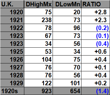
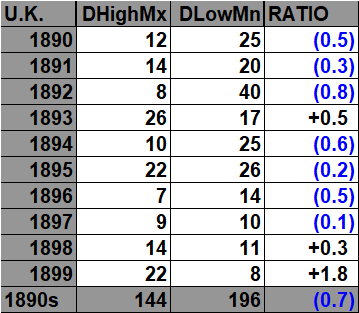
All of the data listed below is part of this one chart. United Kingdom record counts become sparse prior to 1930 but enough such that I might add more decades to this archive prior to 1890 on a future update. The ratio of daily record high maxes to low minimums for the 2020s so far is higher than any other decade (for the United Kingdom) since 1890:
Here is the decadal bar graph of daily record high maximums vs. daily record low minimums:

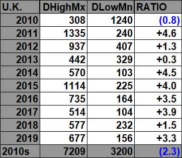
Here are the current daily record counts per decade, which have gone into the prior chart:

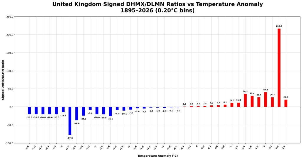
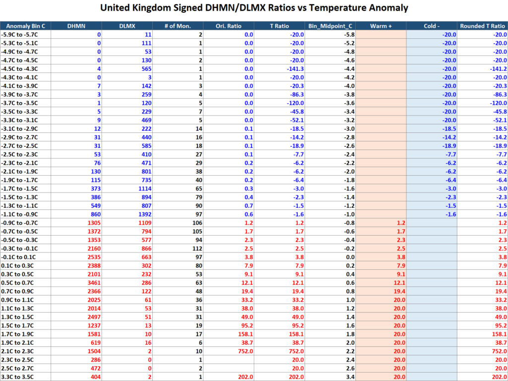
United Kingdom Daily Temperature Records (1910–2026): My analysis of more than a century of UK daily record temperatures shows a clear long-term shift toward warm extremes. Daily record highs have become increasingly common relative to daily record lows, with the warm/cold record ratio rising rapidly as mean temperature anomalies increase. Despite the United Kingdom’s strongly maritime climate—which naturally moderates temperature extremes—the relationship between warming and record-setting behavior closely resembles that found in the United States and Russia. The results provide additional evidence that continued warming is producing a measurable increase in the frequency of new warm records while reducing the occurrence of new cold records across widely differing climate regimes.
For the United Kingdom monthly climate sections, we used the following sources:
- ERA5 Reanalysis (via World Bank Climate Portal) – Primary source
- Monthly average temperatures (°C)
- Monthly temperature anomalies (°C)
- Modern record used to populate the climate sections of the workbook.
- Anomalies referenced to the 1991–2020 climatological baseline.
- Berkeley Earth – Historical extension and verification
- Used to extend the monthly temperature series farther back in time where needed.
- Provided a long, homogeneous record to maintain consistency before the ERA5 era.
- Rebased to the 1991–2020 reference period so it matches the ERA5 anomaly scale.
This combination provides:
- High-quality modern observations from ERA5.
- A long historical record from Berkeley Earth.
- A consistent 1991–2020 anomaly baseline across the entire 1910–2026 period.
Using two independent datasets also serves as a cross-check. The close agreement between ERA5 and Berkeley Earth over their overlapping years increases confidence that the long-term warming signal seen in the UK daily record analysis is robust and not an artifact of a single temperature dataset.

The 2020s:


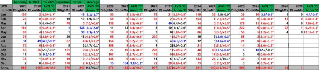
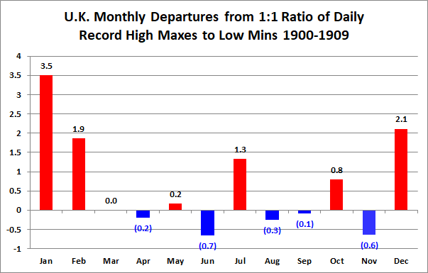
For the above and following data sets of record high maximums and low minimums blue colors represent cold months and red warm. Those months and years that are all-time record warmest or coldest are colors purple. Those months with counts close to a 1 to 1 ratio of highs to lows are colored black. Time stamps for when I last updated counts are located in the upper left-hand corner of each chart. Monthly departure from average data for Britain has been updated. Drop me a note if you see an error or if you have suggestions for improvements.
https://www.metoffice.gov.uk/pub/data/weather/uk/climate/datasets/Tmean/date/UK.txt
The 2010s:



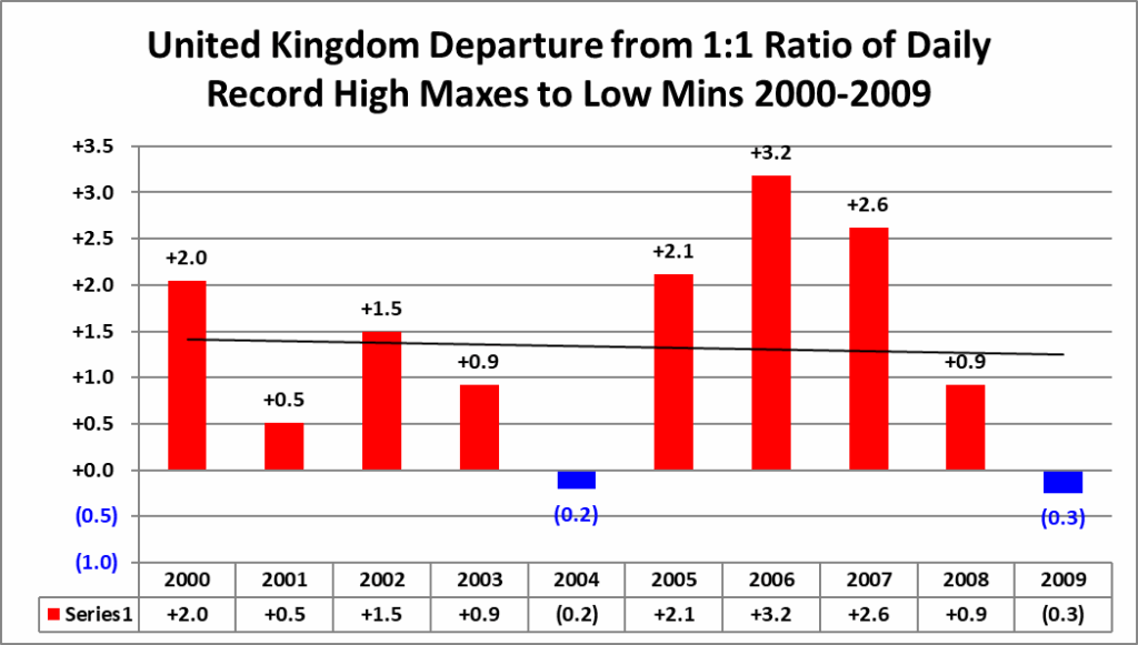
The 2000s:


The 1990s:



The 1980s:

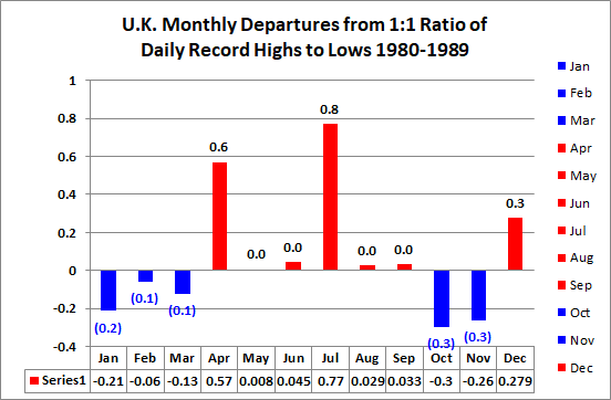


The 1970s:


The 1960s:



The 1950s:
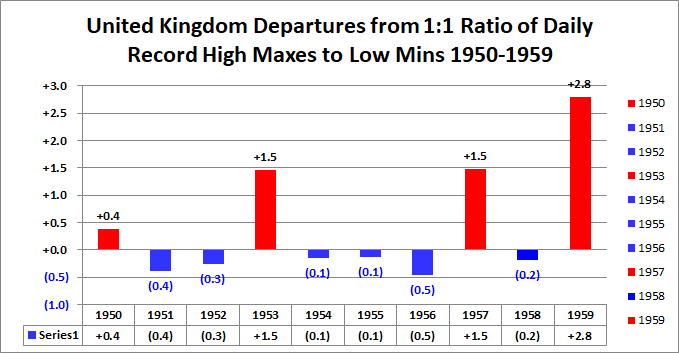

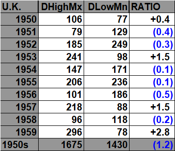

The 1940s:
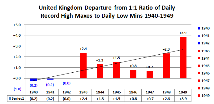



The 1930s:


1920s:



The 1910s:



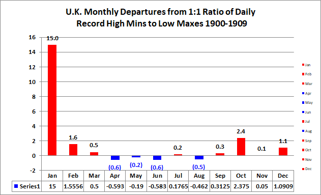
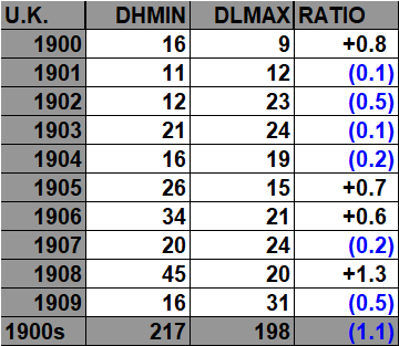
The 1900s:



The 1890s:



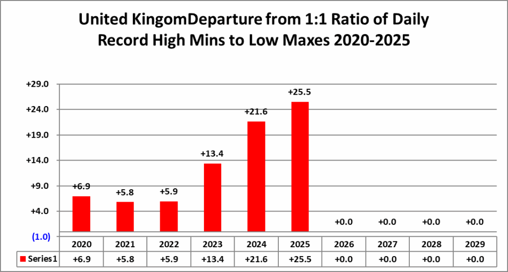
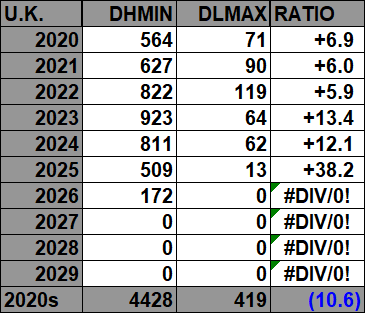
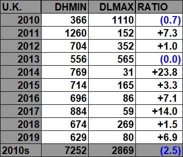
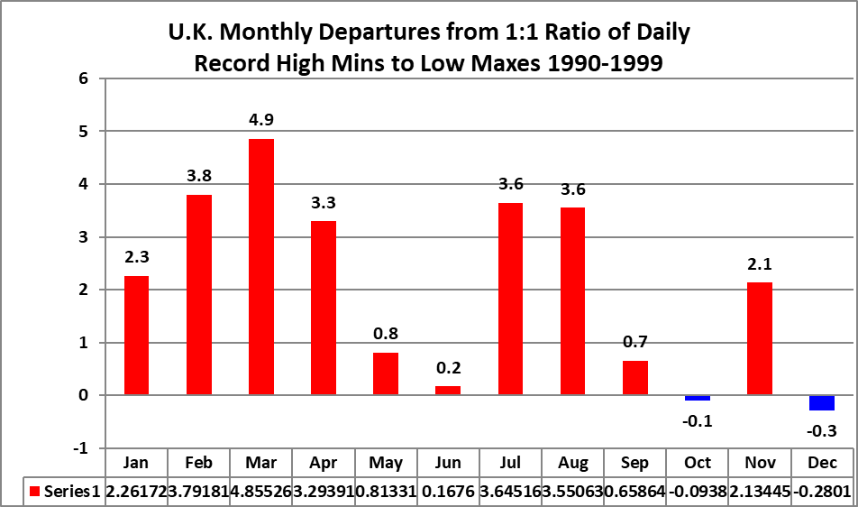
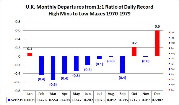
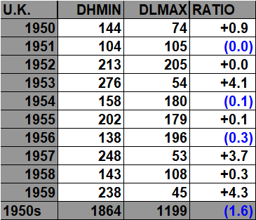
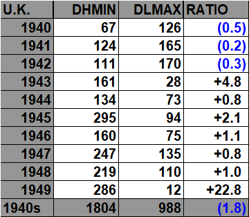
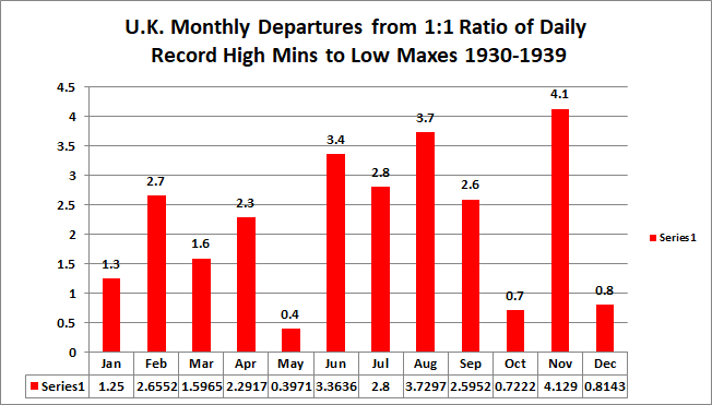
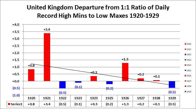
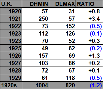
The ratio of daily record high minimums to low maximums for the 2020s (so far) is higher than any decade since the 1890s (For the United Kingdom):
All of the data listed below is part of this one chart shown above.


Based on the completed UK record analyses we produced, the comparison between the two record pairings revealed an interesting asymmetry in how the British climate is changing.
- DHMX/DLMN (Daily High Maximums vs. Daily Low Minimums) showed the strongest warming signal. Warm daytime record highs increasingly outnumbered record low minimum temperatures, especially during positive monthly temperature anomalies. The relationship between warmer months and more warm daytime records was fairly consistent and produced a clear positive trend.
- DHMN/DLMX (Daily High Minimums vs. Daily Low Maximums) displayed an even stronger signal of nighttime warming. Record warm minimum temperatures became increasingly common while record cool daytime maximums became progressively rarer. This is consistent with one of the best-known fingerprints of climate warming: minimum temperatures are increasing faster than maximum temperatures, particularly during cloudy, humid, and maritime conditions.
Scientific comparison
The two analyses tell complementary stories:
- DHMX/DLMN measures how often exceptionally warm afternoons are replacing exceptionally cold nights.
- DHMN/DLMX measures how often warm nights are replacing unusually cool days.
The second metric produced the cleaner climate signal because nighttime temperatures are less affected by day-to-day solar variability and respond more directly to increases in greenhouse forcing and atmospheric moisture.
What makes Britain different?
The UK’s maritime climate dampens daytime heating while reducing nighttime cooling. As a result:
- daytime record highs do increase,
- but record warm nighttime lows increase even more rapidly.
This is exactly what would be expected over an island nation surrounded by relatively warm ocean water, where cloud cover and humidity limit overnight radiational cooling. Recent UK climate assessments likewise show a marked increase in warm temperature records and a decline in cold records over recent decades.
Overall conclusion
The two record systems reinforce one another rather than contradict each other.
- DHMX/DLMN demonstrates that Britain is experiencing substantially more warm daytime extremes than cold daytime counterparts.
- DHMN/DLMX shows an even stronger increase in warm nights and a sharp decline in cool-day records, indicating that the background climate itself is warming.
Taken together, the British record analyses provide strong evidence that warming is occurring throughout the entire daily temperature cycle, with the most pronounced changes occurring during the overnight period. That pattern is physically consistent with expectations for a humid maritime climate experiencing long-term warming and strengthens the overall climate signal because two independent record metrics arrive at the same conclusion.

The 2020s:

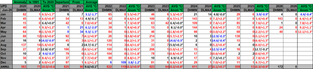
For the above and following data sets of record high maximums and low minimums blue colors represent cold months and red warm. Those months with counts close to a 1 to 1 ratio of highs to lows are colored black. Time stamps for when I last updated counts are located in the upper left-hand corner of each chart. Monthly departure from average data for Britain have been updated. Drop me a note if you see an error or if you have suggestions for improvements.
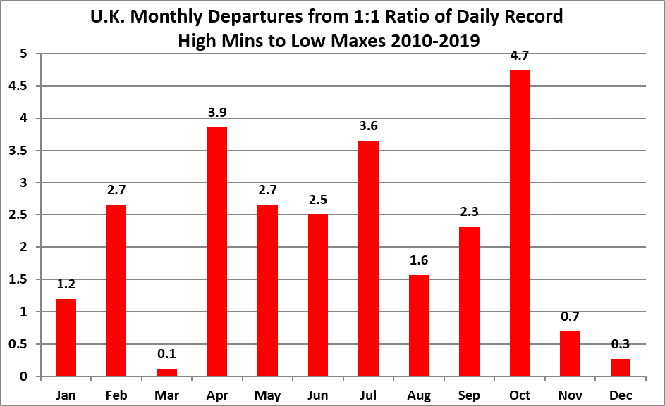
The 2010s:


The 2000s:



The 1990s:



The 1980s:



The 1970s:



The 1960s:


1950s:



The 1940s:



The 1930s:



The 1920s:


The 1910s:


The 1900s:


The 1890s:


These are all of the British daily reports of record temperatures in the NCEI system back to the year 1890.
Guy Walton…”The Climate Guy”