Made May 2022/Updated JAN 2025/NOV 2025/OCT 2026
The purpose of this post is to catalogue counts of monthly records (record high maximums, record high minimums, record low minimums, record low maximums) for Australia coming into the National Centers for Environmental Information’s site and all related charts and graphs produced in my Excel files for those data sets. For example, the highest temperature set during the month of March at Atlanta Hartsville-Jackson Airport was 89F set on 3/23/1995. I continue to update these data as part of my long-term work examining the warm-record/cold-record relationships first studied in the 2009 Meehl et al. paper published in Geophysical Research Letters, research that I helped initiate during 2000–2009. Each individual count could be a report of a tied surface record or one broken by several degrees Fahrenheit. Here is the link to the NCEI site:
Here is the link to the NCEI site:
https://www.ncdc.noaa.gov/cdo-web/datatools/records
More from NCEI:
“The daily records summarized here are compiled from a subset of stations in the Global Historical Climatological Network. A station is defined as the complete daily weather records at a particular location, having a unique identifier in the GHCN-Daily dataset.
For a station to be considered for any parameter, it must have a minimum of 30 years of data with more than 182 days complete each year. This is effectively a “30-year record of service” requirement, but allows for inclusion of some stations which routinely shut down during certain seasons. Small station moves, such as a move from one property to an adjacent property, may occur within a station history. However, larger moves, such as a station moving from downtown to the city airport, generally result in the commissioning of a new station identifier. This tool treats each of these histories as a different station. In this way, it does not “thread” the separate histories into one record for a city.
This tool provides simplistic counts of records to provide insight into recent climate behavior but is not a definitive way to identify trends in the number of records set over time. This is particularly true outside the United States, where the number of records may be strongly influenced by station density from country to country and from year to year. These data are raw and have not been assessed for the effects of changing station instrumentation and time of observation.”
An updated 2016 study from Dr. Jerry Meehl indicates that the daily ratio from year to year will average around 15 to 1 by 2100:
Per one of the authors of both the 2009 and 2016 studies, Claudia Tebaldi said “This climate is on a trajectory that goes somewhere we’ve never been. And records are a very easy measure of that.”
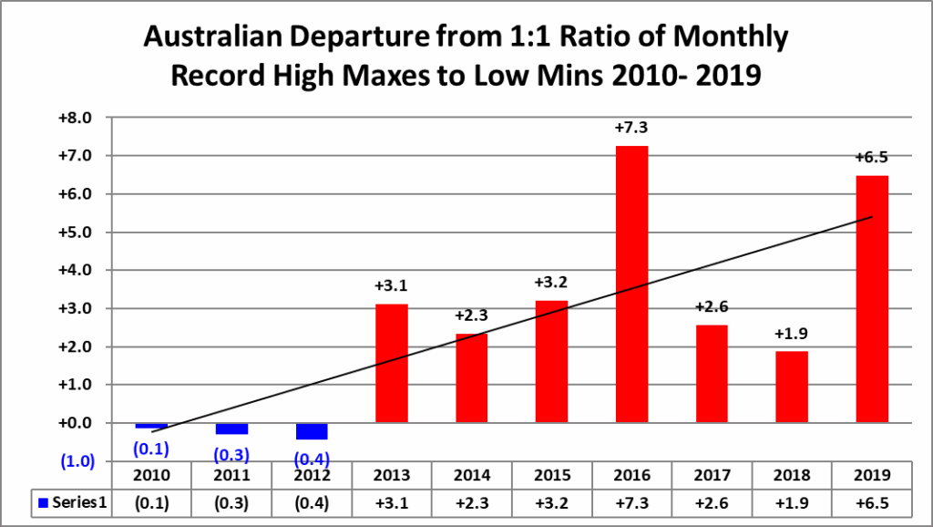
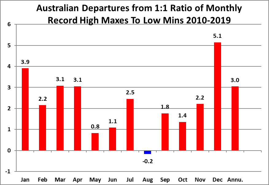
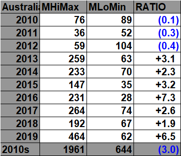
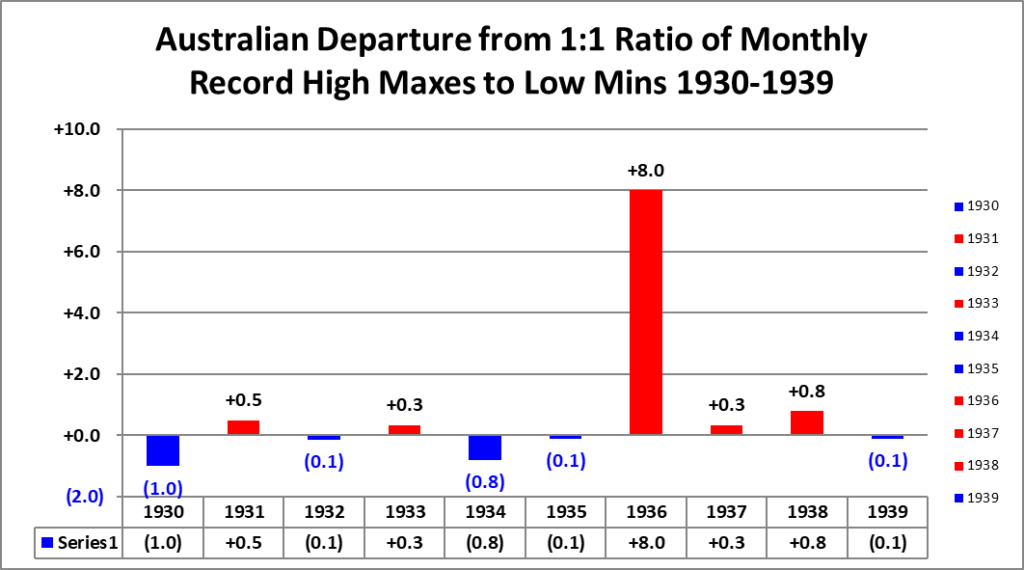
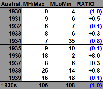
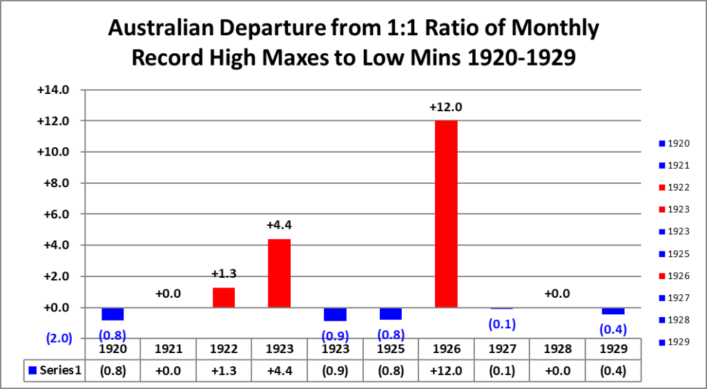
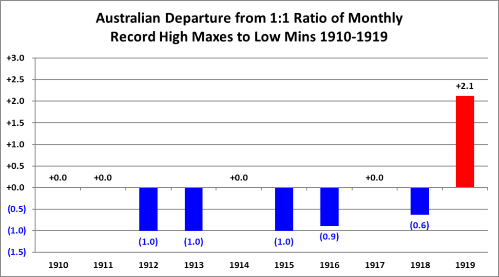
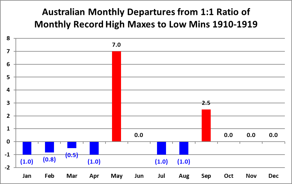
All of the data listed below is part of this one chart. The ratio of monthly record high maxes to low minimums for the 2010s, so far, is higher than any decade since the 1910s:

Here are the current Australian monthly record counts per decade (including ties):

At +2.0°C and warmer for aversges, MHMX records outnumber MLMN records by about 16.6 to 1, while MHMN records outnumber MLMX records by about 15.1 to 1. On the cold side, at −1.0°C and colder, the corresponding cold-record dominance is about 5.5 to 1 and 2.5 to 1. The most interesting point is not just that warm months favor warm records; it is that the relationship becomes strongly nonlinear as the anomaly grows. The monthly categories react more strongly at large positive anomalies than the daily categories do.
The MHMN/MLMX result is especially interesting because persistent warm minimum temperatures become dominant even at moderate positive anomalies, suggesting that sustained background warmth strongly suppresses monthly cold extremes.
One especially interesting feature is that the monthly record categories appear to respond more sharply to very warm background conditions than the daily categories do. That makes sense physically because a monthly record requires warmth to persist across much of the month rather than occur on only one or a few days. In particular, the MHMN/MLMX analysis shows that persistent warm minimum temperatures become dominant even at more modest positive anomalies, suggesting that sustained warmth is especially effective at suppressing monthly cold records. As with the daily analysis, these results are descriptive rather than causal and should be interpreted alongside changes in station density and observing-network coverage. Even so, the Australian monthly results reinforce the same central pattern seen in the daily data: increasingly warm background conditions strongly favor record warmth, increasingly cold conditions favor record cold, and the relationship becomes much stronger as anomalies move farther from the climatological mean.

To better quantify the relationship, monthly anomalies were grouped into 0.10°C bins. Within each bin, warm-record and cold-record counts were compared using a signed ratio, then square-root scaled for display so that both large warm and cold imbalances remain readable on the same graph.

The 2020s:


Red marks anomalies above +0.5°C, blue marks anomalies below −0.5°C, black marks months or years within ±0.5°C of the 1961–1990 mean, and purple identifies all-time warmest or coldest months/years. Time stamps for when record totals were last updated are located on the upper left corner of each chart.

The 2010s:

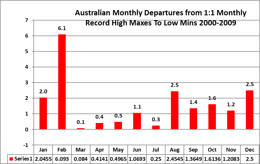
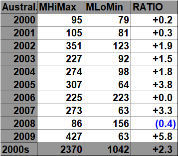
The 2000s:
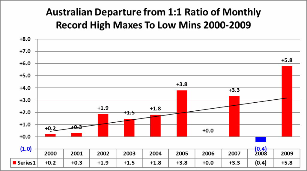

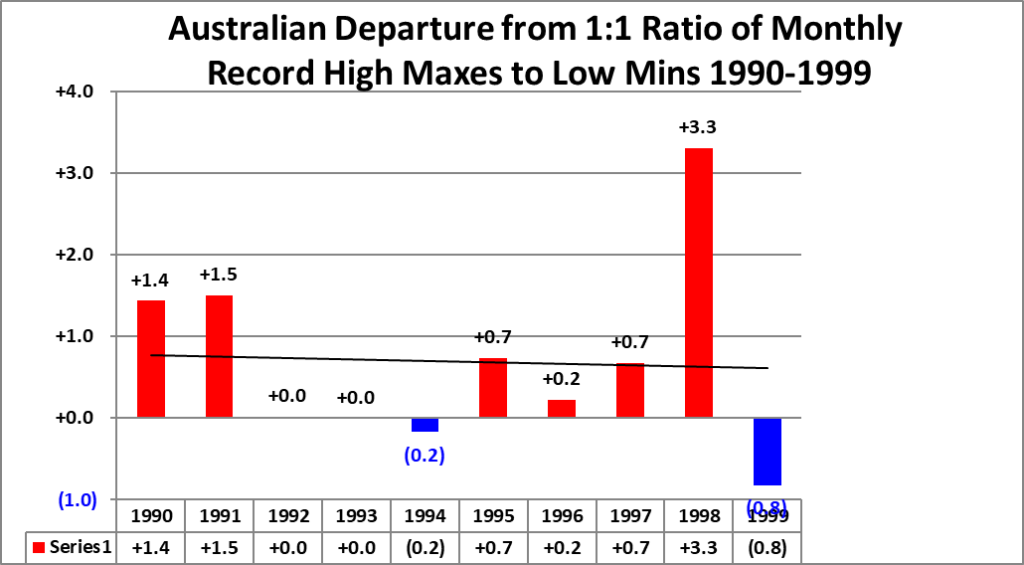
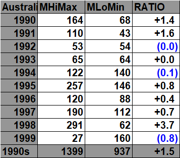
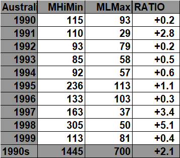
The 1990s:


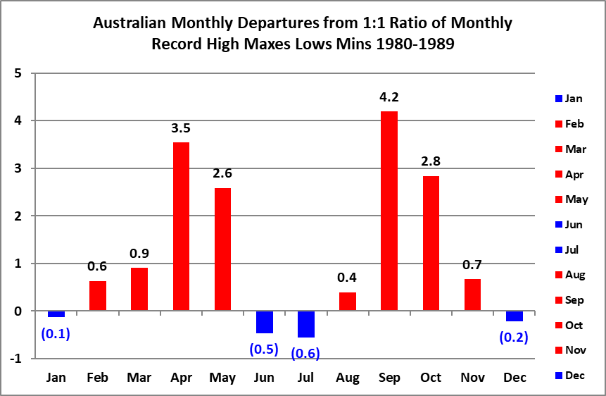
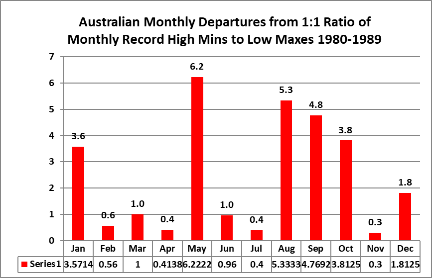
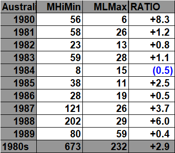
The 1980s:



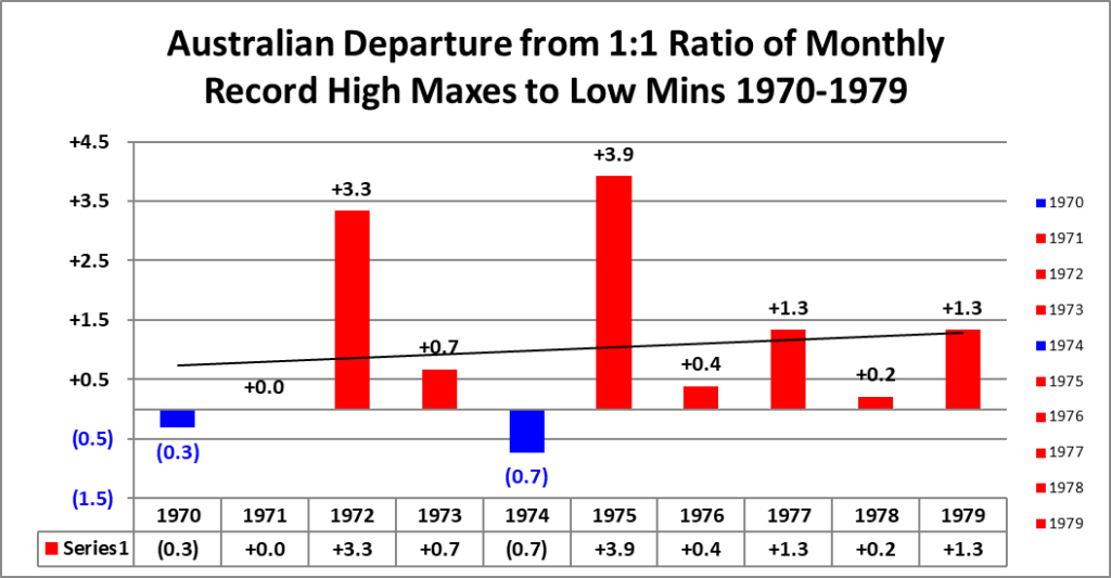
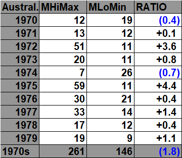
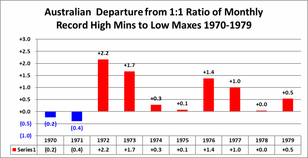
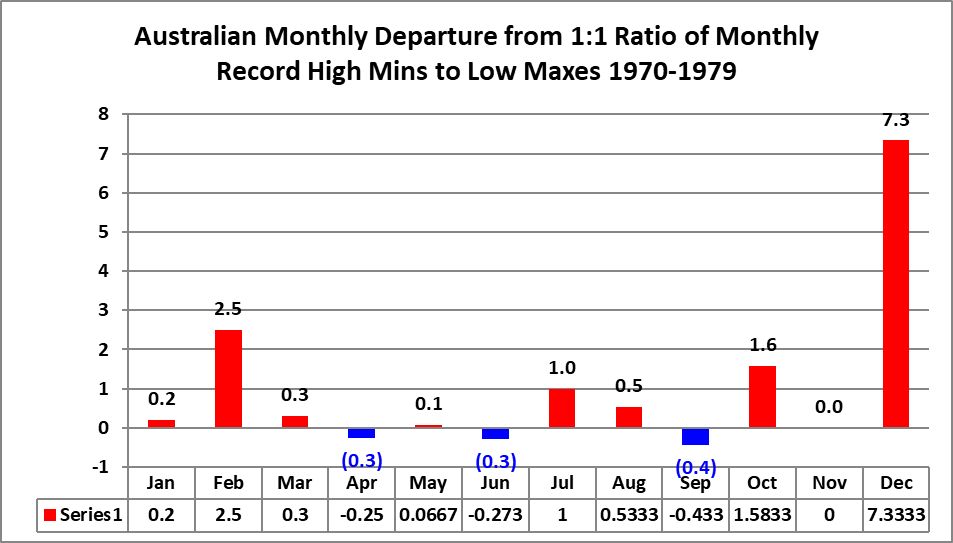
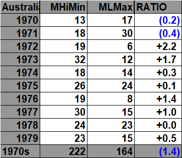
The 1970s:


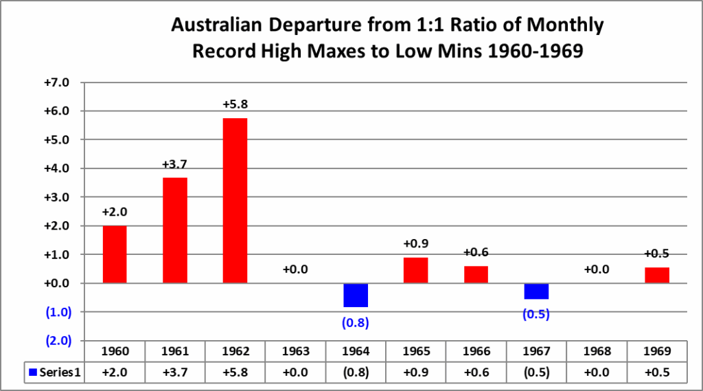
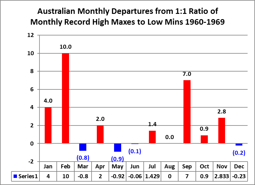
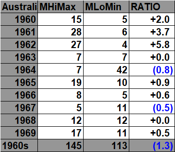
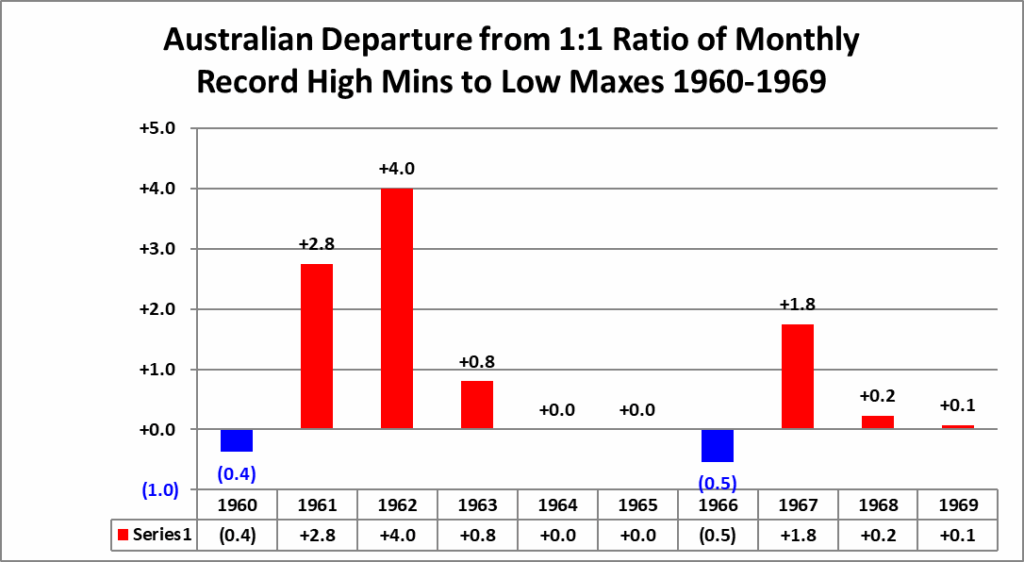
The 1960s:

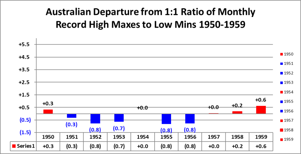
The 1950s:


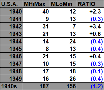
The 1940s:



The 1930s:


The 1920s:


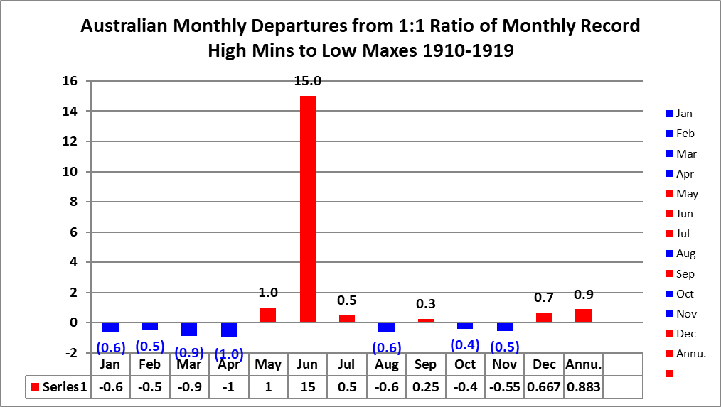
The 1910s:


The 1900s:
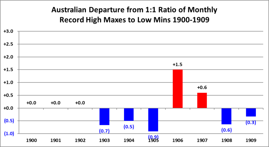


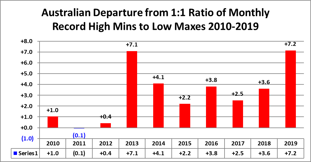
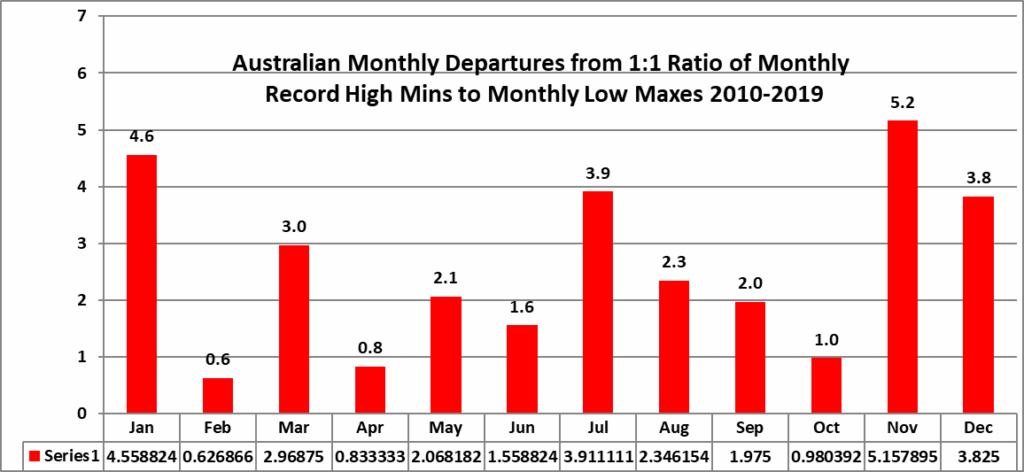
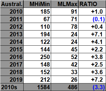
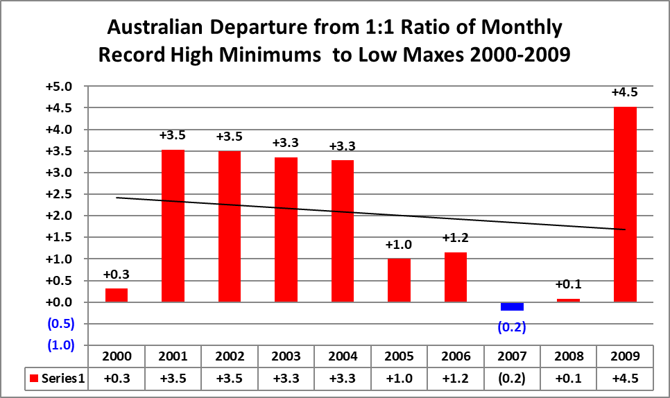
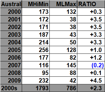
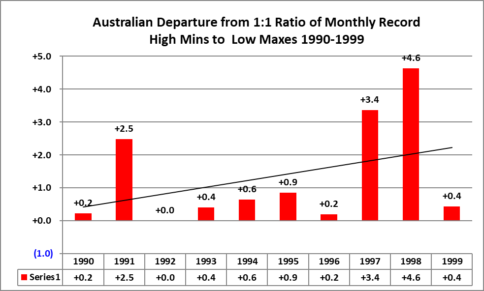
All of the data listed below is part of this one chart. The ratio of monthly record high minimums to low maximums for the 2010s are higher, so far, than any other decade since the 1900s:


The Australian monthly record data show a strong nonlinear relationship between the background monthly temperature anomaly and the balance between record warmth and record cold. Near the 1961–1990 average, warm and cold monthly records are much closer to balance, but the separation grows rapidly as anomalies move away from normal. At +2.0°C and warmer, monthly record high maximums outnumber monthly record low minimums by about 16.6 to 1, while monthly record high minimums outnumber monthly record low maximums by about 15.1 to 1. At −1.0°C and colder, cold monthly records dominate instead, by roughly 5.5 to 1 for MHMX/MLMN and about 2.5 to 1 for MHMN/MLMX. The relationship is therefore not proportional: increasingly warm background conditions produce increasingly large imbalances toward monthly record warmth.
One of the most interesting features is that the monthly record categories respond more sharply to large positive anomalies than the daily categories do. That likely reflects the persistence required to set a monthly record: sustained warmth across much of a month has a stronger effect on monthly extrema than a brief hot spell does on individual daily records. These results are descriptive rather than causal and should be interpreted alongside changes in station density, observing practices, and network coverage.
The 2020s:


The NCEI monthly record archive begins at 1900 for practical completeness
Red indicates anomalies warmer than +0.5°C, blue indicates anomalies colder than −0.5°C, black indicates months or years within ±0.5°C of the 1961–1990 average, and purple marks all-time warmest or coldest months and years. Time stamps for when record totals were last updated are located on the upper left corner of each chart


The 2010s:

The 2000s:


The 1990s:


The 1980s:


The 1970s:

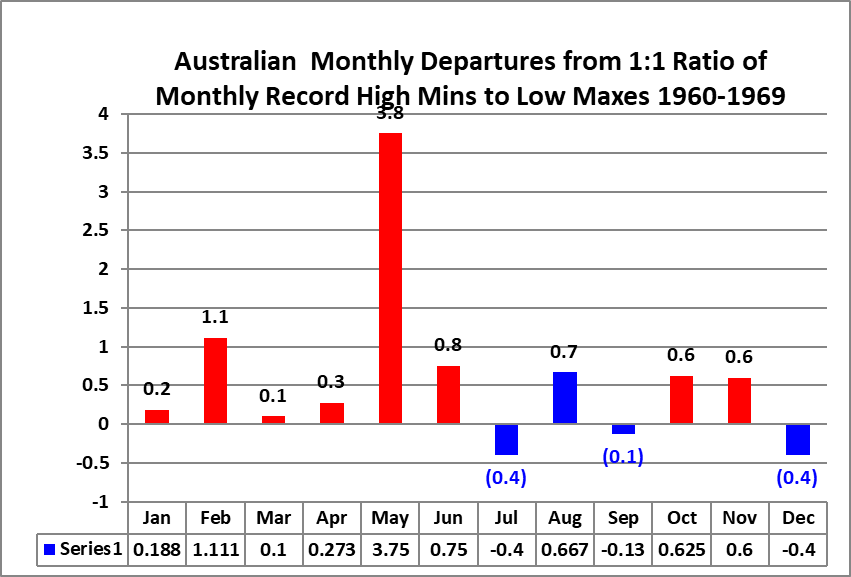
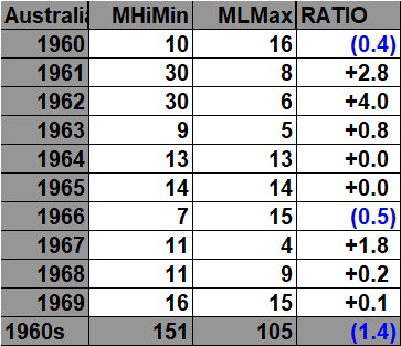
The 1960s:
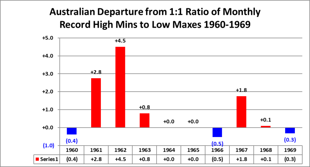

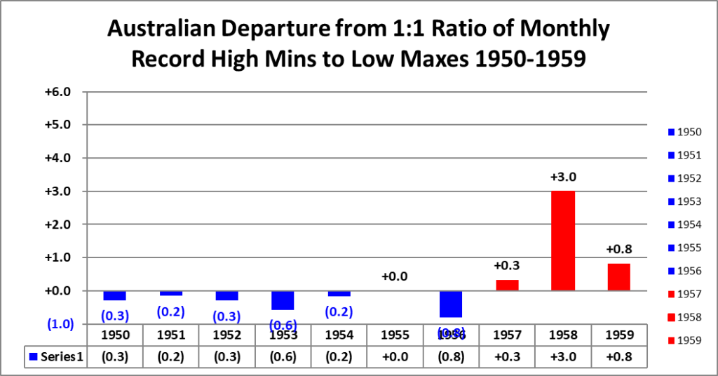
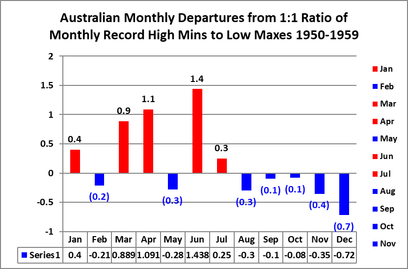
The 1950s:


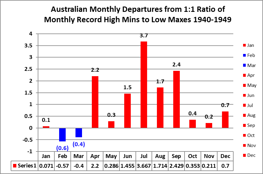
The 1940s:



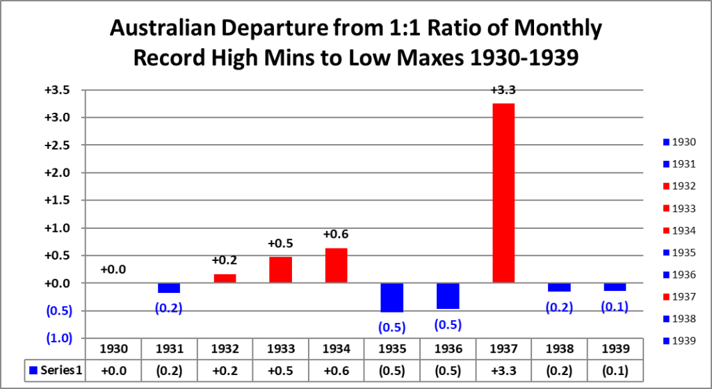
The 1930s:


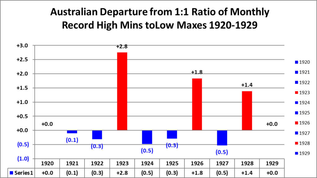
The 1920s:


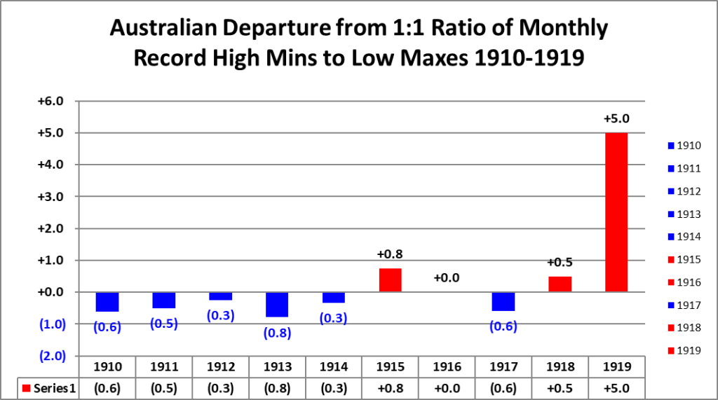
The 1910s:


The 1900s:

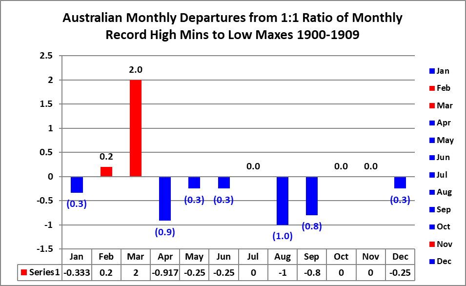


This is all of the counts of reported NCEI Australian monthly records going back to 1900.
Guy Walton…”The Climate Guy”